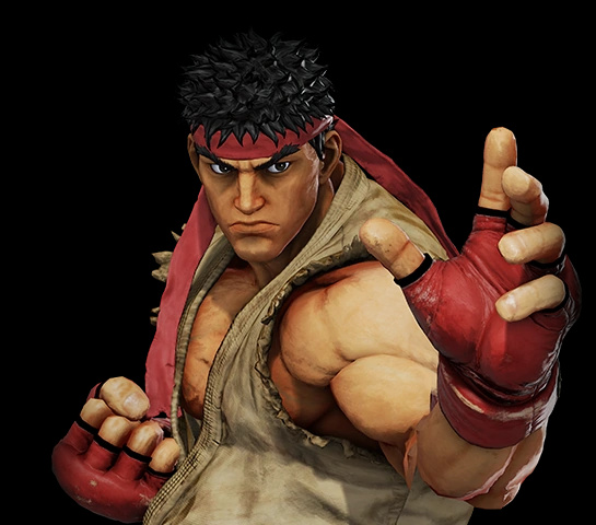
Tbh most of people don’t have a clue about what art direction is, so i will be hesitant use what a-lot-of-people like as proof of better art direction
SFV surely looks “prettier” for a series of factors (wich in large part it’s enough to win the a-lot-of votes), but honestly i have hard time point at SFV art direction as the reason
To me it’s a ridicolous difficult comparision, because on one hand it’s easy point at the two SF4 main visual problems:
-
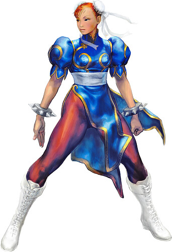
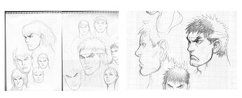
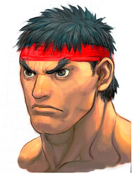
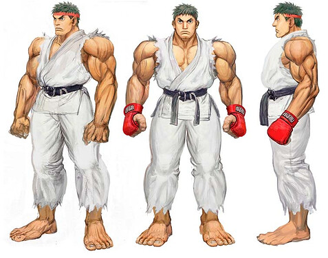
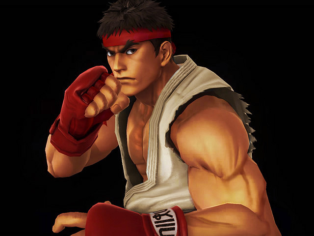
The whole art direction is strong and stick to Ikeno’s vision, but the style chosen is an highly controversial choice (personally i did’nt liked it much), we can call it “kinda ugly” to have a simple simple way to see it
Essentially the Captain may have took wrong decisions, but soldiers executed orders efficently and loyally.
The result is that in both virtues and (many) sins you got a visually coherent thing, where everything for good or for bad seem done by the same hand with same vision
-
The tech side was’nt that good, one can rightfully say art director should have maximized what they got for the best result, and i kinda agree.
But personally it’s the type of smart thinking that i consider a + (and an actual must to aim at maximum quality) when i see it applied, rather than use it as argument to accuse when it’s not
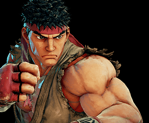
On other hand, if i must do same reasoning on what’s “gone wrong” with SFV art direction i feel more like


Of course both games visual had many good qualities too (SF4 probably less recognized ones at that), and i appreciated them… i actually consider both games “pretty” when took at the right moment
And again it’s not up to discussion wich of the two looks “prettier”, SFV is prettier… and aside the kinda unfair comparision with a ps3 game, i consider SFV a good looking game on general
I just think SF deserve better than both
Maybe a strong (SF4) art direction, good tech (SFV) and all for once used on a truly beautiful style (neither tbh) wich combine high level jap character design and loyalty to SF aesthetic
From there it’s the usual wishlist of “perfect” style, but jumping that i think one sure thing is that watching Capcom’s past, at theyr peak they used to have a much better understanding on how create a great stylization of SF characters… it’s easy blame the switch to 3D, but it’s in artworks too
To that SFV in particular added a visible loss of identity and a lot of “whatever” mindset
Speaking of whatever, all this ideal streak of ideal good decisions is useless, let’s see how things will go under new guy… for better or for worse SF6 will likely be very different from SF4/SFV
I just hope he will not sell SF(6) art anus to the west, and i’m not speaking of “DmC” kind of bullshit… i will not want them to “DMC5” SF either
