Hey I gave you two sets of win quotes ![]()
On personal level i agree with you, for many reasons i ever liked the idea of Hugo as ultimate SF Giant, and on design level i find it having so many things that make him much greater and more interessing than Abigail
On other hand i can’t blame them (SFV guys) too much, Abigail exist since FF days in SF universe and he ever was much bigger/heavier than Hugo and more slim/V shaped while at it.
They gone surely too far, but not by THAT much considering the original source
I wish they gave him less esasperate proportions with slighty bigger head like in this old shoop

Also we should consider artist’s concepts did’nt had same proportions, as usual sfv 3d modellers took huge liberties
You got a repository for all those quotes for SFV and other games? Definitely appreciate the diligence!
I still have to do some editing, but I’ll have it all ready once the Seth quotes are finished. I have a feeling he’s the last character, so the entire thing will be complete.
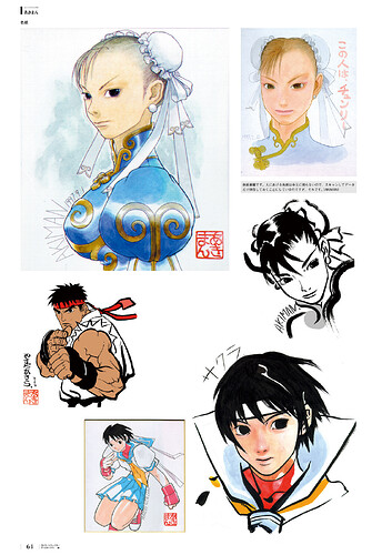
By Akiman, personally I never liked his stuff (thought the Sakura posing one at the bottom looks good) but…
I love Akiman and pretty much every Capcom artist from the golden Era. I love it when you people post any art ![]()
![]()
I kind of like most Capcom artists. But I’d say that mid 90’s Bengus, Kinu Nishimura and Haruki Suetsugyu are my favourites, I really love the 90’s-early 00’s anime vibes they all carry. I’d say Hideki Ishikawa too but ever since I found out that he draws child porn I can’t look at his Megaman/Alpha 3 stuff the same way again without being disgusted.
Capcom and SNK too have such a distinct and charismatic aura about them with their characters and designs and it’s largely helped in part by their brilliant artists.
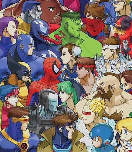
Murata Street Fighter art is love.
Murata Street Fighter art is life.
It should be the artistic basis for the next Street Fighter especially with the recognition value of the OPM art style right now.
It captures the pure essence of the characters and has INSANE energy and vibrancy to it. I fell in love with it
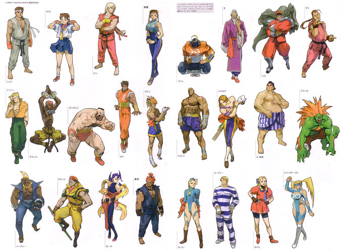
All these were back when Capcom had great art
SFV not only is’nt on par, it barely have a clear one at all
SFV got
- motivated Bengus +
- stylistic trip Bengus -
- kiki -
- fucking udon people -
- bizzarre modified renderings -
WTF
Best days of SF character design:
SF2-SFA-SFEx-SF3 years
Best days of SF art style (artwork)
SF3:NG/SI
He did and incredible good job, i would totally enjoy It
Reality is, they will never do it, next SF will try even harder to look westernized
Like it or not, even SF4 had an artistic identity in comparison to SFV.
Yeah but what is the point when the identity is shit. ![]()
Hating Udon artwork is very unfairly to make you sound like superior lol, there are tons of decent one like that I like Alvin Lee, Chamba and etc.
Kinu, Shinkiro, Akiman and Ikeno modern art is still impressive nowadays.
I miss Classic Bengus, for both 90s Capcom titles even before Alpha.
Fixed
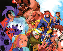
I’m not as much of a fan of Classic Bengus because he always did the giant feet thing(which you can’t tell from your images).
I very agree with this
SF4 had many merits on his visual structure and development/method
Had also flaws, but to begin with they got some fundamentals of design like identity, coherence, hierarchy or group vision of the elements done right
SFV improved in some other areas, but lost some good points (the ones above for example) where SF4 was strong
Yeah, Thats noticeable on SFA vanilla single character art, but not really entirely in some earlier art outside Alpha and before SFA3.
Inconsistency is the result of constant outsourcing to the lowest bidder instead of cultivating talent. Like a lot of SFV’s problems, it comes down to god awful management/production staff.
Thank you. I’m glad you said it. Back in 2008 when SF4 got to arcades in Japan and a few in the States, at that point we were starving for a new SF game. So once we got it, we were like “this is AMAZING - waaaaah the graphics!!!” But once we got to see the identity after a few months to the next few years, it got easier to spot BS that shouldn’t have existed in those character models.
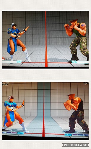
The character movements are just really strange. Go ahead and fire up your system of choice and look at Guile’s neutral stance. That’s not the stance we’ve known from him. It’s more erratic, definitely not the poised and focused stance we’ve seen. That stance should be called The Hunchback of Guile Lame. Remember when a good majority of Ultras were ROFLCOPTERS? Torridge Farm remembers. Why did they think that was a good idea…?
Why do Ryu’s and Akuma’s gis look more like tank tops, rather than martial arts uniforms with the sleeves ripped off? That was weird.
Never forget.
To be fair Guile SF4 stance was more a stylistic choice than anything, they wanted to highlight his defensive approach to fighting by giving him a more tight boxing guard, the elbows getting closer and more forward (as to create a shield by closing them together) cause the “hunchback” thing
Also the weight more on lead leg suggest he’s ready to do a back step… “step” in most fight styles is done not like normal walking but more by having a 70/30 weight distribution and the heavy leg pushing the light one to slide forward or back.
Usually you got the 70 on rear to be able quickly step forward, staying ready to switch weight on the lead if you have to retreat… Guile having as standard the 70 on the lead shows a defensive mindset
Fun thing the rest of his animations there ignored all that, as his way to trot forward on tips kinda negate all that, but this is another story ![]()
What i did’nt liked of SF4 Guile was more that to rep well canon, he should have looked more heavy built next to shotos, something that i think SFV did better
