This confirms my suspicion that Lucia would’ve looked a TON better if she was a darker shade of dirty blonde or even a light brunette.
The prototype names were mentioned in the special SF2WW issue of Gamest, except they actually refer to Dictator as “Washizaki” instead of calling him “Eagle Head”.
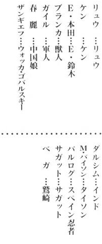
Most of them are just descriptive names (Chinese girl, Spanish Ninja, military man, Indian, beastman), but Vodka Gobalsky for Zangief always cracks me up.
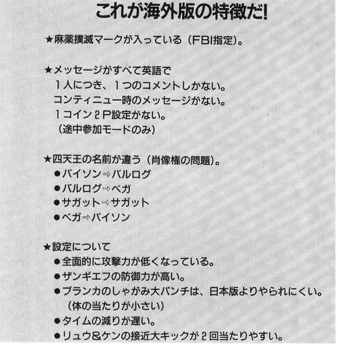
There’s also a small section on regional differences. Some of the stuff are obvious, like the name swapping, multiple win quotes and protips during the continue countdown, but there’s actually some balance differences in the gameplay too.
*Characters’ attack strength is lower in general.
*Zangief’s defenses is greater.
*Blanka’s crouching HP is harder to pull compared to the JP version.
*The timer countdown is a slower
*Ryu & Ken’s close HK is easier to 2-in-1.
Yes but that’s a comparison that includes
Terry Bogard: Literally the best main character fighting game design ever created
and
Geese Howard: Literally the best boss character fighting game design ever created
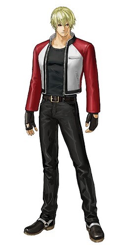
Rock is an S-tier design…and he’s still like three leagues behind the SSS+ designs of Terry & Geese because they’re pure magic
Nah. Geese is a straight-up better design than Bison
SNK boss design tend to be better than Capcom. Geese, Mr. Big, Krauser, Rugal, Krizalid. All awesome designs.
Rugal is the best madman boss ever in a fighter alomg with his first introduction.
Wolfgang Krauser is the best boss ever.
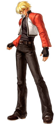
Rock is cool looking EXCEPT for that short sweater ending at his ribs. Too girly looking which I understand is a thing they like in Japan, but no.
slightly better^
Since Rugal is my fav fighting game boss, I agree in that regard.
I still rate Geese as the perfect fighting game boss design, but my own personal preference is for the absolute madman that is Rugal Bernstein. Geese is great for initial look and fighting style and presence when he FIRST appears. He tells you so much without an OUNCE or lore because his design is so strong. Rugal becomes transcendent when you know about him, know about his deal and get to see him just continue to come back as this monstrous foe complete with DBZ-style white-hair power-up Omega form.
Bison fights 2 v 1.
Rugal laughs and takes on people 3 v 1.
Bison is trying to achieve more power.
Rugal is fighting for lulz to dip people into bronze.
What a boss (literally)
Tbh i was more sold on ( A ) but gone for the not-modified Story haircut because It distanced a lot from other blondes and made silhouette more spicy
But like you i will be ok with either, both feel different/unique and add tomboy vibe, ( B ) has been first try but feel too much delicate
1000% disagree for several reasons.
1: His silhouette is VERY likely a call-back to Future Trunks from Dragon Ball Z. They both have identical haircuts and both are the son of a villainous character who died leaving them to be trained by a previous rival of their fathers (Geese & Vegeta/Terry & Future Gohan).
-
The half-length jacket is EXTREMELY important to the structure of his sprite/model in that the hemline of it accentuates the movements of his upper body and the through-line of his physical motion. It’s right at ‘fist’ level during attacks so it emphasizes the motion of his blows and their animations as he strikes. This is part of what makes Rock’s attack look so visually dynamic and impactful. The raised height of the jacket also keeps his hips entirely visible so the motion of his legs looks more graceful and fast.
-
The shortened jacket creates a 1/3rds color balance of the character with the top half being eye-catching red/white/blonde (bright colors) and the bottom 2/3rds being simple black. This is really good color balancing as it draws attention, again, to Rock’s upper body and its motion.
-
The shorter jacket draws attention to Rock’s more slender frame and the fact that he is lean. This reinforces the idea that he is a speed fighter AND that he is a younger character. Lowering the jacket makes him look chunkier than he is, which makes him look slower and older than he is, as well.
The shorter jacket is EXTREMELY important to the coherence of Rock’s design.
Neither of those those things is an explanation of why an all inclusive roster isn’t possible in other games.
Yes, it’s a tag team game. Does that mean if it wasn’t a tag team game half the roster would disappear? The characters are all still playable in the same game.
And yes, there is a 10 year gap, because when Tekken starts over with a new engine, they consistently rebuild the roster over the next several games to the point where “EVERYONE IS HERE!” again.
It is, but I always hoped for sequels that brought back more of old FF cast.
It’s called Miracle-tier in Garou. ![]()
Miracle Tier sounds right ![]()
Yes it would. A couple of the characters the tag games add are canonically dead like Jun, Kunimitsu and Angel or retired like Michelle. Characters like P. Jack don’t have a place thanks to being redundant and not having a real place in the mainline games.
I said that because if you ask me if i will let go Terry or Geese to make space for Rock i will INSTANT be like
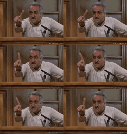
fuck no kill Rock on the spot
To be fair as you said poor Rock is put up vs 2 icons of fg history… if i can steal for SF 3 chars from SNK entire universe will probably be Joe Higashi (my fav) then Geese, then Terry
Terry is my second fav hero design, just behind Ryu (who is criminally underrated design)
Geese probably share with Bison (cape) and Cervantes (human) the #1 Boss spot
Rock to me is a “good” design but that’s it, but should be said i’m absolutely intollerant toward the whole category of skinny SNK guys
Early KoF Kyo Kusanagi (school huniform) and Rock Howard are only two somehow see in positive light lol. Of them i consider Kyo much better design though
On general usually i can’t say a successor that i like more than the original
Maybe only Dudley taking boxer spot from Rog and few others, but are more the exception than anything, i can pick ever the original and 90% of times i will be satisfied with the result
I can try slowly
If you ain’t got the time, don’t worry about it. It hasn’t been updated in, like, a year, so if it doesn’t get finished I don’t think anyone is gonna complain or even notice. It just bothers my OCD.
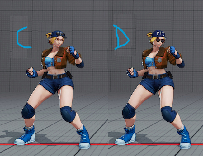
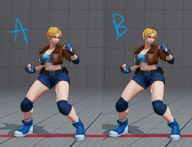
My order of prefence will be something like A>>C>B>>D
i see your Gilsig and respond with young Margot Robbie

She doesn’t even have the same nose.
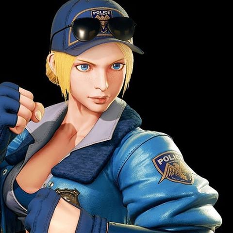
Also C is ![]()
Should be her default.
I hate fighters that fight with glasses on. In fact, it makes me like K’s design less in KOF14. He needs to take the sunglasses off when he fights instead of keeping them on
