Your friend’s not a bad artist, but needs to finish his work – feet!
There’s a difference between trying to capture the red/white of the stick in your art and only using an awful, desaturated, reddish grey for EVERYTHING (I honestly suspect this was all done in other colours and there’s a Hue/Saturation adjustment layer on colorize mode on top on the default settings – aka awful). Colour helps things stand out. Either change the background colour, or have your friend colour those drawings so they’re more than just sketches, or both (do both).
Layout. You’ve got these various sketches of you laid out in this awkward arc and it just lacks any real visual interest. In a similar vein, that symbol in the background probably has some sort of significance for you, but it’s mostly obscured by the buttons and will be further obscured when there’s a dust washer in place. Shrink it down and try to make it more visible. It might also look cool on a custom dust washer from Art’s Hobbies.
More specific background stuff. Colour aside, it’s boring to look at. Simple (and ugly), random, abstract backgrounds were cool for like a week in 2001. I honestly don’t know what to tell you to replace it with other than ANYTHING ELSE.
Obviously needs work done. I’ve been advised the way to go is focus on 2-3 characters but i would like to sick with majority i have, even though it seems there is too much going on.
Hey man, you have a point…But you don’t have to be an assholeand try to break down his self esteem…. Your critiques can use less insults… This isn’t American Idol, Jackass…
The pictures are choppy… You need to start learning how to use the magic wand tool (GIMP or Photoshop)
The dimensions are disoriented… Some characters are too flat like wesker in the left side… Try evening out each side…
The man in the background is too low res and it looks horrible (sorry :S) it seems you used google images
YOU DIDN’T PUT ALEX FOR SF: 3RD STRIKE, YOU BASTARD! THIS ARTWORK IS HORRIBLE. lol jk its fine you’ll just add him when you make these fixes…
I don’t mean to judge but… If this is a Marvel X Capcom Artwork, why is Gatchaman from Battle of the Planets on the left…
Still though, It IS kinda badass You should try getting these fixed and it’ll be better because I love the concept.
psst… ADD ALEX INTO THE ARTWORK~~~~ HE WILL MAKE THE WHOLE THING LOOK 300% MORE BADASS EVEN WITH THESE 3 FLAWS
If your using microsoft paint, you should stop…
www.gimp.org/
Thanks for your comments Eutrophic. You’re correct they are google images, guess I’m being a bit lazy- ha ha!
I’ve only had Photoshop for about a week and still learning. Will look at magic tool tutorial to improve the look- thanks!
Sorry- I just like that character- thought no one would notice - ha ha!
Yes - Wesker does look slightly out of place, think its his dark colours. He’s only in there because I abuse him in MVC3!!
I tried balancing the colour of Alex (your fave!!) to blend in!!
that’s bull. he’s right. it’s tacky. it has alot of potential being an original drawing but it is lacking in a few critical ways. he wasnt being an ass. he was being a critic, and that is exactly what was asked of him. people need to develop thicker skins.
“awful, desaturated, reddish grey for EVERYTHING” is literally what that stick design is, and the first thing anyone who is looking at it will notice.
just finished this one. I could use opinions on this (harsh or otherwise) but keep in mind this is made to be to someone else’s taste. im looking for an opinion from someone who may be able to relate to Ghost in the shell more than i can, because ive never actually seen the movie/show/whetevs. the theme is “earthtones”
For a very specific taste and theme, it fits pretty well for the original Ghost in the Shell movie. You have the Major, the logo, and the Tachikomas which are all key parts of the movie. Don’t think you could do much else considering the theme.
He has a point, not to mention he asked for the critique and concerns. Like Drop said it has potential since it’s original art but it’s lacking and Lord Brit pointed out most of the flaws surrounding the design itself. This= truth.
soothsayer did you need any additional info or anything for the Blue Mary stick, im not picy at all you pretty much have free creative exploration with it but i just wanna make you sure you know all the template stuff and all that
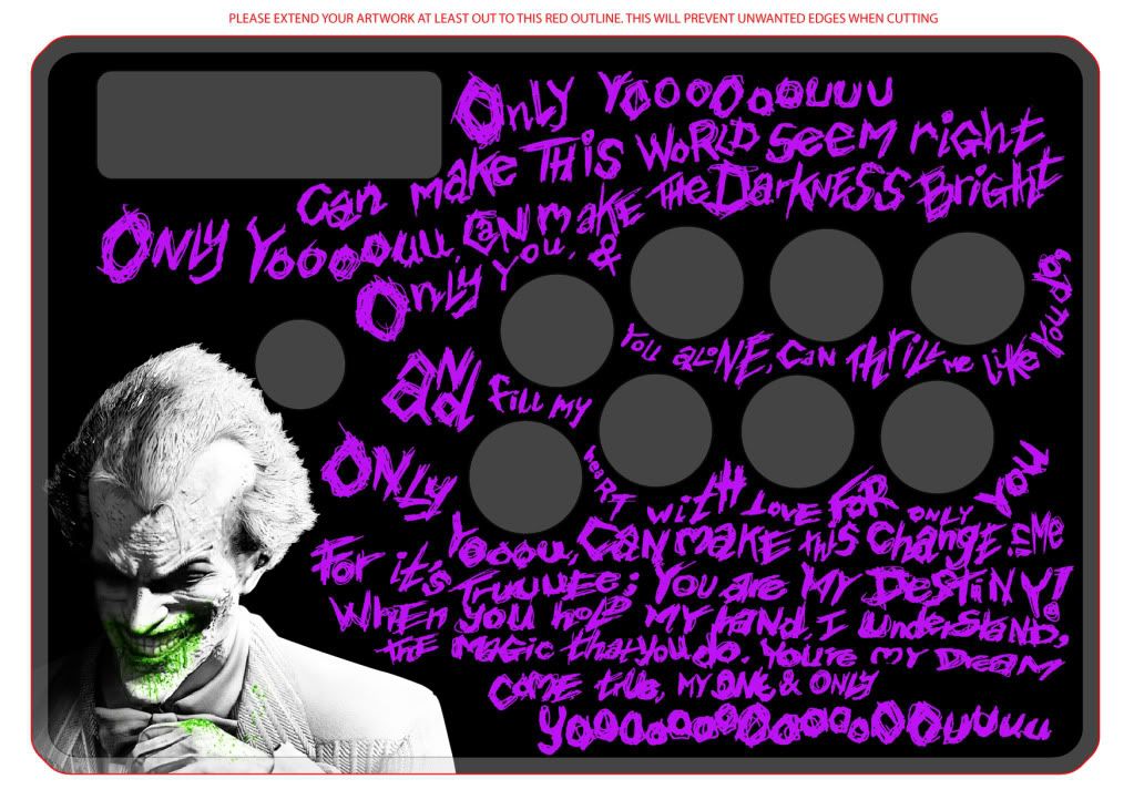
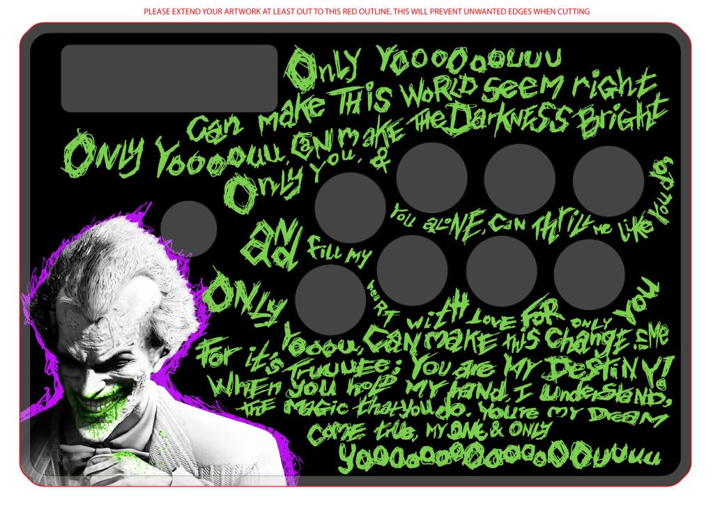
Just finished this so far - still gonna put a little work in it. It’s for my GF’s (yet to arrive) Brawlstick.
Can’t decide on the green or the purple. Any opinions/ advice would be appreciated.
I really like this, personally, but it doesn’t feel very ‘Ghost In The Shell’ to me.
I think it’s maybe the paint splashes in the BG. Something cleaner and less random for the High Tech Ghost world, prehaps?
Just my Two Cents.
If that’s the case I really just need to know what stick, how many buttons and if you want any text featured on it? A Phrase, character name, your tag/nickname, whatever.
I could have swore I’ve seen that same design on a couple of your other pieces…
Did you design it for that piece decide you liked it a lot and used it in a couple of other designs?
oh ok well its a mad katz chun-li te, 8 buttons, picked blue mary cuz shes awesome, one of my favorite and i thought her color scheme would go well with the translucent blue base, and my gamer name is BakaSmurf, somewhere maybe in graffiti like text, i dunno your the artist its been a while since i had one done, few years really, so i really dont know much of what i want at this point once i see like a base design i can get an idea of what to add, take away etc
 you’ll just add him when you make these fixes…

