np, thats fine, thank you
just throwing it out there but u should probably look into putting the laughing mans symbol on the stick somewhere, just render it a different color to go along with the theme. other than that great stick man.
Did you use a new metal faceplate or did you just take off the Chun Li art?
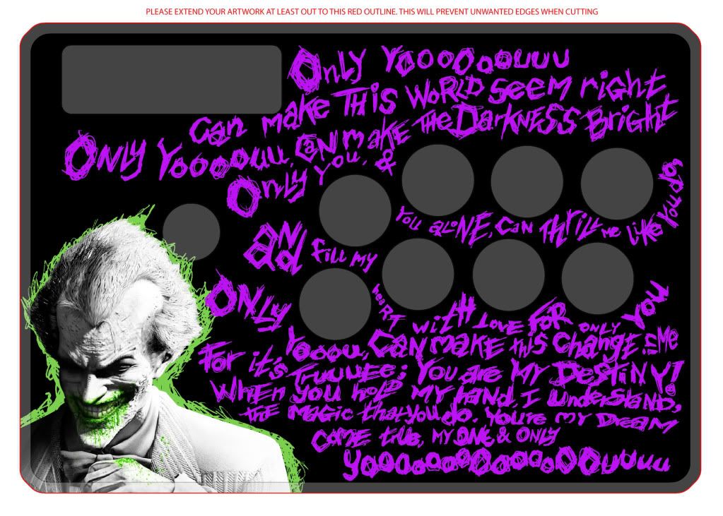
Just noticed I didn’t have a layer turned on. Here’s the purple again.
GF is probably going with this one.
To be honest the characters looks out of place because they’re no proportionate to their art. You re-sized them to fit the stick’s parameters, not their artwork’s parameters which is FAR more important and if it just doesn’t fit it’s too big or if it’s pixelated it’s too small. I’m just pointing out simple flaws, please don’t say I’m being mean but someone already mentioned this problem as well and I’m not sure if the proper consideration was taken in. Also your daredevil is obscuring the logo that you decided to put on that stick (I personally never put logos I find them to generally be hideous in every way)
i probably should have been more clear about that. before i was commissioned to do this i had only used this design for the hrap vxsa. it was requested of me that i use the same border for the TE, but i had not actually made it until this design, and while i finished the taskmaster themed one for myself, this one is the first one i started with that design, if that makes sense.
Wow. I thought this was a template thread…what happened…
Your girlfriend is a winner, I wish my girl played fighting games or any games for that matter really. Le sigh.
Yeah that’s what I thought it came down to I looked back and was thinking about it as I looked at your templates.
Oh this is still a template thread I just have way too many “Works in Progress.” probably should have thought ahead a bit here. So I post here to pass time while I mindlessly PhotoShop.
lol its awesome! O:
You should use a thicker red brush and write bigger overlapping of the green/purple text so it would look like it was written with blood…
lol thats what i would have done xD anyway, EPIC FIGHT STICK!!
I tried balancing the colour of Alex (your fave!!) to blend in!!
Lol I was joking about alex xDD I wrote that after I took a glimpse, I honestly didn’t notice he was in here lol
Sorry- I just like that character- thought no one would notice - ha ha!
Hey, I don’t blame a man for having good taste  Ken the Eagle is my main in Tatsunoko vs Capcom
Yes - Wesker does look slightly out of place, think its his dark colours
ORMAYBEWESKERISTOOGODDAMNTHIN…
lol try fixing his size first  I like how deadpool (or who ever that is…) is in the middle
Try making him larger so it only shows his face… and you can make him fade into the background :PP
Sorry, I understand… I just felt he could have been firm and critical, without being harsh and inflammatory.
It’s not that I was mad that he was telling him that it was bad, the sole fact that he trash talked along with it was pissing me off… It is hideous in my opinion, but not everyone knows much about design…
But I guess I should of left it be…
[LEFT]Drawings[/LEFT]
[LEFT]It’s not even complete…[/LEFT]
[LIST]
[]The stance on the first looks akward… And extremely unconfortale
[]The stance on the last person is a little off proportion
[]“The character is actually me as a muay thai fighter” Lol? So you don’t have any feet in real life?
[]They’re not even complete… You didn’t even bother to color them… If this is a WIP I understand, but really…
[]It’s boring… Plain and simple. The drawings are pretty damn good I’ll give your friend some credit. The poses are neat. But it’s just dark red shading and white lighting… I understand you were trying to follow a color scheme but this is kinda sad…
[]The contrast is too intense IMO I’m not sure about anyone else here, but I just don’t like how the dark, desaturated red goes with the white… feels unsettling but that’s just my opinion… The contrast is too harsh it makes my eyes bleed… The shading of the fighters + The white light shining on their bodies:Blinding…
[/LIST]
Background
" **Help us make this art epic as "… You have a long way to go pal, sorry…
[LIST]
[]The background is boring and lacks anything worth paying attention, and kinda hideous too… :X
[]Just looking at it pisses me off… It looks so lazy… I don’t want to accuse people, but It looks like you didn’t even take a single amount of effort making the background… It looks like you just used a filter in GIMP or Paint.net to make this… Hell, it didn’t even have to be abstract… A plain red background would have more stylish than this if you know what the hell your doing…
[*]What is Gigyas from Earthbound doing in the background??
[/LIST]
I don’t know… I’m sorry if I was too harsh, but really… This is bullshit…

Look at this…
[LIST=1]
[]No random abstract background,
[]consistant color scheme
[*]most importantly the presentation makes sence…
[/LIST]
This is what you need to keep in mind when fixing your fightstick, I would be glad to see you improve…
we saw it on the Mario one
We saw it on a couple of them  but yeah he clarified he had it for a different template not a TE, that TE one was made for that commission.
ctrl+c ctrl+v move anchors
Edit: oh and I didn’t see that reply from drop one. Too many spammed posts from eutrophic. I’ve heard of triple post but five in a row? Really? You’re asking to be given infractions
For my new HRAP1. Still a WIP. Feels a bit empty on the top. :

Tsk, tsk, tsk d3v. I thought you would have done one by now.
could i get some feedback on the template i posted on page 61 please? the chun li one…
The drunken dwarf finds the lack of templates in this thread disturbing.