I haven’t perused through all 4 pages of the thread, but I pretty much get what everyone’s discussing here. While I understand wanting the art direction on characters (like Ryu) to change, I’m in agreement with d3v and the others who say that really can’t be the case too drastically, else the character would be virtually unrecognizable, especially if he/she is the face of the series. Despite each SF game having a different “main” character for that version’s story (i.e. SF2 = Guile, SF3 = Alex, SF4 = Abel), Ryu is still the staple of the series.
Also, storyline wise, Ryu is a traveling warrior. I would even expect him to look different until he had achieved a certain level of his training to where maybe he could add something to his outfit. The other characters have changed more over the years to look different. I’m not opposed to making a few cosmetic changes on characters here and there, but they can’t be too drastic of changes. But others are right, characters from other fighting game series pretty much remain the same. I think Killer Instinct is the only game that completely redesigned its characters each time, however keep in mind, those characters also played a lot differently from each version as well.
My vote for a different art direction is more in line of what SNK did with KOF XIII, and GOD ESPECIALLY with how Guilty Gear Xrd looks. KOFXIII looks beautiful with its “dot art” animation, and while people may not like the way GGXrd plays, it is an absolutely beautiful game. I’d LOVE for SFV to look like either one of these, but then again, maybe it would be better suited for the Alpha series (if we get an SFA4), or if by some wonderful fate they make a new Darkstalkers.
I made this.
I just took Ken from SF4, layered him onto an Okami in game screenshot, and as for Ken’s flaming dragon punch I just took some fire effects from the Okami game and layered it over Ken’s fist and right side. I also cel shaded Ken and removed some of his details to flatten/abstract him a bit.
I liked the aesthetic from the old trailers better…lighting definitely improved but that grittier, more realistic character portrayal is much preferable to me. Now it looks very close to SF4 in the latest nash trailer.
Can we have somewhat realistic proportions this time? Ryu doesn’t have to resemble 70s Schwarzenegger. Can hands and feet not look like clown shoes? Can we get rid of double chins, can faces not look f’ed up? I know all of Capcom’s great artists have left the company, but can they bring in someone? Street fighter used to be a pretty good looking series.
I get what you mean, 2D sprites have class and are ageless, qualities that 3D can rarely if ever attain. But I also understand that 3D technology is the only way I will be able to enjoy SF like I used to 20 years ago. Capcom are simply adapting to the times. Having said that, 3D technology that mimics 2D anime has come a long way, there are things Capcom can do with SF characters now that 2D sprites can only dream of achieving (without costing an arm and a leg that is). When it’s all said and done, Capcom made the right choice to move the series into 3D.
I like that Capcom are sticking with their art style that they introduced in SF4, but are refining it and pushing it to the next level, fulfilling it’s potential. What we saw in SF4 was only the beginning, it was limited by the technology of its time and we are seeing that art style mature in SF5. By the time SF6 rolls around some day, the technology will allow something as fluid and crisp as the best animes ever drawn I bet and possibly even better. But that wouldn’t be possible without the trails and tribulations of SF4 and SF5 graphics.
@d3v Those are obscene! I like female fighters that actually look like fighters. I give Cammy a pass because she is ancient and Juri because she’s insane, but every other female street fighter has generally been appropriate and wasn’t pandering to the male demographic… remembers Sakura …never mind.
Yeah, more realistic proportions combined with the anime style could look fantastic actually and would be a bigger departure from SF4 visually speaking because the characters will certainly look different.
SF5 certainly has more realistic proportions than its predecessor, but still not realistic realistic.
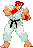
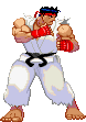
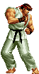
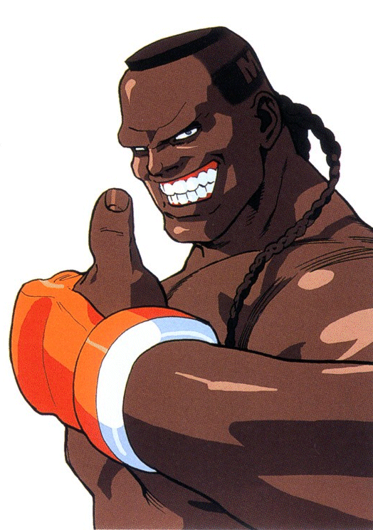
That SvC sprite is awesome. However even with the SF2/alpha/sf3 comparison, it is clear they went with much more exaggerated muscle mass in alpha and that style was continued in SF3. Same with big feet.
With sprites, since everything is hand drawn, the proportions could also change depending on movement. In motion SF2 looks fairly realistic.


