After watching the trailer for Street Fighter 5 I can see that it has more detail, but it doesn’t stand out from the current game. IMO how are they supposed to attract people to a new title if it looks old? What about those that didn’t like the SF4 designs? Maybe it’s time for Capcom to do a SNK with their character designs. To be honest, they’ve been FAR too safe with their character designs(special moves as well, but that’s for a different thread) throughout the years. I’m really surprised they did not use the 2D/3D tech that Arc Sys did with Xrd with SF Alpha 3 art. The characters still look like they belong in that old Clay Fighters game (IMHO).
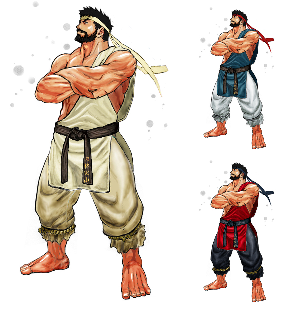
Even something like below would add flavor to a two+ decade-old game (Will Guile ever get more moves?):
I just wish people would stop bitching about the art direction of a game that is in its very early stages of development.
Anyone who has watched the trailer can tell that it looks way better than SF4 , and that’s what counts.
Three of these are just costume swaps. SFIV already has costumes more outlandish than these, so I don’t know what kind of “flavor” you’re expecting. The Gouken picture is concept art from SFIV. So I’m REALLY confused as to what you’re getting at.
And honestly I don’t think SFIV and SF5 look that similar. What do they share in common? Semi-realistic models with a slight cartoon appearance? By that token you might as well say that SFIV, Gears of War, and Uncharted all have the same art style.
Ryu and Chun-Li’s new faces alone show that the imagery is a nice step-up and definitely NOT using the same light and comedic style as before. All the bitching about art style on this forum has once again reminded me of how clueless many people are when it comes to art or creative endeavors in general.
Why are you being so difficult? Anyone with 20/20 vision can see that this is a great improvement from SF4’s ugly models and I don’t even have 20/20 vision… Ryu looks like a determined badass and Chun-Li looks MUCH more feminine, in the face and body (hands included). I can’t believe some people don’t see this change for the better…
I’m sorry if I hurt anyone’s feelings, but IMO the game’s artstyle is just as ugly as SF4. It just has more detail to the clay-like designs. It looks like SF4 touched up. Pretty lazy TBH. 3rd strike art with the 2D/3D tech (and new mature/older-looking characters) would be better. Post-3rd strike, SF has just been funny-looking. To each his own I guess.
I like the art style but I will admit that the game does not stand out, especially when compared to nextgen graphics. It also doesn’t dramatically stand out as an SF game. I think this is mainly because of the character design, proportions etc. More so than it is the choice of graphics engine.
I’ve said this in other threads and i’ll repeat it here, actually changing the character’s default outfits and appearance will help give this game a “new” appearance. MK does this all the time and it works. They find ways to make generic color swapped ninjas feel NEW every single game.
I need they need to up the muscle tone on the females. I hope Juri keeps her muscle tone form SF4. I want to see those biceps and abs. If you’re a superhuman martial arts master…there’s really no excuse to not be fit and well toned. Not spaghetti arms like in those anime fighters especially the women (in anime fighters). Of course though I’d tone done the muscle tone for the guys…they just look like gorilla’s… tone up the women tone down the guys. Juri needs to look the part.
They could and they’d end up with something that looks pretty similar to what we have now. 3S’s artstyle also has the same things we see here, bulging muscles, large hands and feet. Heck, the SFV style is much closer to Ikeno’s art than IV which was him trying to emulate Bengus and Akiman.
So far i like it, they went for a smoother look as well, instead of the jagged normal maps they used in sf4 (which was actually done on purpose in the art style and not just some kind of graphical limitation.).
I dont understand why some expected Capcom to go for a cell shaded look like guilty gear, I actually prefer this, its rare that the cell shaded style looks as good as Guilty gear and a few others.
I’m also not a fan of the SF3 style all that much and would prefer a character design style similar to MvC3’s Street Fighter characters. Less gratuitous muscle on dudes and a complete lack of it on most of the female cast. Make everyone look like athletes and not competition body builders or super models. I can actually get behind most of the animation effects and stages except maybe making the background a bit brighter.
I think the new CVS1/2 sprites of Ryu, Bison, etc, struck the perfect balance of muscles for their characters. I would prefer the character design closer to that. It also fits the darker and more serious tone if that’s what they are going for.
Then SF3’s artstyle is beautiful and beautifully animated. Easily one of the most awesome 2D graphics to date.
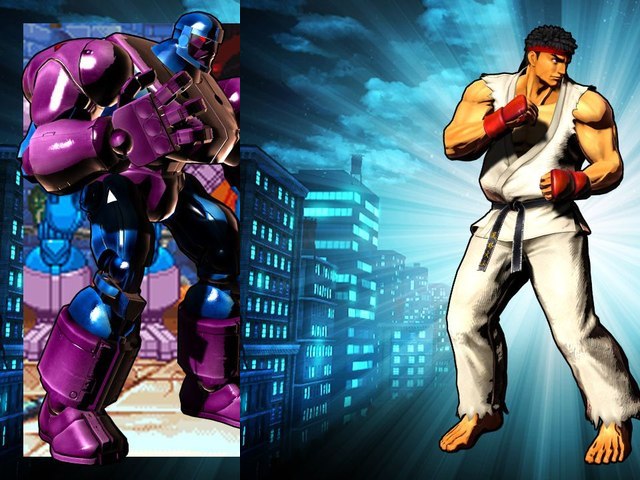
Although i dont have much of a problem with the art style of mvc3 itself, i really didnt get the street fighter feel from the mvc3 style, and i dont think Ryu looks like Ryu in that game…
Yes the cvs2 style Ryu looked perfect in my opinion.

