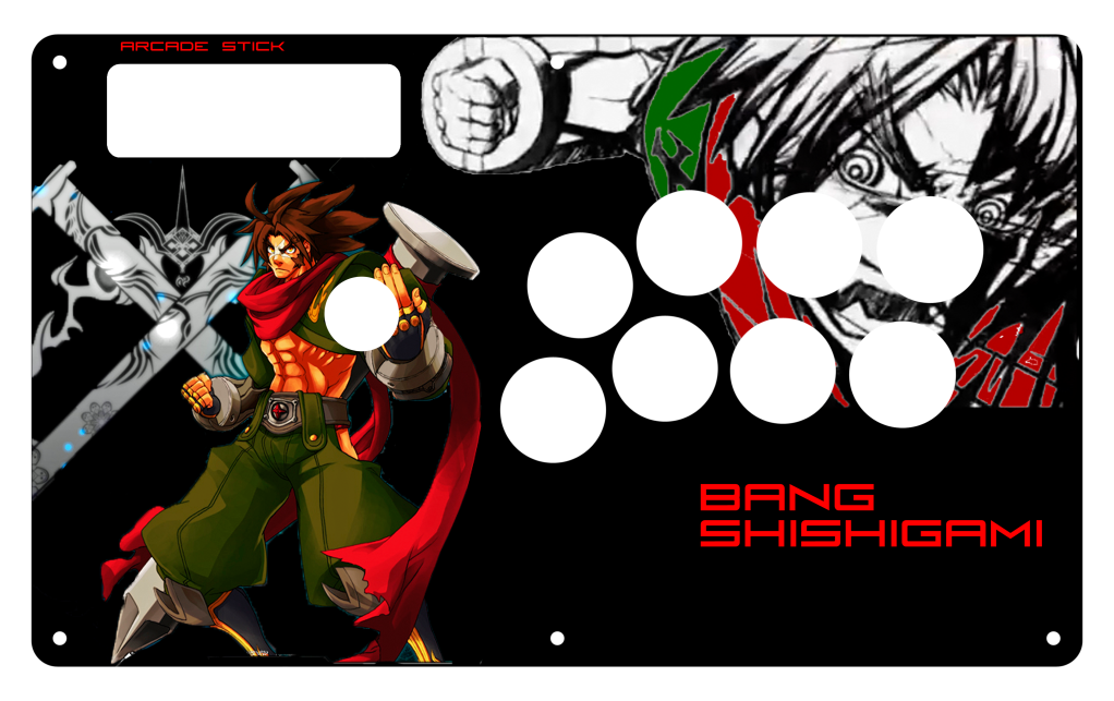
@Greent
The most important bit, don’t place your character in such a way that it looks like the stick is stabbing him. For more info, refer the my first post.
Unless, you know, you’re going for that.
This is my first attempt at something like this. I’m no artist but I loved the design of this that I had to put it as my stick art. I didn’t feel like uploading the whole thing so I screencapped it instead.
http://img188.imageshack.us/img188/453/templatedraft.th.jpg
Thoughts?
move Bang to the left some more.
I’m not sure if I’m in the right thread, but do you guys know where I can get some Guy artwork?
AIM me if you can. I’m usually on.
you can try to find some hi-res art on kawaiidream.net for art. IIRC I’m not sure if they have SSFIV images for Guy, but I do know that they have images for Guy from SF Alpha/Final Fight.
Thank You
:wow:
This tutorial was simply amazing!
You helped me to complete my TE Artwork
and improve my Photoshop skills.
:bgrin:
10 out of 10.
I appreciate all the hard work
you put into making this tutorial.
Thanks again d3v.
Great tutorial, d3v.
I felt like sharing my Custom Work, let me know if you think its too busy or if it needs some work. The original is in 700 DPI and CYGM color filter for better printing so some of the colors maybe off in this RGB version.
http://img109.imageshack.us/img109/9173/mbisonmadkatstestickcov.png
Wasn’t sure where to share this, but this thread seems a likely place.
For those of us with Mayflashes, I took the faceplate scan that’s somewhere here on SRK and turned it into a fully-layered psd. All holes and text labels are individually viewable. Currently, the text labels are just the awful Mayflash ones but, of course, they can be replaced with whatever.
Darken your background a bit so that Bison isn’t drowned out. Also, you might want to tone down the effects on the SSFIV logo.
Which Bison? XD
Naw I see what you mean about Bison. The SF Logo really doesn’t have many effects…I just put it under 3 of the background layers so that it would blend in better. I suppose I could always go change the colors on it so it matches bison.
Very nice tutorial. Only right now, im having trouble finding the button font. (square, triangle, X, circle…etc.)
I know i saw it somewhere in the template thread, but to go through 400+ pages in such a short time before work, its a daunting task. lol
You should read this Thread too.
Because I linked it.
Second Page.
http://img191.imageshack.us/img191/8025/almost1.jpg
Alright, I need a critique. I am having problems since I don’t have auto blend. Kenshiro doesn’t mesh well with the background. It looked dope in the beginning, just fell a little short of what I wanted.
It’s all about how you cut him out/isolate him from the original background. You need to take time to make sure that he’s cut out right at his proper outlines.
So I have to take the original layer with ken and cut him out better is all. Anyway just to put an outline on him? If there are any other things artistically that I have missed don’t be shy, let me know. It would be easier if I had Auto Blend but, elements doesn’t have that function. Well if there are any other things I may have missed artistically or overall design-wise, let me know.
This is going to be so manly.
He how do you put pictures in the background letters? Is that a layer your doing?
