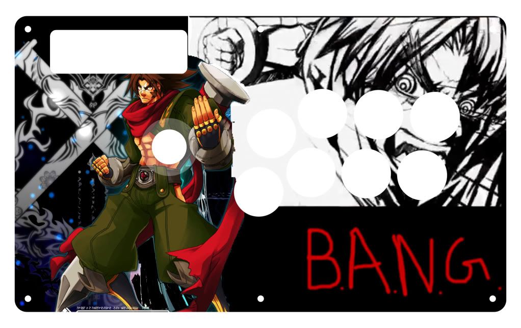
OK ill do that but can someone give me a design that can go with the picture i cant find any.
Here’s one that might fit Guile to your liking :
http://sleekupload.com/uploads_png/12/firstcamo.png
Forest Camo.
It looks really good now. If you want to put in the PS3 buttons around the button holes here’s what you can do.
1- you can use the text tool for X,O,L1,L2,R1, and R2
2- for the triangle and square buttons you can either make them yourself by drawing individual lines to create the shapes, or try to look for a shape tool to get the shapes.
I’m more used to the Xbox 360 layout so it’s different button layout for the PS3, sorry if this didn’t help much.
Ah, very much so, thanks for giving us the link to it.
can anyone explain to me how i inset my final template (.jpg/png) in the mockup file?
I use gimp and everytime i paste the picture, it creates a new layer.
is there a design for for full panel te?
thx
It should create a new layer. Just make sure you move that layer under everything besides the “Panel” Layer. Other than that, it should be fine.
can sumboidy lend a hand
http://i550.photobucket.com/albums/ii423/wiz428044/FSTE_Round2333333.jpg
does antbody have a clean image of this i just cant do it myself it would help me alot
Look at the link I posted on this Page.
It is also a Font, if you don’t want to use the link above.
http://www.dafont.com/font.php?file=fireye_gf&page=1&nb_ppp_old=10&text=&nb_ppp=10&psize=m&classt=alpha
It is 100% confirmed.
Fireye GF.
thank you very much jdm714
Wait, you wanted the real Font used by Mad Catz, or the Font used in that picture you posted?
The Font used by Mad Catz is Fireye GF.
http://www.dafont.com/font.php?file=fireye_gf&page=1&nb_ppp_old=10&text=Tournament&nb_ppp=10&psize=m&classt=alpha
The Font used in that picture you posted is 911 Porscha.
It is a Font that MIVLives found to be closest to Mad Catz Font before got identified and confirmed.
http://www.dafont.com/font.php?file=911porscha&page=1&nb_ppp_old=10&text=Arcade+FiGhtStick&nb_ppp=10&psize=m&classt=alpha
i used the wording from the juri an deejay template that was in the link you provided. I didn’t feel like doing it myself but was Fireye GF font used in that?
I linked you to a Post by sselemit.
There is no Dee Jay.
The only Dee Jay I see on that page are from d3v.
Those have 911 Porscha.
This may sound noob, but what would be the best paper to use when printing. Obviously 8.5x11 paper doesn’t fit the TE sticks. And even if i were to use larger regular paper (Legal) I feel as though it would look cheap.
Do you use photo paper?
Behind the plexiglass?
heavy-duty card stock paper, a4 legal size.
Preferably non-glossy.
It is either A4 or Legal.
Not A4 Legal.
Laugh.
A4 is 8.3" 11.7" measure.
Legal is 8.5" 14" measure.
A correct TE Print does not fit on A4 Size by the way.
Legal is the smallest size a complete TE Print will fit on without using the weird ones.
Okay, let’s start with the basics.
-Make sure your main character is above all of the layers besides the button and stick layouts. This way you don’t have to erase the images that are behind it.
-The magic wand is your best friend. What I find easier on Photoshop CS4/CS3 is to select the background you want to remove and delete that, instead of trying to select the character itself and messing up all the time.
-Think about the layering. Make sure you have a mental picture of what you want to do before doing. Remember, everything does better if planned out first.
-Make sure you have a theme for you stick. Think of how can images blend in well. Think on the lines of this :
http://i100.photobucket.com/albums/m27/XxVi3txSoulxX/Joystick/fun1.jpg
Noel done by xnammerx (got it from the offical SFIV TE/SE Template Thread
-Fonts : Instead of painting it on, you can apply text via the text tool. For fonts you can go to http://www.dafont.com/ to get fonts. What I suggest for this TE is to use something from the foreign look section on dafont.com . Find something to your liking and that matches Bang.
-For BlazBlue TE sticks, people usually do something on the lines of this :
http://i285.photobucket.com/albums/ll72/helmet40/SampleBlazblueLayoutTake2.jpg
As you can see, the button layout (D A B C) is a usual for a BB themed arcade stick. This is a suggestion though, and not everyone is fond of doing it.
These are just the basics that I have learned by self-teaching myself how to use Photoshop. Make sure you toy around with it to learn more about it. Experience will be gain if you spend more and more time with it. I’m still learning. Have fun!
thx alot
i will appy these techniques and see what i can come up with
im also in the proces of learing
im using photoshop elements 8

