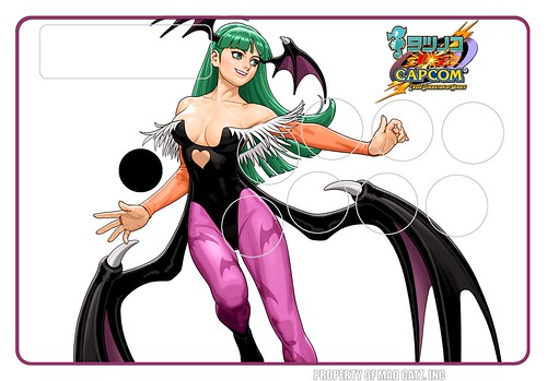
Since alot of people have been asking, I’ve decided to go ahead and create a guide/tutorial on creating custom stick art. Now before I start, let me state exactly just what I will be presenting here. What we have here is a simple tutorial for getting started on creating decent looking custom art for your stick. What is wont do however is teach you how to be as good as some of the better artists on this board, at least not immediately, just like with fighting games, being that good is a matter of practice and experience. It assumes that the reader has at least some basic Knowledge of Photoshop or any similar image editing software.
For this guide, I’ll be using Photoshop CS3 (since that’s what I use) and the templates for the original MadCatz Tournament Edition and Hori Real Arcade Pro 2SA/3 (since at the moment these seem to be the most common). However, aside from some Photoshop related bits (and some idiosyncrasies of the templates) what’s written here should be pretty applicable to any other program and stick.
Stacking Them Up - A Short Introduction to Layers
Before we start on working with the stick art, we should first discuss layers as the templates are in Photoshop .PSD format which utilizes layers. What are layers? Well imagine the art as consisting of a large collection of cutouts tacked on top of each other. This makes working with the image much more organized than if it were just stuck together like in Paintbrush.
In Photoshop, the layers are handled by the layers pane on the bottom right.
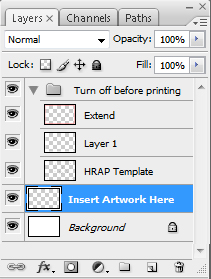
In this pane, you can select individual layers as well as move them up or down by dragging them among other things. To turn off layers, simply click on the eye icon to its left. Take note that pasting an image in Photoshop will place that image in a new layer.
Controlled Space - Working With the Stick Layout
Before we start working on the art itself, it’s very important to first consider the layout of the stick which you will be applying the art to. More often than not, most newbies will simply look at a piece of art and simply put it on a stick without considering how it will interact with the buttons/stick. Even if you use clear buttons, the buttons will have an effect on the art.
Now consider the MadCatz T.E. FightStick, now take the layout and imagine the stick and buttons as having square “hitboxes.”
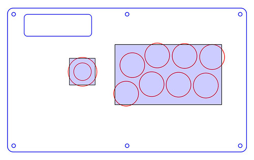
While the shape and the curvature of the stick and buttons does allow for flexibility, the area highlighted in blue is pretty much the space that the stick and buttons control (the same can be said for screws and control panels). These spaces must be taken into consideration (not avoided mind you) when creating custom stick art. While this usually means not putting any large art in these areas, you can also place art that in a way compliments or is complimented by the button/stick layout (e.g. a character that is positioned in a way that they flow with the button layout, etc.).
A Window Into Another World: Working with a Single Image
The simplest form of custom stick art is where you take an image and then paste it onto the template/stick. It’s deceptively simple but also very easy to screw up since there’s not alot of leeway to move the art around. For me, working with custom art like this is like creating a window in the stick itself - great care must be taken so that the buttons and stick do not block the best parts of the view from the window.
The most common mistake when doing stick art this way is choosing a source image that simply isn’t large enough to be printed properly on a stick. Stick art (and the templates used for them) is usually printed at 300dpi which for a TE or HRAP ends up at around 4000 or so pixels wide - most art on the internet is simply not big enough.
The compromise then would be to find art that needs only a minimal amount of resizing to properly fit into the template. This however leads to another common mistake - resizing the image in a way that distorts it. In Photoshop, this usually happens because the creator used the Transform tool (CTRL + T) and then simply stretched the image to fit the template without consideration for the proportions. It’s best really to keep the original proportions of the image, either by making it so that Transform keeps the proportions (hold SHIFT while dragging) or by resizing the original image (since most editing software allows you to constrain the proportions while resizing this way. In Photoshop, the latter can be done by pressing ALT + CTRL + I, this also allows you the benefit of choosing how the image will be Resampled, for enlarging Bicubic Smoother is usually the best.

At this point I’d also like to point out that it’s best to resize the image slightly larger than the template to allow for some adjustment. It’s best to make sure that the important bits of the image are not covered up by the buttons and stick. For this, I usually follow the rule that any eyes/faces of characters should be clearly seen. If it’s a scene, be sure that the most important bits aren’t covered up. If the positioning of an image means that you can’t avoid having the buttons cover something up, then make sure that even if it gets partially covered up, it’s pretty easy to see what’s going on.
Putting Cammy On Your Stick: Working With Isolated Character Art
The other common type of stick art wel see is that where art of a character is put on a separate background (oftentimes completely new). Before we get into the nitty gritty of actually choosing and isolating a piece of character art however, we should first re-look into the space available in the template. That is, instead of just looking at what space is blocked by the buttons and stick, instead, consider the spaces where we can put the art.
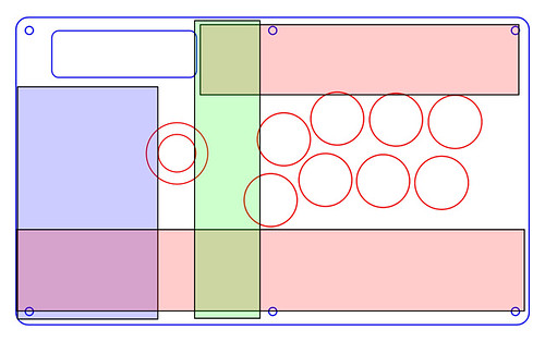
As you can see here, it’s the free spaces in the T.E. template that are now divided/sectioned off and colour coded. For the HRAP template, the same spaces also apply, with the Start and Select/Back buttons taken into consideration.
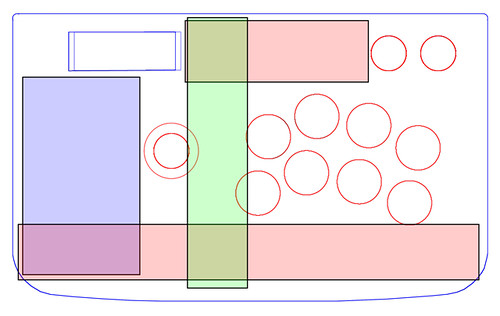
The blue area in the bottom left is usually where large character art is placed as it is the largest bit of well proportioned free space on a stick. The red boxes are usually best reserved for logos and/or gamertags as well as some supplementary art or design work to help liven up the stick. The green area is interesting in that given the right conditions, you can fit a character in there, it’s only a matter of figuring out how.
Now that that’s been covered, let’s move on to selecting and isolating character art. As always, it’s best to use art that’s already large to begin with so that only a minimal amount of resizing is necessary. If the image is too small, then it’ll end up looking very pixelated or blurry. For Street Fighter IV, one of the best sites to use is theKawaii Art Zone which has high res copies of the official character art.
Next to size, it’s usually best to find art that has a plain background and/or minimal background items that interfere with the main character art. This is because the easiest way to isolate art is to use Photoshop’s Magic Wand tool (or any similar too in any other editor) that can select any single color (plus a limited threshold of colours close to it) for easy isolation.
After that, it’s also important to select art that does not have the character cropped off, especially to the right and/or top since doing so will result in having an awkward looking cut off character on the stick (bottom and left are easier to hide for obvious reasons).
Now for the actual isolating of the art. As mentioned above, the easiest way is to use Photoshop’s Magic Wand tool or similar. The Magic Wand can be selected by clicking on it’s icon (which looks like a magic wand) from the Tools pane on the left in Photoshop.
After selecting the Magic Wand, simply click on the plain background to select it, then press Delete to clear it out. Be sure however to check if the character is completely isolated aometimes, there is a bit of colour left outside of the characters outline.
You can fix this by undoing (CTRL + Z, or CTRL + ALT + Z to undo in steps) then adjusting Tolerance of the Magic Wand (in the menu bar on top). You can keep redoing this until you get something you are happy with. Repeat for any other bits of background which you might have missed (not adjacent/connected to the part you removed, usually between legs and arms). You can also do the same to any logos you want to place. Once the character art and/or logos are isolated, copy and paste them into the template and then position them as you like.
The next step is creating a background. To do so, first select layer labeled “Background” from the template (or create a new layer under the art by pressing SHIRT + CTRL + N then dragging it below the layers for the art). Now for the background, there are many options available. The simplest would be to take a large full image, usually with the character in question or at the very least art that relates to the game that the character is from and then, use that as the background - following the same guidelines for single image art that I previously talked about.
In doing any background however, it is best to make sure that the background compliments the character. Usually, this means selecting a background whose colours do not clash too much with the colours of the character art. It’s also best to make sure that the background selected does not overpower the character art in such a way that the character art just about disappears due to the background.
Too make things a bit easier, I’ve uploaded a few backgrounds based on sticks I’ve previously done that you can use.
For a more minimalistic approach, you can also use a simple gradient background. To do this, simply choose the colours you want to use. On the bottom of the Tools pane to the right in Photoshop, click on the foreground and background colours and select the colours you want using the Colour Picker.
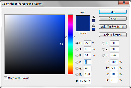
Then select the Gradient Tool (click and hold on the Paintbucket icon to bring up the sub-menu then select the Gradient Tool).
To create the gradient, simply click and hold on where you want the foreground colour then drag to where you want the background colour. This should produce your gradient background.
Final Round - Applying Finishing Touches
Now that you’ve got your art on the stick, it’s time to step back a bit and look at the art as a whole. Take your time fine tuning the art, making adjustments where necessary. This step is what can truly make or break great stick art. Don’t be afraid to make a change if you think it’ll for the better. You might even find that disregarding some of the things I’ve mentioned will actually make it a better piece - this is art after all and there is no simply one-two-three step system that will produce great art it’s all up to you and what you think works best.
Preparing to Print
Now that you’re artwork is done, you’ll have to prepare it for printing. You do this by simply turning off all the non-artwork/template layers. This is done so that you don’t get any white lines when cutting since the templates aren’t always 100% exact and people are bound to make some small mistakes when cutting.
To do this, simply, click on the eye icon beside all the layers that you need to turn off. You’ll know that they’re turned off when the eye is gone and you can no longer see the contents of the layer in the artwork.
Now go and have your art printed and then get it on your stick (for the T.E. you can follow this tutorial).
Also, before I end, I’d like to give my thanks to some folks:
-The people at Hori and MadCatz for their sticks (including MarkMan).
-The regulars and artists at the Official TE art thread who have inspired me (chunbelievable, GXE, MIVLives, manman, kte03, Ranma444, protomanSTi, SilentRage03 and whoever else I missed) as well as Shin-RoTeNdO for starting that thread in the first place and likkuid for his mockup template.
