Check the stickies.
So with the Hori Vx Sa template, what size do I tell the Kinko’s guy to print it? Had an issue yesterday where the template isn’t sized right to print, I need to re size it or something Any guidance will help haha
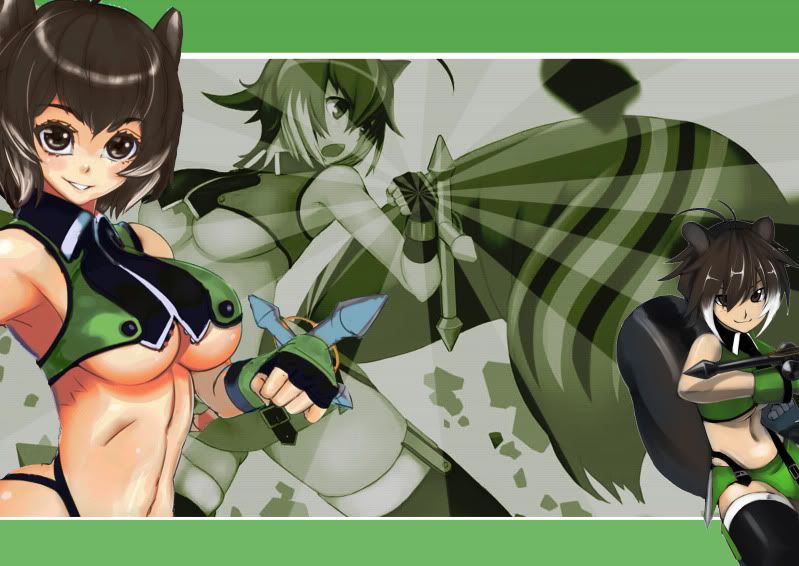
So… I’m gonna mod my HRAP3 with sanwa (or maybe seimitsu… haven’t decided yet…) buttons and I need some artwork… So can anyone either give me a HRAP3 template or does anyone maybe have some cool designs? Touhou, Blazblue and MVC3 designs interest me the most but if anyone has a HRAP3 design with any other anime, manga, light novel, visual novel or Japanese video game then I’d appreciate those, too.
Sorry, but would a template request still go here?
As stated, use Image Mishmash or the Art Thread.
This is more for learning how to make your own top panel art.
Any tips for my prior question above, really need some guidance 
I’ve been tinkering with this Okami design for the last few days and after *a lot *of google searching I found some brush effects that were able to accomplish the general idea of what I was looking for. Despite that though I’m not completely satisfied with it, but I’m not really sure what do at this point to improve it. Any ideas?


It feels like there’s too much whitespace. Needs to be “dirtier” if you get my drift. Either more splatter or have a semi-transparent Ammy image in the background.
I actually cleaned up some of the “dirtier” edges of the brushstrokes since I didn’t think it looked very good, but I think I know what you mean. I suppose I can experiment with it a bit more, though I’m not quite sure how to go about it. With the paint splatter effects it makes sense to have some random paint splatter here and there, but I’m not sure if that concept would work with what is supposed to represent a more precise calligraphy brush.
I have hard time seeing how a background image would work though. There’s whitespace, but most of it is in awkward positions where a background image wouldn’t really show through very well. Also I like the relative simplicity of the design, I feel like a background image would make it too busy. I’ll try it out anyway though.
So as I was experimenting I had the potentially good idea of using a scroll texture as the background image. I kind of like it, but something also feels a little “off”. I think part of it might be that the graphic I was using doesn’t quite mesh with the scroll look. I tried switching it with my old graphic (which I kind of like better anyway) which I think does mesh better with the background, but then ends up conflicting with the space used by the ink. 


Zeik56, are you rendering the stick before doing it? If so, I’m interested in that.
I made some stick artwork and now I’ve got some questions… what material should I print on? And how to cut the holes etc.? (here’s the album with the artworks, I wanna know if I’m doing it right…: http://photobucket.com/animuvidyamango )
here is a spiderman i drew for a blog using your material as reference.

Do you mean a template render? Or something else?
A 3d render (with blender for example), but maybe you’re using photoshop.
Yeah, I am.
I’ve read through all the comments on this thread and a few people have asked if you need to stick the art onto the metal casing using glue if you are going to have plexi over top of it, and I haven’t really seen a definitive answer. The art will be between the metal plate and the plexi. Should I still get some adhesive spray to keep the art down or will the fact that it is sandwiched between the 2 covers be all that is needed?
No need for adhesive when it’s under plexi.
I’m cant figure out how to make this look right. It feels like its missing something soo I’m asking for help. I though about adding that ink splats around the right character(like in sf4) but I don’t know how to do that.