i think what d-fist is talking about is tangent in terms of lines meeting at a point. so like where the left glove meets the face and where the right glove touches the shoulder. lol took me forever to figure that out ^^; i also agree that the halftone is a little weird. oddly enough tho, looking at it a second time it’s not that bad. i dunno. otherwise, you rape as usual. awesome stuff man.
good shit all the way.
which softwares did you use? you penned it first, on paper, then painted it with painter X or PS?
or was the whole thing in PS/Painter X?
HOLY CRAP. That Ike is epicly awesome, may I use that for an av?
Overall your work is amazing, sir. The very first pic in the thread looks a lot like a female version of Breath of Fire 4’s Ryu. 
lol, woof you read my mind. thanks for clarifying that bland wolf. df i gotta talk to you more on aim man, you still post on ca?
dasiatic - 've been using a blue pencil lately, then soft lead liike 4b, then finish up with an hb and scan it. after that, i just paint in photoshop. i can’t use painter for shit haha. want to though.
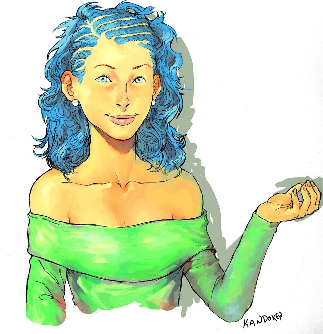
alphadragoon - yeah, i didn’t really mean to make kando that way. her eyes are very rounded out, which isn’t what i usually do. it was just a sketch anyways. by all means go for it. i’ll have the ike done in a day or so, if you could hold out till i post it again that’d be cool.
i’m tryin to see about wizard philly, i’ll post more monday

Cool, I’ll wait for the final Ike to be completed then. Thanks, man.
procrastination and lack of slp.

feel free to color it if you want. (alt brawl colors would be sweet)
hi-res version on da.
Awesome work as usual man. Ive finally got a DA account and I’d really appreciate a page view from someone the likes of you! http://anderu4you.deviantart.com/
Chun looks pro!
hey Kando, been meaning to ask – what inspires your colour selection? esp for the grays. You have some of the most interesting grays in colouring.
neoblood - will do! your ff advent has a nice composition man.
Rook - my color selection? hmm… well… arnold tsang made a huuuuuge impact on my overall color composite. but i’d say pete took over in that arena as time passed. seeing his paintings on his blogs he had such confident broshstrokes and speed, along with akimans work back in the hp days(2004?). the ultraman and busin made me realize how much greys made other colors stand out. i really didn’t like greys until recently. oh yeah and norman rockwell’s another inspiration. he got me into contrasts. im still working on the placements of strong hues and greys, but its kinda weird. idk if that helps. but thanks alot man! 


=}
I’m glad you still post here Kandoken; your work never ceases to amaze.
The sketches above look excellent, and the Chun Li that is coloured looks astounding. Really excellent work!
That Crouching Chun is AWwwwww YEeeeeah!
Do you use blue pencils and then ink? (If so what do you ink em with?)
Or do you do it futurisitic with a tablet?
The shading in the top half of the coloured Chunners is incredible!
Truly… you can do no wrong.
I’m glad that you don’t use a conventional gray scale for rough sketches but a blue scale instead! GO BLUE! ^^
That Ike looks amazing. Other than the fact that Ragnell looks a bit shorter than it really is, I can find no fault with it. Great job. :tup:
Sweet Link sketch, too.
Beast as always man, beast.
Yeah, your new stuff is really great.
Hey SFMC, you should post more on here!
amazing work as usual!
my only complaint, and it is minor, is that the hand and feet are so close to the edges.