Already saw this but it’s hot man. Printed out pretty well in the book. Link’s head is off a little but it’s a solid pose. Chun sitting is awesome. I like the pose and anatomy. Her nose should be lower and we shouldn’t see so much of her eyes since her head is tilted downward. Other than that, you went pretty hard on these.
the sitting Chun one is awesome. really, really like that one. colour it if you can! 
Ryu doing his thrust kick has great colours and modelling, but his foot really bugs me. First off, it feels a bit short compared to the rest of him, and second the downward orientation kills the dynamism of the kick. I think if it was a bit longer (more of his shin should be exposed), and the foot should have some twist to it, so he’s kicking with the outer curve of his foot instead of the flat of it.
i like how you have mix the SF3 art style with the color style of a 16th century tapestry.
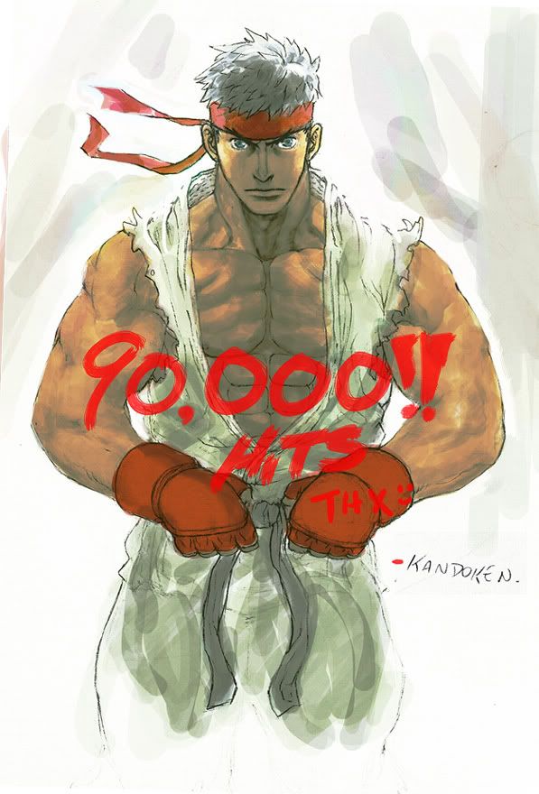
huh. i was thinking of the cvs1 art. that kinda dirty style is really really cool imo. i’m a little torn in the inconsistencies in the ryu tho. what i mean is i’ll look at the arm and see a lot of full realism. and then move up to the hair and head band and see a difference in how the strokes and shades interact with each other. still not sure what to think about that. but overall it’s another great kandoken piece to fall in love with 
def good. the angles and proportions on this one are good. what made you decide to color it that way?
Your blue hair girl is cool.
That last Ryu is manly good!
The elbow looks a little too forward but maybe no. It might be more realistic if his head was less lit but then less of a money shot.
I would like to see Snake colored.
dude. you should change the name of this thread to ampm. there’s just too much good stuff. the colored chun is way pro.
LoL [at the AMPM comment].
But it’s true. That Chun piece is very dope, and the way you chose to color it in makes it an eye catcher.
Good shi…stuff. Too much good stuff.
i also thank you for making her boobs normal sized
awesome chun piece. love the crouching pose
the ken piece looks nice too. the hadouken energy thing isn’t so convincing though.
Yeah, thanks for that.
It’s rather refreshing for Chun-Li to not only look Asian, but for her also not be in competition with Mai when it comes to having future back problems.
More seriously, though, your recent Chun-Li art may be favorite Chun-Li piece that wasn’t made by Jo Chen, especially the colored version of (I’ve always been partial to that form of coloration/painting, though I keep forgetting the formal name for it).
Great work as always.
(P.S. Please finish the Snake sketch.)
I unfortunately have to agree with this, though it’s not a huge problem for me since it’s difficult to show speed in art without it looking cheesy or “overcompensating” by using after-images and such.
What’s slightly more noisome to me is how out of proportion his foot looks. It’s not like it’s really out of proportion, but it does look a bit bloated in my eyes. It wouldn’t bother me so much if the viewer’s eyes weren’t supposed to be drawn there since it’s “foremost” thing in the picture and is focus of the bottom of the page.
I’m not sure how you could fix it–if you even wanted to since it’s not really a big deal like I said–without doing something ridiculous like re-drawing it or giving Ken a huge, distracting hard-on to draw away attention.
“Hardonuken!”
Like I said earlier though, good job on these.
Dude, how can you forget back lighting from the hadouken! I saw a pro do this: use a soft brush to go over the area around the hadouken on a new layer, then erase what you don’t want. Adjust the new layer til you’re happy. If you don’t want to draw attention to his foot, the easy way would be to just blur it out and resize the canvas to draw more attention to the fireball. The cast shadow is a bit confusing too, since the light is coming from the right. The hair rendering is a little flat too, but it was sorta drawn that way. Other than that your coloring game has stepped up tremendously man.
the legs are the only thing i mind but as for the rest. two words:
you bastard
you da man Kandoken.
really like how you do skin tone and muscle definition.
do you work from reference?
keep up the awesome work.
i can understand this…it implies ryu is in a cramped space. shoulda pushed the picture back. More back and to the left…bring the foot farther away from the edge…if ur gonna be so close…might as well just push it off the screen like the bottom foot.
Wow kando I can’t believe how much you have improved, Your work borders on flawless and could easily be marketed. Very inspiring. Great job man!

