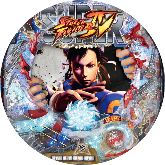
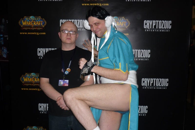
It’s not about graphics (lightning, polygons, etc.) alone. It’s about visual style, presentation and atmosphere, which were always important. A game like Samurai Shodown 2 still looks and feels awesome today.
Yeah, art direction, style, presentation, they are all.much more important than technology. Just compare Marvel Super Heroes to MVCI or MvC3… That game had amazing spritework with excellent animation, backgrounds and great music. It still stands today as a great looking game despite lower technology.
Game looks like ass, they got no X-Men and characters people have actually heard of are day one scam dlc whilst the roster is full of “who the hell is this” on the marvel side.
There is no reason to have any faith the gameplay will be good from Capcom’s recent track record and a game directly aiming to take that 3 v s3 with assists Marhval space has just come along and absolutely killed it at E3.
No amount of fake hype from the top players on Capcom’s payroll can save that, Capcom got lazy and complacent and now they getting clowned on for it.
The problem is with the faces it’s not even a subpar quality of work because it was like they are changing and altering how the character do look and known for. It’s like they didn’t like the default looks of the characters.
I don’t really get that criticism… to me, Chun Li definitely looks like Chun Li. It doesn’t seem (to me) like they were trying to change the characters. It just looks like they went with a sort of weirdo Disney-fied style that people simply do not enjoy the look of. I keep seeing people saying “that doesn’t even look like Chun Li!” But… it clearly looks like Chun Li. Yeah, it also looks like a shitty action figure version of Chun Li. But I think people are getting carried away.
MvC:I definitely looks plasticky and kinda gross. I feel like it was some attempt at an Overwatch-ey “everyone can play this game!” style that just flopped. I dunno. Maybe it’s more evident with the characters other than Chun Li and Ryu (I’m not any kind of expert on Marvel characters), but when I look at them I don’t feel that they are significantly out of line with the character they’re supposed to represent. Crappy style? Sure. But not incoherent, unidentifiable, or uncannily wrong imo. Just kinda crappy. Faint defense, I know.
It’s a false prophet wearing Chun-Li’s outfit
Hmmm, what? Did you know how insanely popular the MCU is worldwide? I guarantee you that in current year more people know who Dr. Strange, Gamora and Ultron are than the core members of the X-Men.
***TWENTY
MOTHERFUCKING
PERCENT
COMPLETE:***
Never again defend Capcpom’s lazy shit efforts.
I know this is accurate ,but it just makes me more sad all the same.
:sad:
The thing is people around here including me isn’t expecting in game graphics, animation and visual like this.
Spoiler
https://pbs.twimg.com/media/DCMV1LMV0AEujyE.jpg
https://i.ytimg.com/vi/9W2StzfTmZ4/maxresdefault.jpg
http://www.capcom-fc.com/sf4/thumbnail/SF4pv1_003.jpg
https://www.inside-games.jp/imgs/zoom/125098.jpg
https://assets.mubi.com/images/film/44227/image-w1280.jpg?1445898264
https://i.ytimg.com/vi/V6vpVPbtOrI/maxresdefault.jpg
https://i.ytimg.com/vi/lj3NUu_h_lY/hqdefault.jpg
http://2.bp.blogspot.com/-HRxp5oSEs8c/UuXwAafb_bI/AAAAAAAAFro/3xYQOIaXfDs/s1600/DL_04.jpg
https://thumbs.gfycat.com/WetAdorableDonkey-mobile.jpg
https://smotret-anime.ru/posters/7517.3127522453.jpg
http://3.bp.blogspot.com/-pRvZZdVF620/Uquvv_YOC0I/AAAAAAAAEUU/h2qU3OylB_A/s1600/Chun-li.jpg
http://25.media.tumblr.com/58b91d4466d7f1dc01d676933a19f26b/tumblr_n2rit4yzBJ1rr56cmo2_500.gif
http://68.media.tumblr.com/bb746a82c4c5d39e2a9bc9e33cd4a69c/tumblr_nk4ri9nY5c1tttzvco2_400.gif
https://68.media.tumblr.com/4bfaa5989f92f72ceb2510b97f52a280/tumblr_nsg45b5GA61uazugyo1_500.gif
https://68.media.tumblr.com/c3e0fb4ac55a3f84b3aa2b31b3842bdb/tumblr_ojmxv7IpO21se9xd2o1_500.gif
People here are considerate enough for this kind of usual results and so as I am also. (Not talking about polygons and hair but facial features)
Spoiler
http://www.noe-v.com/images/articles/sf_young.jpg
https://i.ytimg.com/vi/BU2ABeotnI4/hqdefault.jpg
https://hashtagnerdswag.files.wordpress.com/2014/07/ryu-street-fighter-02.jpg
http://www.fightersgeneration.com/characters2/ken-x-edayan.jpg
http://www.writeups.org/wp-content/uploads/Ken-Masters-Street-Fighters.jpg
The problem is why some facial aesthetics ends up like this (Not talking about polygons and hair but facial features) It’s like they are trying to alter or radical change the facial features?
If this is intentional it’s like they just want people to gravitate to DLC costume or be the talked in social media by spreading it like memes for advertising.
it’s not even a poor subpar quality of imitating the previous work. If this ain’t intention, This stuff happens when a project is handed over an artist without the proper guidelines and orientation on how to handle a particular character. Not knowing his or her limitation on creative freedom for a specific character. They should just stay faithful to the design.
Even other companies did better design for facial aesthetics (Not talking about polygons and hair but facial features)
Spoiler
http://www.mansai777.com/pc/news/list/08_08_06/epic16.jpg
http://www.pachinkovista.com/pfactory/model_images/64/017264_01_151_0.jpg?
http://streetfightermiscellany.com/sfm/sfmimages/perfectko.png
http://rs105.pbsrc.com/albums/m221/a892/Sprites/SNK%20Vs%20Capcom/Ken.png~c200
https://cdn.wikimg.net/strategywiki/images/f/f4/SVCC_Ryu.png
https://i.ytimg.com/vi/wwvuYzaNsPg/hqdefault.jpg
Even the fanarts in deviant, pixiv and etc get things right and more faithful to the previous designs of facial aesthetics and features.
Spoiler
https://s-media-cache-ak0.pinimg.com/736x/41/e4/5f/41e45f9a4d4ef0c2922ae0babf79f972.jpg
http://zbrushtuts.com/wp-content/uploads/2016/01/Ryu-3D-WIP-by-georgius-1-660x330.jpg
http://static.wixstatic.com/media/4bb921_e0133e2f9bc2443fa4d0f41015b4741f.jpg
https://i.kinja-img.com/gawker-media/image/upload/t_original/lnpay3aclfhf1ftnzmjr.gif
If this trend of loosely designing keeps on being like that. This mistake seems to have no direct problems for now but it will does gradually alter the future design to be more butchered visually because of continuous contradicting and inconsistent design to each other because of different influences and preference. People would change how they see the character.
Even other Disneys knows how they design that are complementary to Capcom greatness.
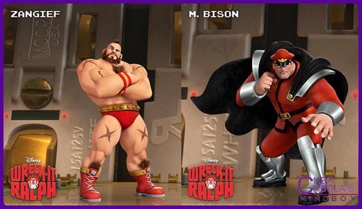
What if DBFZ would become a new trendsetter of fighting games… A new era that fighters looks directly like the animated cartoons and anime in Artstyle…
Imagine NRS proposing to Warner Brothers 5 years from now. A new Justice League game but different it not a part of the injustice universe.
Something like a Tentative title of Justice League Fighter.
With 3v3, Assist, DHC, Snapbacks, Aerial Combo and etc…
Supers, specials and normals moves are based from the Justice League Unlimited Shows.
A Justice League game that sole focus, influenced and references is based on Bruce Timms works not in the comics or any movie.
Art style would be lead by Bruce Timm. Bruce Timm was the creative mind in 90’s animated DC cartoons from Batman, Superman, Titan Titans and Justice League.
It would be animated in clean style cel shading like watching the animated series in full HD graphics with less shaders and brighter colors.
Actual Game Footage
http://static.srcdn.com/wp-content/uploads/Justice-League-Animated-Series-Cartoon-Network-2016.jpg
The art style will only have fine lines and never have any kind of pseudo 3d effect shaders or gradients so it won’t end up like this…
Spoiler
https://static.comicvine.com/uploads/scale_small/2/26503/763113-justiceleagueunlimited1.jpg
http://www.legionsofgotham.org/Cartoons/JLU/JLUwallpaper1.jpg
https://keithroysdon.files.wordpress.com/2012/06/justice-league-unlimited.jpg
https://www.supermanhomepage.com/images/justice-league-tas/jl-season2-3.jpg
http://www.legionsofgotham.org/Downloads/Wallpaper/WALLPAPERJL1.jpg
https://images-na.ssl-images-amazon.com/images/I/71YQPpSqpSL.SL1257.jpg
https://s-media-cache-ak0.pinimg.com/736x/03/e7/fd/03e7fd8ce2dc58254a82c0ab4ef08f1b.jpg
https://s-media-cache-ak0.pinimg.com/736x/3e/66/14/3e66141d04ec7d6ac97304c694d33607.jpg
https://images-na.ssl-images-amazon.com/images/I/714QKtRZe0L.jpg
http://www.deathsdoorprods.com/wp-content/uploads/justice-league-517fc1fd399d5-1024x576.jpg
http://k37.kn3.net/taringa/6/4/7/3/0/3/5/hanzo_hasashi/C90.jpg?7304
https://nerdymindsmagazine.files.wordpress.com/2014/12/justiceleague.png
https://s-media-cache-ak0.pinimg.com/originals/3f/d1/10/3fd11007c4ea8b08804bafbb9d13d985.jpg
https://images-na.ssl-images-amazon.com/images/I/51GY7S2A52L.SY445.jpg
35 characters initial roster unlocked in retail game.
Here are some of the character silhouette along with the DLC preview over 60 characters.
https://38.media.tumblr.com/a6d9d37e0243281aa157c9dce89e39d3/tumblr_nihf73vgTc1qea7tao9_500.gif
http://www.cbr.com/wp-content/uploads/2017/02/justice-league-unlimited.jpg
Demo Characters
https://thementalattic.files.wordpress.com/2016/11/justiceleague-featured.jpg
Animated Shots
https://68.media.tumblr.com/76cbaceb18ab1c53cef551f84c7e50f7/tumblr_ooizwrJRK31vgvq8oo1_500.gif
if Capcom continue to messed up with the designs of their fighters. while other FG dev tries to be faith full to their best design while adopting best practices of gameplay…
The thing is how about Capcom?
https://68.media.tumblr.com/c7431817ef9423aa4f998352528c4c6f/tumblr_o0thnitT3f1son3fpo1_400.gif
Capcom should fix their thing.
Even monster hunter alt did more justice in Chun’s Facial Features.
http://blog-imgs-53.fc2.com/e/l/b/elbrancoauditore/blog_import_5046695518fec.jpeg


The game is undefendable. The models are bad, the animation is bad, the backgrounds are fucking empty and ugly, the roster is bad, the gameplay is retard and the story mode looks as bad as the SFV one.
You can’t compare with MvsC2. It was a game that came in an era were 2D fighters were at the edge of extinction because 3D games. And even that, it had more work and love that this crap Capcom is trying to release in three months.
The only way you can defent that game is beeing under a paycheck from Capcom.
There is no reason to have any faith the gameplay will be good from Capcom’s recent track record and a game directly aiming to take that 3 v s3 with assists Marhval space has just come along and absolutely killed it at E3.
I don’t think this can be disputed anymore. Lots of people who’ve tried either the story demo and the 1v1 E3/CEO demo (including a few people here) have said that the gameplay is great, and that it’s probably the most open and creative game in the series since MvC2. Assists are hardly missed, not when the new system means you can effectively use every single move of your second character as an assist (at the cost of switching to them). Even before they revealed how it would work, people already theorized that a system that allowed you to freely tag in the second character from any part of a move (startup/active/recovery), while still keeping the move on screen would allow for more creativity over plain old assists, and that’s exactly the system we got.
I appreciate the detailed post Shakunetsu, but I still don’t see how this amounts to more than a style issue. Yeah, some of the Street Fighter V models in particular look really garish, but that’s due to their hyperexaggerated style. I mean, you can’t chalk their ginormous hands and feet up to “well these people just don’t know what humans look like!” Ryu’s got this super ridiculous frown on his face and some massive eyebrows, but those were… all part of his character design in some previous iterations as well? There are two “styles” of Ryu–“boyish” and “masculine.” Alpha 3 (I think?) Ryu is boyish, most other depictions are masculine. To me, there’s a much larger difference in terms of character “look” between boyish and masculine Ryu than with SFV Ryu to every other Ryu. SFV Ryu (to me at least) is faithful to the character–it’s just kind of a really weirdass graphical style that people tend to hate. Which I can understand, as it’s neither hewing to standard anime or standard comic book conventions, and therefore is essentially displeasing to a lot of the audience for these types of games. MvC:I is even worse, because instead of being a risky/bold style, it’s just this kind of… blah, nothing style.
Those Monster Hunter pictures–Chun Li looks okay in the first picture, super derpy in the second picture. Ryu does not look at all like Ryu to me. I don’t really accept those as being another company getting it right, even with unspecialized assets. THOSE are really different characters, or at least Ryu is.
But I guess at this point I’m just arguing against something that’s apparently obvious to the rest of this forum. For what it’s worth, I’m not sure how much I like the SFV style, and I definitely do not like the MvC:I style. And that includes the character designs.
Ppl were talking crap about kof14 graphics. Even games before that one. Really can’t be surprised.
TWENTY FUCKING PERCENT
Close this useless ass thread… I’m tired of seeing all the Capcpom dick sucking that goes on around here.
I appreciate the detailed post Shakunetsu, but I still don’t see how this amounts to more than a style issue. Yeah, some of the Street Fighter V models in particular look really garish, but that’s due to their hyperexaggerated style. I mean, you can’t chalk their ginormous hands and feet up to “well these people just don’t know what humans look like!” Ryu’s got this super ridiculous frown on his face and some massive eyebrows, but those were… all part of his character design in some previous iterations as well? There are two “styles” of Ryu–“boyish” and “masculine.” Alpha 3 (I think?) Ryu is boyish, most other depictions are masculine. To me, there’s a much larger difference in terms of character “look” between boyish and masculine Ryu than with SFV Ryu to every other Ryu.
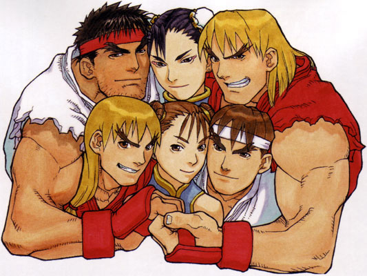
**Like I said in my earlier post on the spoiler part no one were expecting something like those boyish and anime looks other than at least near SF3 if you seen the samples. **
The thing is SF4 and SF5 is a prequel to SF3 right? So they need to compromised with Ryu’s facial structure from those games since SF4 is near SF2 timeline and SFV is probably near NG. **They can always put the frown and the thick eyebrows to any black haired man with a red headband but the thing it should look be along Ryu previous design from race being Japanese and timeline of existence. **
**In fact this images is more aged version of RYU because this his SF3 interpretation so the SF4 and SFV should be more younger… **
… however the SF4 “Vanilla” Ryu is more aged looking than his SFV counterpart that is also more aged than any SF3 iteration.


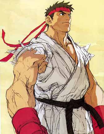
SFV Ryu (to me at least) is faithful to the character–it’s just kind of a really weirdass graphical style that people tend to hate. Which I can understand, as it’s neither hewing to standard anime or standard comic book conventions, and therefore is essentially displeasing to a lot of the audience for these types of games. MvC:I is even worse, because instead of being a risky/bold style, it’s just this kind of… blah, nothing style.
Actually I find SFV Ryu at least compromising to SF3 design yet not as near. I don’t believe everyone here has an expectation for Chun li to look like her anime version or like some comic book character but rather to look the usual like MVC3 since this is MVC4.
They should at least given limitation on those styles and the worst interpretation of Chun li facial mold if were looking to action figure that were GI Joe and Toy Biz which were decade ago.
Those Monster Hunter pictures–Chun Li looks okay in the first picture, super derpy in the second picture. Ryu does not look at all like Ryu to me. I don’t really accept those as being another company getting it right, even with unspecialized assets. THOSE are really different characters, or at least Ryu is.
The monster hunter picture like I said on the comment is about **Chun li facial features not Ryu. **I just included the Ryu alts for references that they are just alternates costume with other looks than the beard guy. I’m just pointing the Chun li facial aesthetics even it was just an alternate it looks more Chun li than MVCi’s Chun li.
But I guess at this point I’m just arguing against something that’s apparently obvious to the rest of this forum. For what it’s worth, I’m not sure how much I like the SFV style, and I definitely do not like the MvC:I style. And that includes the character designs.
The only problem in SFV facial features were Ken’s and I see the problem with SFV’s Ryu is tolerable and Chun li in terms of facial features in fact they are better than SF4 vanila. By the way I was okay with Ryu in MVCi and the thing is about Chun li face in MVCi because it’s very different in terms of facial structure. It’s not a subpar of attempt replication the issue here is like they are trying to replace it.


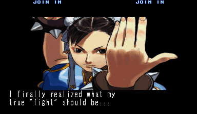
**In fact this is the oldest illustration of an aged Chun li that appeared in SF3timeline. Sf3 is the most aged version **
They should have a Style Guide for individual iconic characters that give a bit limitation to the creative freedom of do and don’t on facial aesthetics and structure because without it design would end up like the current MVCi Chunli. **The point is this practices causes inconsistency, conflict and complication to the characters personality and identity because of loosely visualization so they need to ORGANIZE that part by doing individual style guide to iconic characters to avoid messing up with the character’s branding. **
http://rs257.pbsrc.com/albums/hh226/betrayerjuan/WWFNoMercy0EA8DD4A20F186D46B_ciByRG.png~c200

**
FANMADE** by @Providenceangle


** The thing is fans are more faithful to the character aesthetics and even other companies that still manage to get it at least near**
Othe company works

