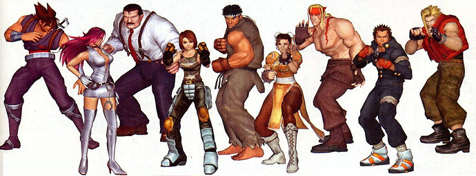
Works for me!
Each chapter brought something different, but somehow there’s a path of evolution in the design of the series
SF1 to 2, to A, to EX to 3, to, 4 to V
It’s not the characters theme itself, it’s also a way to build the design playing with level of stylization and caricature, proportions, colors (and color schemes), repetition of elements, balancing weight of the figure, visual identity (and how it works next to rest of existing cast) and so on
Hard to point with words, but when you can figure out what kind of cocktail you expect to find in a SF design, you can watch one of these capcom’s table of concept sketches and point wich one will work well as one (wich is’nt necessary the coolest one)
Good example i can think is Laura, i was suprised Battle one did’nt been chosen to be the standard, it had so many better points design wise
But overall i like SFV redesign work mostly than not
What i find bizzarre (it normal actually but strike as bizzarre to me) is see some actually GOOD designs get shit, while some much worse get praise
This is the result of people expecting to see a design that please their taste instead a good SF design that eventually please their taste
PS: on the Hugo vs Abigail thing (good point)
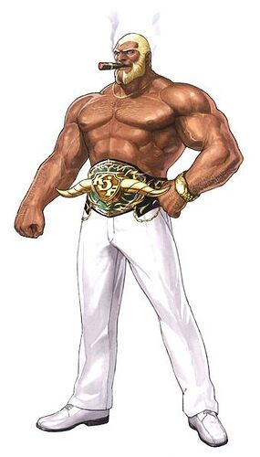
Both have been created by same logic of play on proportions, though i find Hugo a waaaay more refined character study.
He way a deviation from the line but was done on purpose as an anomaly… the whole intent was have him stand out next to others, not just as bigger but as “giant”, literally as a person with clear gigantism (giant head/facial bones is an effect of that).
His idle animation was fantastic at that, you had him sway like an heavy pillar with a huge boulder on top.
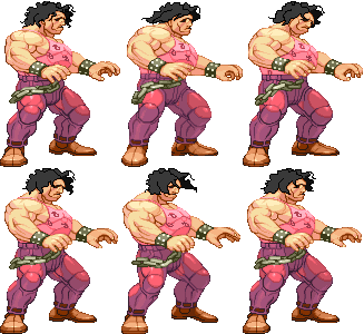
all movements were made to hint a never seen before (in SF) weight/mass moving, the biggest mass being much more on torso than limbs next to let’s say Alpha Gief.
Eyes being invisible most of times deep inside eye-sockets, all was made to show him as a “creature”/monster more than your usual SF big grappler, add the simple mind (with toys room, and Poison playing smart for him) cliche to have him play that role.
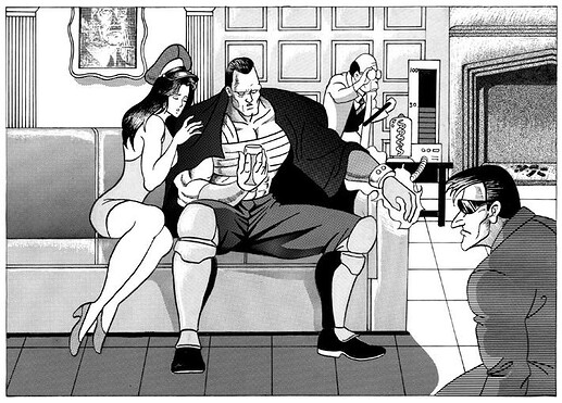
They also mixed old FF Hugo with FF2 boss Bratken (example Hugo SF3 stage) to reach that vibe
Abigail yes, they did same eye catchy “let’s exagerate gimmick”, but they did with infinitelly lesser class imho.
Abigail it’s literally just “he’s big as fuck!!!1!1!!!” kind of design
They gave him an unique size/proportion too, but here the job feel waaay more banal and less refined, they just slapped on him a generic super muscle giant V shape built and pushed the setting to maximum. Animations are nice, but also these aren’t on par with the job done for Hugo’s mass
But here a note should be made about the fact Abigail suffer (ike many others) of 3d modellers adding their touch instead try to stick with the concept sketch, where Abigail was less pumped and more vertical
If modellers had less attention-seeking approach probably Abigail will have ended up more interessing figure, instead be just a GG Potemkin in SF imho
I will probably still find Hugo a more interessing char for many reason, but as giant gimmick they will be closer
At the end there was the key… with Hugo seem they wanted to build a monster considering SF limits and designing him around them to show the extremization of that (fantasy) anatomy.
With Abigail feels they (or likely the 3d modeller) just ignored these limits and done the fuck they wanted
Same for mobility/animation… Hugo was less absurd in proportions and still showed he did lot more strain to move his huge mass around
Abigail shows some, but still nowhere close despite being built way more unbalanced
Again, just feels there’s lesser thought behind
To be honest, it looked great but more than tech used itself i think it pay a much greater understanding of the character and capcom style
This Alex from CFAS looked will have ended up much more “Alex” than the one we got in SFV
Really ? You really pick up the ring out of the argument when the crux of the matter is that a hoodie is a big disadvantage in a fight. One that takes only a few seconds to remove.
And every fight I’ve seen with Balrog in SFV he’s talking before the fight and has ample time to remove it, and even store it somewhere nearby where he won’t have to step on it during the fight.
Urien seems quite happy with the society except for the fact that he lost to his brother. He indeed hates his brother and consider some of the tradition of the society to be responsible for his loss, but he never went as far as rejecting the society entirely. After everything he is still unable to consider himself outside of the society.
Does his costume reflect that? Not much in SF3, but not at all in SFV. Yes something better than the loincloth could be found, or more exactly, he should keep the loincloth and Gill should wear something else that corresponds him better, but the suit is a lot worst, both as representing his mental state, and as costume for fighting.
Yes this is why I find Urien suit to be worst than his loincloth as a design despite preferring it myself. I believe Street Fighter to be about martial arts and as a consequence, I can’t accept designs that are totally unpractical in a fight.
I like T Hawk as a character, but I can recognize that he’s design was half assed and should be reworked fully.
I could go on and on, but it is clear to me that while SFV isn’t as bad as SFa or SF3, there are some massive failures in terms of design, and all in all, I’d rather have the original than the redesigns, but given that the ‘nostalgia’ costumes are sold, I can guess it was done partially on purpose.
You can stop there. Everything after was lowering the bar. But I certainly disagree with your examples, not that they are bad, but there is worst: Rose, Twelve, Q, Seth, Kage …
I included Seth with the SF4 comment “including an attempt to create a worse boss design than Gill,” and previously described SF4 Seth as “one of Capcom’s worst designs”.
Kage is rooted in what some consider the core of Street Fighter, at least ever since Akuma was introduced to the storyline. Good or bad, his moveset, his appearance, and his story all follow directly from established accepted “Street Fighter”. Even if he effectively is Evil Dan.
Rose follows from what was done with Bison after Street Fighter 2, and again is a product of Alpha. Even without the connection to the expanded story of Psycho Power and body swaps and the like, she was still always a better fit than someone like Rolento.
As for Twelve and Q, I used the weirdness of SFIII to argue that G would have fit in that game. I’d originally mentioned Twelve by name, but felt it was pretty redundant when I already mentioned Q and Necro. And the elephant in the room that is Gill.
In the end, I feel Street Fighter is a bit like Sonic the Hedgehog fandom. Sonic has been expanded in so many directions, with different people being drawn to different ideas and aspects (from specific characters to basic game elements), that nearly any offering is destined to disappoint a not insignificant chunk of the fanbase.
The same holds for SF character design. Some like Rose’s design and some hate it. For some reason, there are people that actually defend El Fuerte’s design. Alpha’s Jailbird Cody is a travesty, but some will adamantly insist it is great, and that Mayor Cody is instead the travesty. Some would rather Capcom add five new shoto-derivatives (gameplay and storywise) to a new game than five non-shoto original characters. There are probably some people that actually hold Gill as good design. Some like that SFV had Sakura grow up while others seem to hate that she’s still not running around in a school girl outfit chasing Ryu. Some people like Falke’s Battle Outfit.
(Man, I’m glad some of you aren’t in charge of designing SF…)
Sorry, I didn’t see it when I reread your post, preparing my answer.
Akuma is human, with traits that look bestial but are still within the acceptable for a human being, Kage has fucking horns.
I won’t argue about the weak design of both Rolento or Bison.
But at least both Bison and Rolento LOOK like fighters, both taking appearance from the military side. Both are also very muscular men. Rose is dressed for shopping, not fighting, and doesn’t use a fighting style at all.
As weak as Menat design is, she’s still way above Rose, and I’m happy that she replaces her.
Q and Necro are horrible fits for SF, but Twelve is way beyond that. He’s the worse of the worse, I’d even take Evil Ryu over him.
Certainly, but in the end by trying to please everyone you can end up pleasing no one, by trying to repeat the success of SF2 without giving themselves the mean to do so, Capcom has lost a lot of the fanbase. Maybe sticking to a solid and coherent design would establish a new one?
I defend it. The base is solid, they overdid the cook theme by a lot, but it wouldn’t be that difficult to make a great design from it.
I think we can all agree on that, what we don’t agree on is who are the “some of you”.
Bison a weak design? Menat above Rose? Q one of the worst? WHAT IS THE MEANING OF THIS?!
We’re talking about the dude whose 3rd Strike ending is him obliterating the collected knowledge of the Society because he deems it old and worthless?
That guy?
Yes, I said ‘except’, he hates the part of the society that he associate with his loss. So in an ending that is difficult to consider canon, we see him obliterating a tower containing stored brains, and his brother. He does it as president of the society, which is why I would find difficult to call it a rejection of said Society.
He wants to change part of the Society, and so without a doubt wants to remove any part of the tradition that implies the superiority of his brother, but he still search for the Society to acknowledge him first and foremost. His rebellion only makes sense in the larger context of his life within the society.
If he really felt the Society to be useless, why would he stay and direct all those experiments?
I gotta go back and refresh my Urien knowledge, but I’m pretty sure he hates/despises it all and wants the resources power and influence they have. In SF5 Kolin makes note of how he bribed/threatened the senior council to stop opposing his means and greenlight several projects. He has no real loyalty to the system, but sees what it has given him and where he can take it if he strips it all to its core and he remakes it in his image. He doesn’t care about prophecy, but will look at the ceremony and whatnot and see how it all works and how he can capitalize off of it. He cares not for Gill, but knows to hide the extent of how much he wishes to betray him, etc.
He’s not mostly okay with it from what I’m seeing. He looks down on it and wants to build his own thing on its ashes.
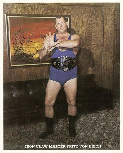
That’s Bask’s 崋山獄握爪 Kazan gokuakusō “Prison Claw Hold of Mount Huà”. They based Bask upon Hulk Hogan, and his “Prison Claw Hold” is based upon Fritz von Erich’s Iron Claw. Even if the Claw was invented by James Donald “Baron von” Raschke, the Japanese mostly know Fritz von Erich. He regularly appeared in wrestling manga, Tiger Mask included.
Incidentally, Zangief also did both Von Erich’s Stomach Claw (down + MP or HP, medium distance grab) and Brain Claw (MP, medium distance grab) back in SF2. Too bad Capcom removed them. By the time of Alpha, only the Stomach Claw had survived.
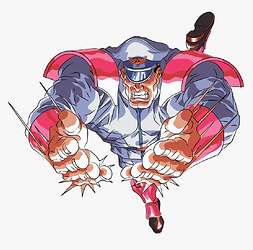
Of course Bison’s Psycho Crusher comes from this technique, only with Psycho Power. An even more faithful reprise of Kazan gokuakusō is the Bloody Spin of Laurence Blood in Fatal Fury 2, however.
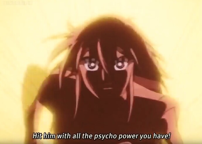
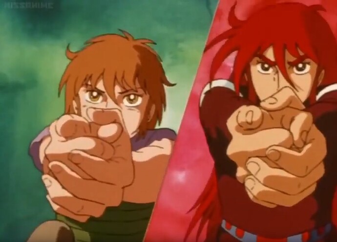
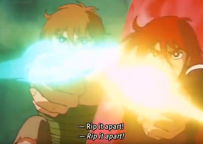
Incidentally, the name “Psycho Power” (this is for @Daemos) comes from Andromeda Stories (1982), where it’s the special power of the protagonists who shot it as if they were wielding a gun:
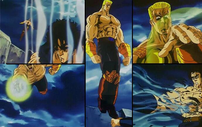
Well, it’s the most likely candidate. Juza then follows the stomp with a grab using his knees and a faceplant (a pedigree without locking the arms, lol), then another stomp with a headscissor, so the resemblance ends here; unfortunately, however, the move has no name because Buronson and Hara never actually bothered to name any of Juza’s moves except for his ultimate technique against Raoh.
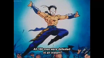
Maybe it’s better FALCO’s 天衝舞 Tenshōbu “Heaven Piercing Dance”. He dives with an energy hand and actually STOPS to balance on Kenshirō’s punch with one foot.
Yes, I have; I know there’s something because a friend that read it ten years ago told me so, but after ten years didn’t exactly remember what and where. Anyway I’m currently browsing through multiple others, not to mention my own translation work… So Heihachi Edajima and his students will have to wait.
Now with all this redesign talk, Street Fighter is doing pretty good in general.
I mean, at least SF redesigns generate and opinion and catch people’s attention.
I feel like KOF has had a way too harder time trying to update itself for new generations. Maybe the original games were less iconic than SF and perhaps a product of their time.
But from the Maximum Impact series, to KOF XII, to KOF XIV, I feel like every redesign has just felt way off.
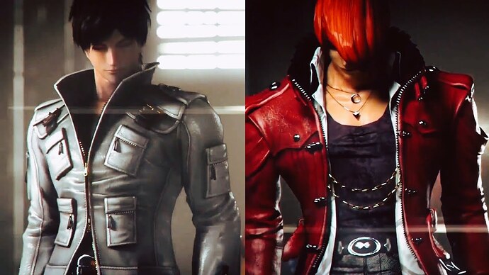
Both Kyo and Iori have been redesigned with pretty ‘random’, ‘meh’, or ‘whatever’ results. Nowadays is WAY TOO HARD for KOF characters to catch people’s attention.
And many other characters designs have been just been botched beyond recognition.
[IMG]
I think in Street Fighter V one can at least recognize what desginers tried to do with each redesign (and the reason behind most of the decisions - aside from Akuma’s new hairstyle).
For KOF XIII/XIV designs, it’s like character designers have absolutely no idea of what they’re doing, and they only select random outfits that can showcase the new level of detail 3D engine can offer, with lots of accessories and textures - that don’t end up getting together whatsoever or creating anything cohesive (let alone represent well the character’s personality or being memorable or iconic).
The poor quality of the 3D graphics in faces, bodies and animations don’t help either (Robert’s face doesn’t even look like Robert).
The designs for most of the new characters are good and iconic, in the other hand (guys like Meitenkun, Najd and Hein being the exceptions).
KOF’s character design took a hit after they lost all their talent in 2000. They either went to Capcom, DIMPs or became freelance (and they end up doing art for Capcom anyway lol).
KOF’s gimmick was that most of their male fighters are scrawny pretty boy’s that weren’t common in Fighting Games during 1987-1993. They designed Kyo to be the opposite of Ryu who’s easily the biggest fighting game male even now:
- Pretty boy
- Prodigy
- Cocky, likes to brag, dislikes training/hard work
- Fujoshi pandering
- No muscle that indicates that he does martial arts
- Short white headband instead of the long one that Ryu has in SF1/SFA.
- Same fighting stance but he sways side to side
The guy who designed Kyo works at Capcom and he did Ryu’s animations in SFV. Kyo was a product of his time, and his popularity was never going to last after they made more skinny Kpop dudes like Iori, K’, Rock, Ash and many others.
KOF focuses way too much on being “stylish” so they’re forced to make drastic changes to keep up with the times. And that eventually leads to disasters like Shun’ei.
Also XIV’s designs for Kyo and Iori are atrocious
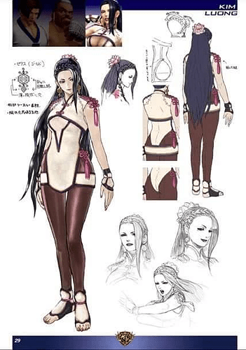
And while many characters didn’t quite change their looks (e.g. Blue Mary, Kim, etc), I feel that the lack of technical prowess from the same just hurt more than the fact that look exact same as their ast appearance in the series
SNK’s last great designs were in Garou (some of which are beyond SF3’s work)
Lol Gief had so many normal throws back in the days, i miss that
I don’t miss the bite one, but many other were cool
Yeah, that’s a good one too
I picked Rei because the double chop of the skull diver
Btw speaking of Falco, the random asura that wrecked him, may (loong stretch) gave them the idea for the Scissor Kick too, even if of course there are many differences
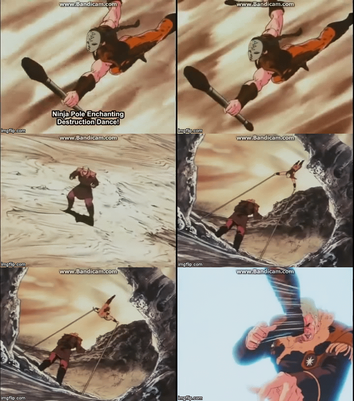
Again very different, but considering how capcom clearly loved the char
i will give it benefit of the doubt
Another even on Bison may be Souther’s way of approach Ken, remind a bit how Bison can unnaturally move forward with his classic slide
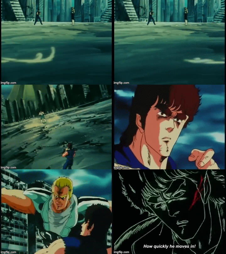
Fun thing that episode open with
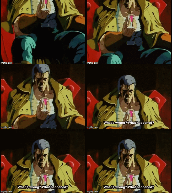
wich capcom liked enough to do this ![]()
In Raoh’s defense, he did’nt had an Hitlah poster in his palace LOL
KOF also has the gimmick that people are largely regular people. Many of the fighters wear “regular” clothes by default, not martial arts outfits or uniforms. They also change outfits over time (though budget constraints can limit this), and may try to be “stylish.”
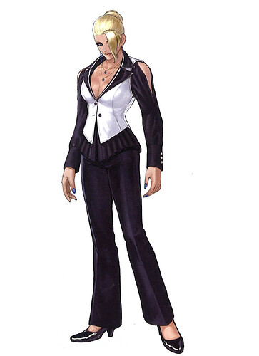
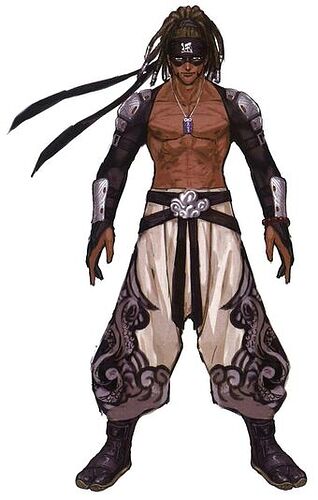
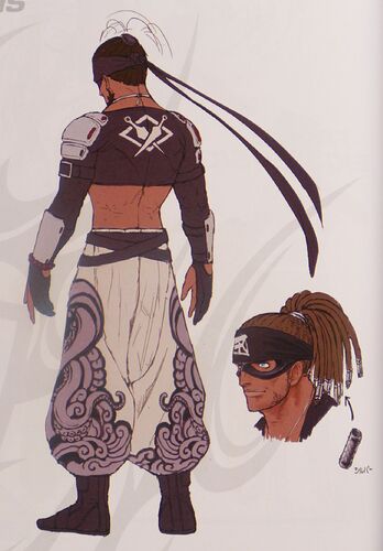
Characters like Kyo, Iori, and Robert fight in their street clothes. Mature and Vice fight in their fashionable businesswear. Benimaru is a model, and his outfits tend to be as much the negative cliche of “stylish” as they are actual attempts at stylish. Athena is a singer that changes her outfit with every game. Sylvie Paula Paula is a visual train wreck because she is an exaggeration based on Kyary Pyamu Pyamu. Ash was Ash.
The biggest issue is probably with Kyo, Iori, and potentially with any new main protagonists (definitely including Shun’ei). Their outfits are just pointlessly overcomplicated, like a parody of Tetsuya Nomura’s belt and zipper obsession. (Funnily enough, Nomura has since said that he had intentionally kept adding more belts and zippers in his designs due to people teasing him for using too many belts and zippers.)
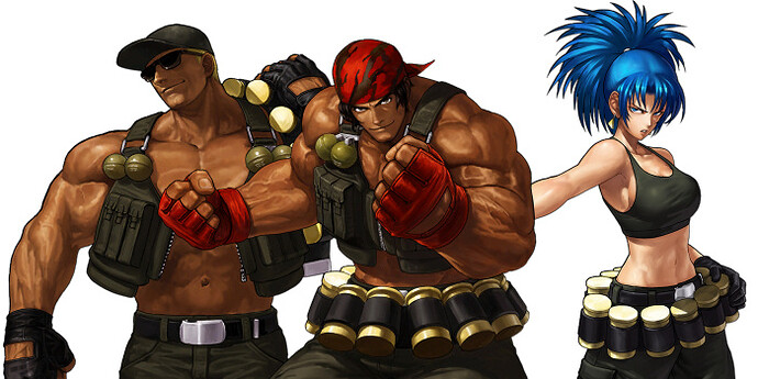
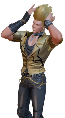
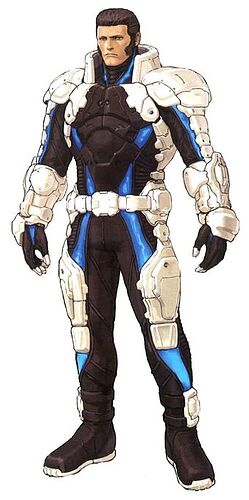
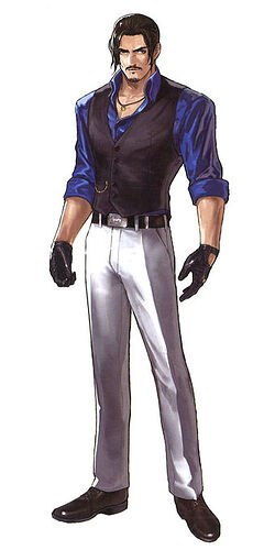
Were the images below supposed to be examples of “botched beyond recognition”? Because they really aren’t.
Ralf, Clark, and Leona suffer from the downright idiotic giant shell casing belts, but otherwise are still recognizably Ralf, Clark, and Leona. (Why in the world would a serious military team ever wear belts filled with giant spent shell casings? Or are they supposed to be containers shaped like giant spent shell casings. Either way, it makes no sense while simultaneously looking awful.)
Kensou’s always had a forgettable look, so continuing to look generically forgettable is perfectly in-character for him. I’m not sure anything can be done for him. Benimaru is identified by his hair and his questionable fashion sense, both of which are present in the image. Maxima has never looked good, and mostly relies on his color scheme, shoulder pads, and mutton chops for recognition.
Robert’s fine, and easily recognizable. Mature is decently fine enough, and again easily recognizable.
Blue Mary did get changed for KOF XIV, for the worse. She lost her oversized loose belt for a differently oversized weird belt and tasseled pouch(?) combo. Presumably she was a tertiary (at best) character budget victim, and SNK just didn’t want to bother spending more than the absolute minimum to animate her in 3D.
Budget and animation are a big issue with KOF XIV in both character design and how the characters ultimately looked in game. With the size of the roster, and the apparently inexperience of the people working on the title, SNK tried to cut plenty of corners. This both presumably shaped some of the character designs (such as Mary trading her silly classic belt for a much worse “skintight” design) and certainly impacted how the final products looked. You can tell the difference between the characters that someone on the dev team cared about versus the characters that were just there to fill space, but honestly even the characters that were cared about still don’t reach their 2D standards in model or animation. (Mind, the same 2D to 3D transition exists within SF. 3D SF is still pretty far behind what was done with SF3’s animation.)
That robert design is bad ass though
