Also why the hell are the Dojo and that Wrestling Ring not stages in the game yet? they look so sick and they already have the music ready for the ring
1 Like
Does the kanji between Alex and Dhalsim mean mugger? 
2 Likes
God, I wish there was a Director’s Cut of ASF. Like with a lot of extra scenes, harder and more creative fight conditions, and more fleshed out character interactions.
8 Likes
Loved ASF, but was pretty disappointed at the lack of battle conditions. It would’ve been nice to see how things would play out if certain battles were lost, finished the opponent with certain attacks, etc. Peter would’ve probably gotten an invitation to join up with the team if he defeated Cammy 
7 Likes
Then Cammy would’ve given up on humanity and went back to being Bison’s waifu, much to the satisfaction of @Daemos.
1 Like
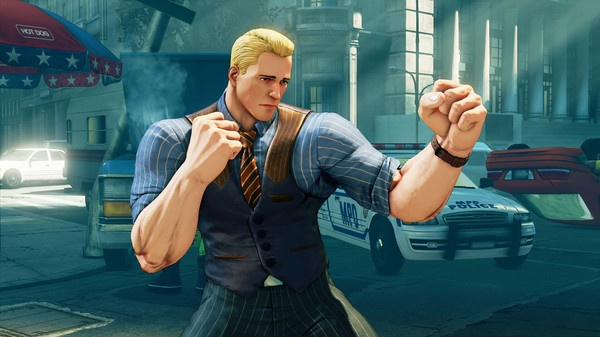
I put my cents in and say I like how Cody looks in Street Fighter 5. he has a nice hair style and default costume has a good sense of fashion. SF5 Cody is one slick dude. I will don’t see much wrong with Cody in SF5 in his default costume.
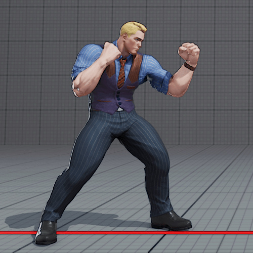
well other than his hands are huge for some reason but that’s mostly likely a thing bought over from SF4. in Final Fight Cody is listed as being 5’11" and 187 pounds. however in SFA3 , SF4 and SF5 he’s list as 6’1" and 176 pounds. this means by Final Fight to SFA3 Cody somehow gain two inches in height and lost 11 pounds in weight.
so technically Cody should be slimmer than he was in Final Fight . in fact if you look at both his and Vega’s height and weights Cody shouldn’t be any bigger than Vega is. also Vega isn’t 6’1’ , he’s technically 6’1" and 1/2 . yep I look up Conversion Chart chart on centimeters to feet and 185 cm = 6’1"
now Cody might be too tall since in game he seems to be close to Urien’s height. I should know because I own the game and did a height comparison between Cody and Urien in training mode on my LG 55B6 4K Oled . all of Cody in all his outfits expect for his Final Fight one have chin stubble. Cody’s Stubble in SF5 has fine detail and in YouTube videos this fine detail isn’t that noticeable because of compression , and when it’s further compressed the detail is just lost entirely.
Speaking of SFV Pachinko Slot, here’s a video of someone playing it (1 hour long, enjoy the footage)
4 Likes
Cody looks fine visually, it’s more about the model itself. I don’t like how dead his eyes are, like my dude is literally dead inside. Or I guess they’re playing on the fact that the fight hasn’t even started yet and he’s already bored. Idk
For the big hands and feet - yeah I think this will probably stay from now on. I don’t necessarily agree with the decision though, seeing as the characters are somewhat close to the camera compared to most other fighting games, so I don’t get the whole “it’s to better see the limbs to read attacks” explanation from like SFIV era when Capcom was asked why they went with such a weird model design direction. I just with at least the girls didn’t have such big fucking hands, just look at Karin - her palm is as big as her head
As for the differences in measurements for the characters (height, weight, chest, etc) - IMO this is a result of poor or mis translations of the past, like how we’ve seen some of the text/dialogue is straight up wrong, or how some of the IV winquotes were intentionally changed in their meaning, plus this is Street Fighter - there’s been a fuckton of retcons over the course of 30 years that the series has existed for, so I’m not entirely sure we can use the previous numbers and state themas correct in comparison to the new data we have for SFV (which should technically be the most up to date?)
I do think, however, that there’s a disconnect between the actual numbers and ingame models, so some of the characters just were incorrectly scaled, which is how you get the case of Cody and Urien being same height in the game (and don’t forget Cody doesn’t exactly stand straight, he’s a bit hunched over vs Urien who stands tall on his feet), while there’s a difference in the lore
It’s the same thing as Dragon Ball FighterZ where ASW clearly didn’t align all the characters perfectly in height, like I’m sure Vegeta isn’t as much of a midget he is in the game. Sure he’s not the tallest guy around but he’s not as small as Krillin for example.
3 Likes
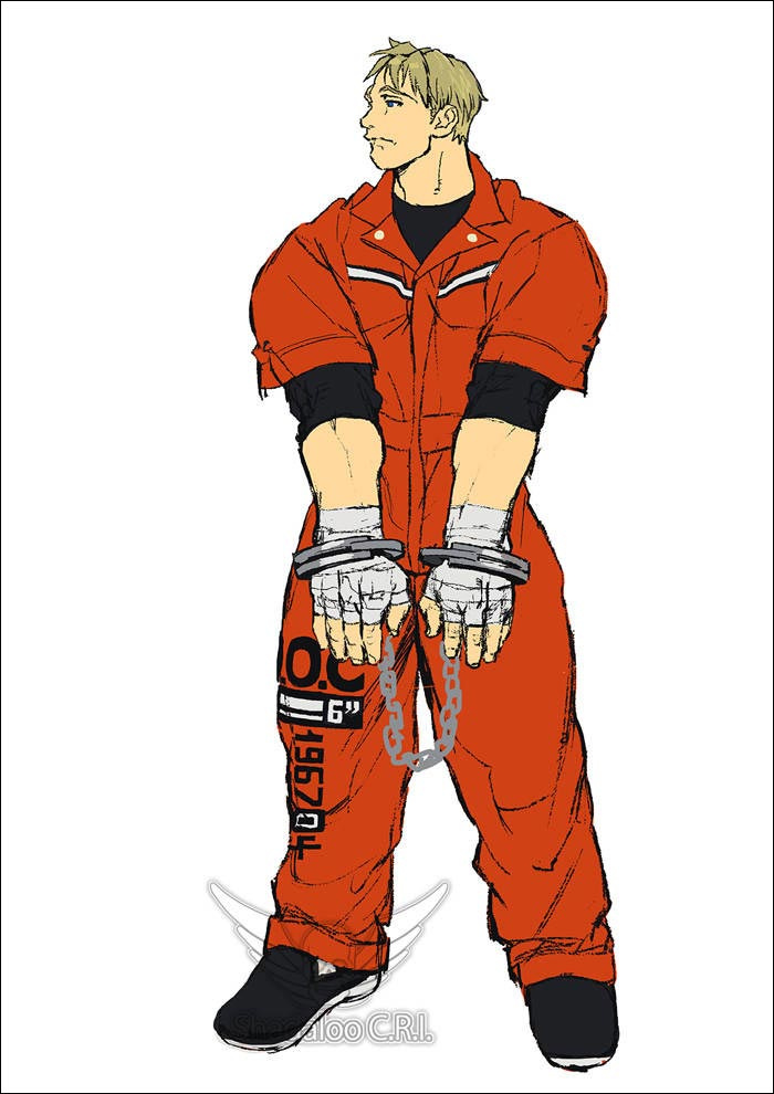
Overall i like Cody (even if ii’ve set #10 FF Nostalgia and switch occasionally to SFA prisoner #1), think he’s my second char after Ryu
Design wise things gone wrong are
-too tall, as you said he’s almost tall as Urien.
Dude is supposed to be taller than Ryu (i’m using him as average standard), but not by that much
-too lean, true Cody ever been much stockier.
Ever using Ryu as comparision, Cody used to look as figure more thick and heavy, in SFV it’s the opposite and proportionally he seem leaner then Ryu
-design wise his standard costume is “wrong”
That’s the most complex to explain, but will try
Essentially capcom design and particular SF design (even in SFV) works on large masses, few main colors and repetition of visual themes/textures with give SF characters what is perceived as a “simple” look
Now Cody
The shirt have his color
The pants another
The gilet another
Parts of the gilet another again
The tie does absolutely another thing again
The shoes don’t even bother to be brown to connect/repeat to other elements above
For a SF design these elements are way too disconnected with each other
One can say lines texture is the repetition/link, but absolutely does’nt work on SF design large masses stylization
(PS: i found fun touch they made his design obsessed with lines as are essentially super thin stripes and he used to wear for years the stripes prisoner outfit, but does’nt save it)
To get comparision Urien in SFV somehow did the suit cool kind, but is infinitely more coherent and solid design
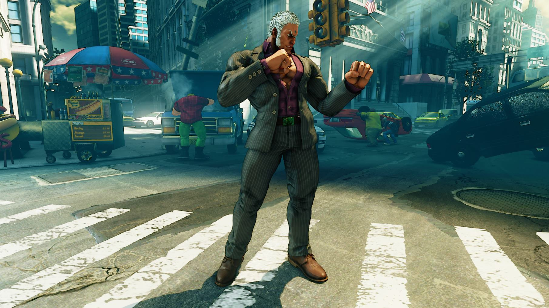
Jacket and pants link and offer a strong main mass, purple shirt is a secondary support color, togheter with dark skin contrast with white hair wich add another to the mix.
Brown shoes and gold belt there are the different details to spice up the figure, but are in clear minority and don’t disturb the overall design direction
Here there was a concept that fit much more the series style
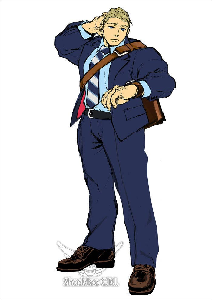
As you can see here masses are more clear/large and there’s waaay much more connection between design elements, see jacket linking with pants and part with the tie motive, leather brown shoes connecting with the watch and the business bag. The azure shirt repeat itself by being visible on chest and wrist
in B4 the predictable reply come → I’m not saying looks cooler (specially considering final design tryhard on looking cool), but design wise is a much much more solid design for a SF game.
Essentially they could still have designed the same SFV try hard cool gilet-Cody, but following the same solid design creative process of concepts
As he’s been made, he seem just straight out of the design code of the rest of the cast, wich when you need to create a cohesive/uniform visual is a failure
I will not be surprised at all if the final SFV concept that end up getting the 3D model has been ignored by the modeller (like Bengus Alex) and lost many/some key elements that will have made it otherwise legit
-Last one is not an “error” but more a missed opportunity
I’m kinda pissed to see that SFV concept artist chosen a cool and original solution, giving him dark sand hair (aalmost light brown) in his concept sketches, it was a very nice touch to connect his FF image (light brown) to SFA/SF4 one (blond), and they ignored it.
Aside the suit concept above, here other examples
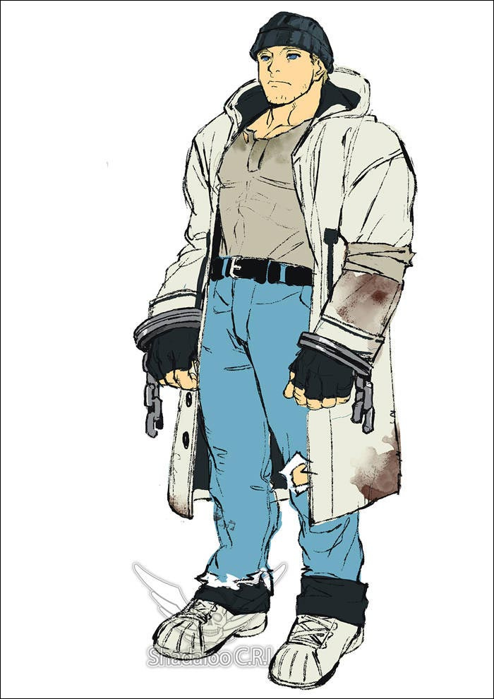
It was a great way to make the #79 blond SFV character more unique design wise and absolutely make sense with the character, will have been the only one in SFV with that hair color.
Instead they straight ignored it and slapped on a shade of the same saturated lemon yellow that half cast already have lol
(Beside that to link with point above also these 2 dropped alt designs show a much much much higher understanding of SF visual code, legit main colors/masses link/repetition work there)
2 Likes
Well, I like how Cody turned out. He definitely took a glo up.
Haven’t got anything to add. Anything I could say was already explained by the comments above.
I think the final design is the best one out of all the concept ones.
5 Likes
True, most of them are really generic and predictable.
What i think should be possible realistically hope for is IF they do a 2nd cinematic chapter, they can fix some ass-made shit from ASF
But i expect something really minimal, like them switching Ed and Kolin low quality ASF models with higher quality playable ones.
Or the (almost invisible) super low res ASF Gill to be switched with a slighty modified version of Halloween Urien.
Maaaybe, and that’s another stretch, if they got some already existing half made material (cutscenes) to polish it up and add it
Cody’s default look problem is that there’s too many colors clashing in the same design, his costume has 7 different colors at once.
Now look at virtually every other character in the game - almost every single one of them has a simple and easy to follow color scheme that doesn’t create a mess and is easily recognizable. Even more complex designs like Zeku, Ed, Karin have precise and disctint palettes, and why Cody’s prisoner (and even vigilante) design from the past was better from this perspective
3 Likes
From Sakura
1 Like
the reason I like Cody’s outfit is because it remains of of a old school gangster look. the vest is similar to the a vest seeing on old school gangsters. the pin stripe shirt and pants is another thing that’s taking from old school gangsters. Cody’s hair style seems akin to a 1920’s hair style.
there’s the stripe tie which is quite common among old school gangster fashion and the black shoes. just put a Fedora on Cody and he be ready to fit right in to a old school gangster setting.
3 Likes
I think almost everybody like the concept itself, what they did wrong is the execution
Again, i think if we have the chance to see the concept artwork of Cody’s SFV design we will see that the 3D model fucked up something and the concept art was a perfect SF design
The hand that made most concepts artworks seem to obviously know how to make a SF design following the visual code (being great while at it), so until proven wrong i will guess modellers fucked up
Cody: I’lL mAkE tHeM a OfFeR tHeY cAn’T rEfUsE
Actual quotes from the second story when he bargains with G.
