Anime like art style in cell shaded is the way to go we had talked and discuss about this before and definitely there are two art direction that the majority is favored of it is either…
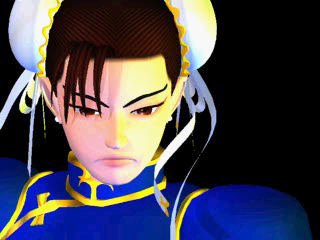
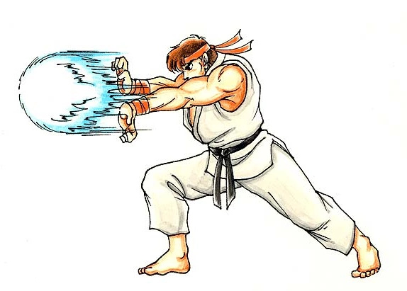
SF Zero/Alpha style or SF2 Movie Anime
Without the hilarity of the wackiness and goofiness that the modern SF(SF4 and SF5) is forced doing in the other cast.
It’s possible that they could either do straight up moving 3d models either base from SSF2 portraits and art or SF Zero portraits and art even without cell shading process that makes it anime but they just don’t prefer it as a current art direction of their modern SF games.
SF4 fugly and wacky art with hilarious expression isn’t a bad work because it’s an art direction.
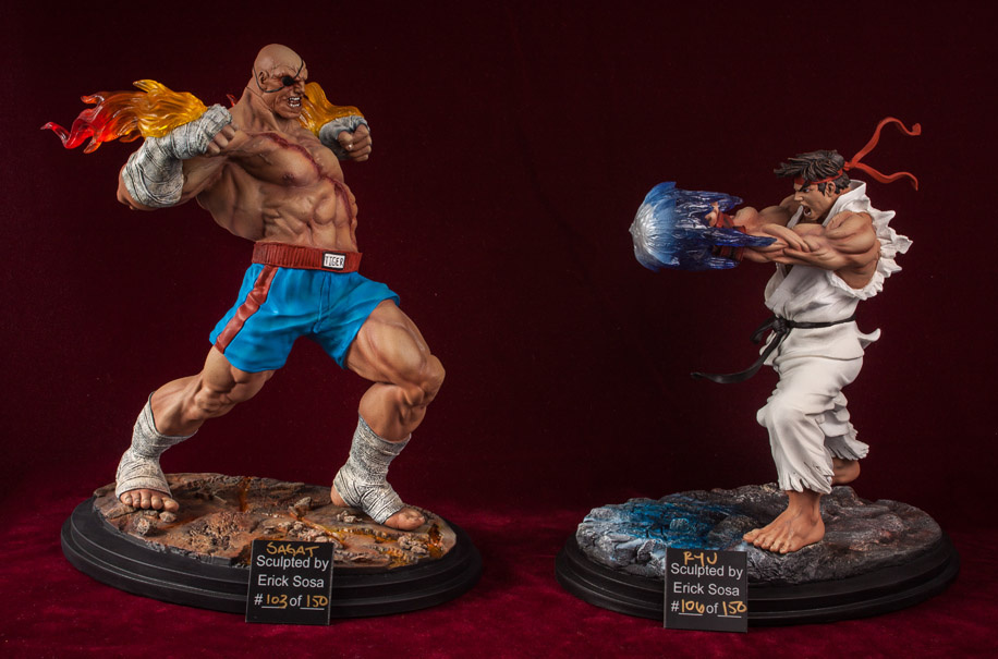
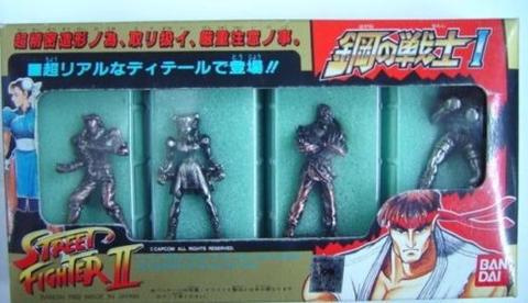
The merchandise bellow from those that license their brand in the past shows clearly they can successfully turn the glory of their past works whether it’s SF2 Art or SFZ Art to be translated into 3D version and it’s not the cased of impossible to achieve that needs a huge budget or not so good 3D Sculptors but its their different target of preferred art direction or how their company handling branding nowadays that is probably hindering it to happen.
2D to 3D conversion is not a matter of polygons count and details that’s why many anime franchise not just DBZ have been successfully translate and recreate their 2d works to 3D model interpretation in the past. The thing is Capcom’s current art team isn’t really aiming to do those art direction… compare to the merchandise that are licensing there brand.
The images are some I have stored in the past years for my toy collecting hobby, some are acquired and some are didn’t.
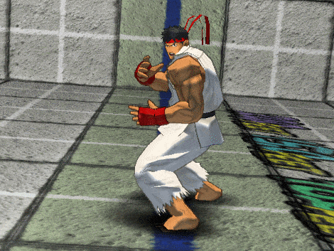
Storm Collectibles: I wouldn’t mind a game that isn’t cell shaded but do like straight on comparison to the portrait of SSF2, like Storm Collectibles did. I really like the art of the original world warriors in SSF2 come into their almost exact 3D or a more purist form.
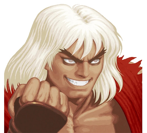
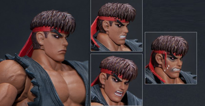
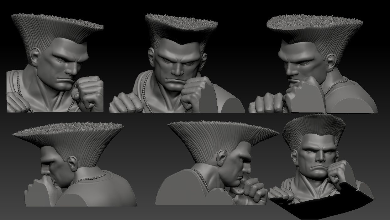
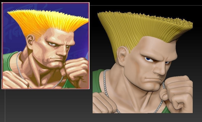
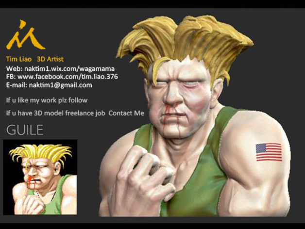
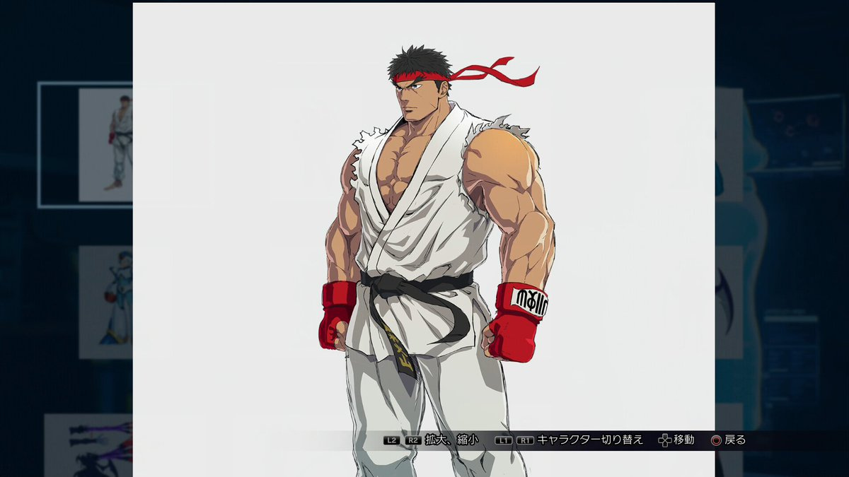
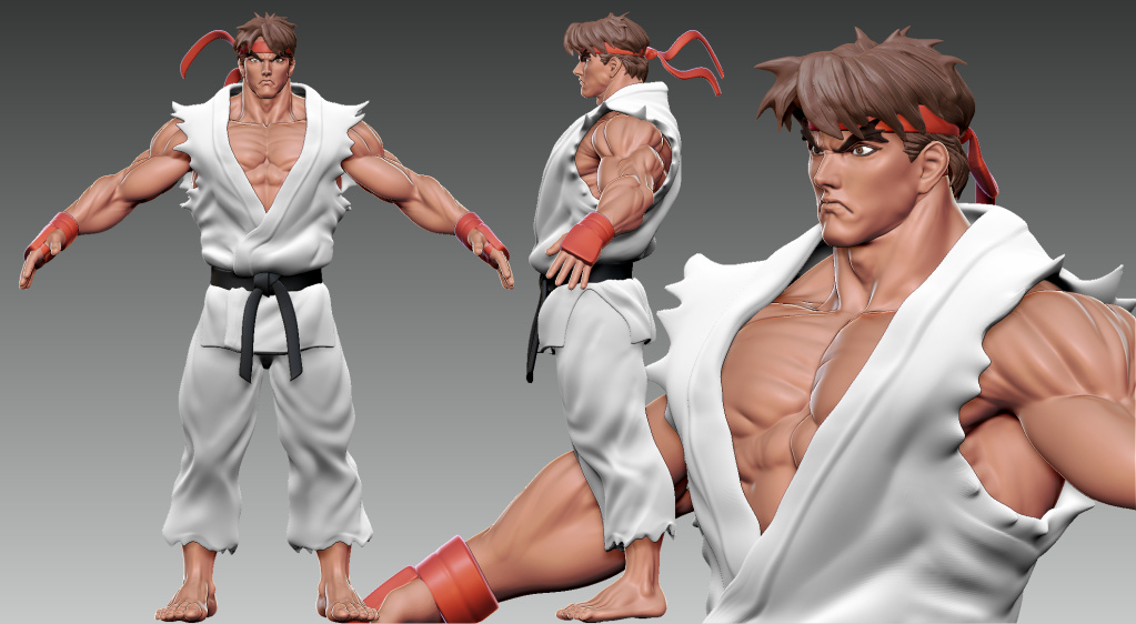
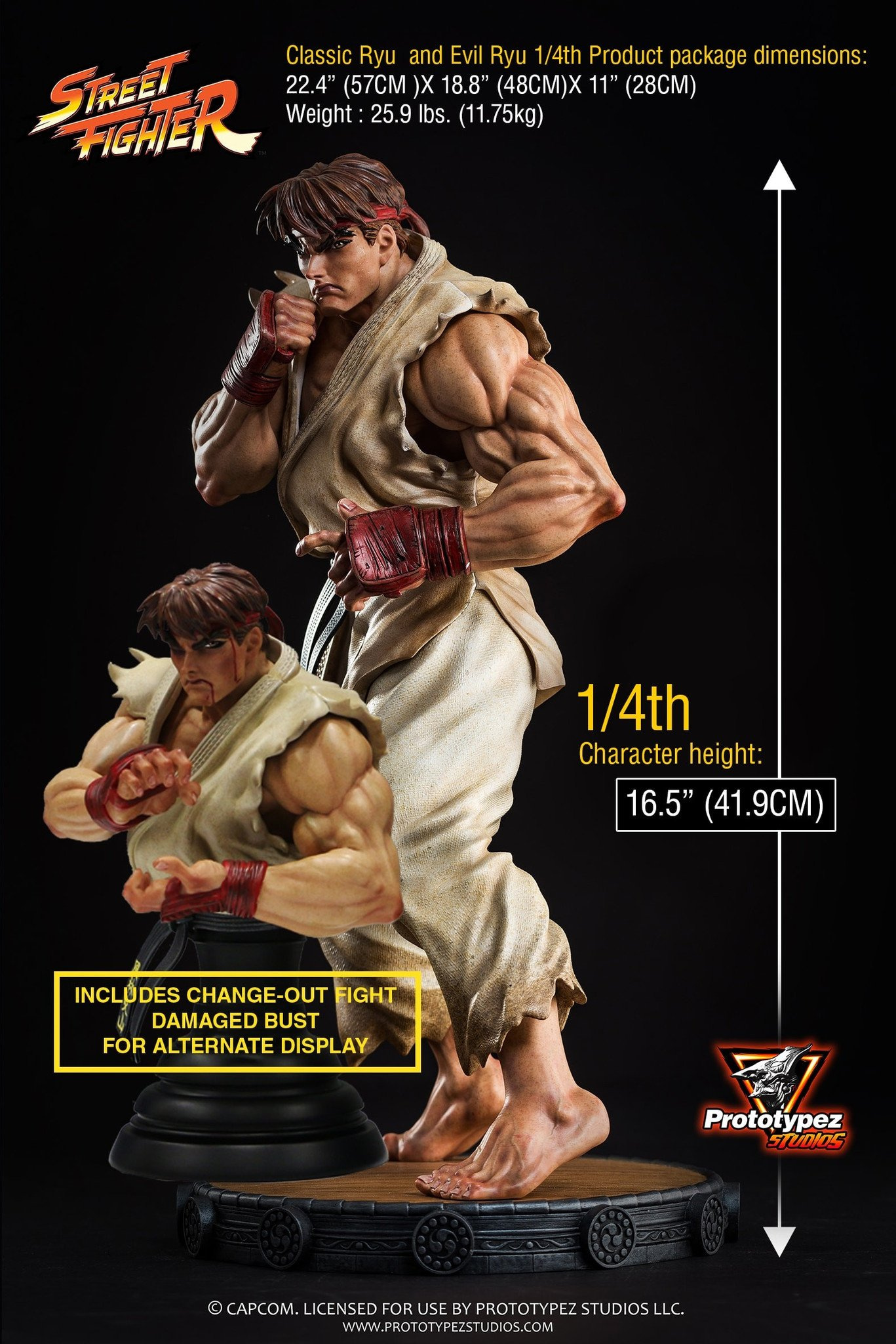
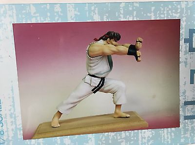
PrototypeZ’s Ryu…
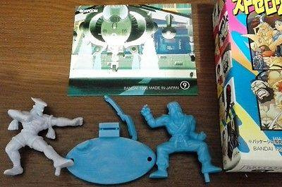
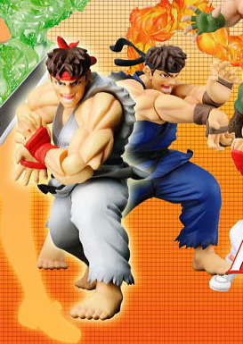
CFE Gashapon
Summary
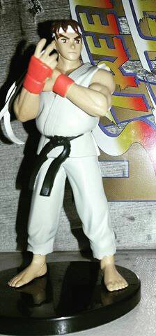
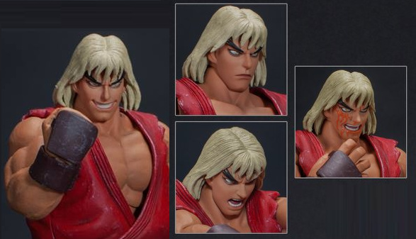
Another from PrototypeZ more of Photorealism
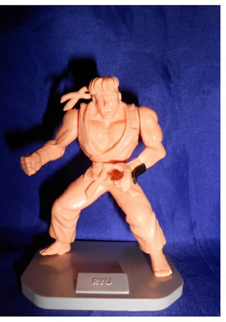
Lets take a look at the past model kits Musaya Resin.
Summary
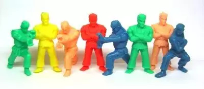
Let’s try Ryu in less detailed aspect in keshi’s(Gomu Gomu) in past bandai works
Summary
There is also something base on Shoei
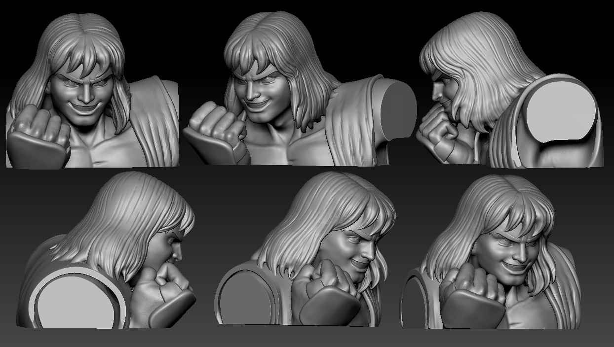
Bengus from Gashapon and Keshi
Summary