It was printed on to vinyl it looks excellent and ive been testing one out, getting it wet etc rubbing the picture and it holds up perfectly, if anyone is interested I dont mind getting the vinyls done for them
Also they are removable, so easy ro swap and change
haha still looking for a Chibi Street Fighter SE/TE template anyone???
heres an example of the type of style im trying to lean towards…((not my work but something i saw online))
The SE/TE artwork/templates are great in this thread, but where can the original (without holes) artwork be found as I would like to use one or more with a Tekken 5 Hori Tenth Anniversary stick.
It’s entirely possible someone browsing this thread might have soem similar art that they found or someone did, so there’s nothing wrong with him asking.
uhm excuse me sirs! i’ve noticed some chibi’s on DA…if said user wants to make a template, you should try looking up those and making it yourself! tis not hard!
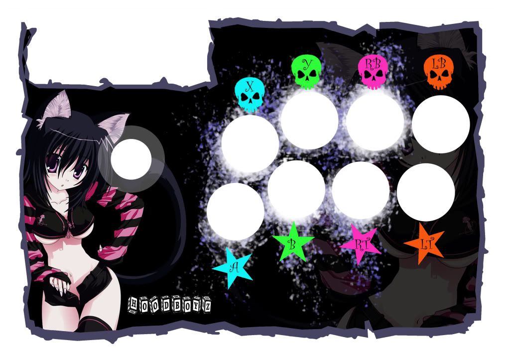
OK guys this is my first template. I want your feedback.
I am deciding on if I should keep the blurred effect. I am going to use the standard 6 white buttons and 2 black, which is why I blurred the areas I did.
Hoodyboy, the first one is best. Also if the background drawing was just her face or a different drawing, it’d be slightly better, but it’s no big deal. Also the font for the button labels could be better.
wh03Lse, can you please remove that image and replace it with a link? It’s stretching the page.
Hoody, I like the button label font better now. You might also keep in mind that the curve in the stick could affect how good the art looks when printed (but maybe it won’t matter). Not sure if the overall design is better in the old one or the new one; I’m split on it.
hi,maybe somebody here can help me,i am building a custom stick and i love the akuma template on page one! i would like the same template only without the screw holes and the blank space in the upper left (same dimensions)!
could somebody help me out please?
btw:very nice templates so far!
Thanks. THe new design is more “in your face” than the last, so it is a bit different. I think I will have to put this design on hold for a day or so to get a fresh take. I am starting on my next template now.
I dont even have a SE yet, and probably wont find one for at least a few weeks so I have time to mess around with the templates.


