Did you have any particular style of font in mind that you could recommend. Maybe an example? I agree with you and ive scanned through dafont.com like recommended but nothing really popped out at me…
Just started modding my SE. Putting together 2 designs and not sure which I like more.Any input would be great, not really proficient at photoshop.
http://i816.photobucket.com/albums/zz88/Acetylene80/Templates/HOLLOW2.jpg
Or
http://i816.photobucket.com/albums/zz88/Acetylene80/Templates/BATMAN.jpg
Thank You I’ll Give It A Shot Soon
Changed the font i think its a little more stylish but doesnt really match the Street Fighter Logo… Thoughts…???
Was watching some clockwork matches and in tribute to him and his awesome team i made a template of team clockwork :). Took a page out b15 art where he usually gives them an old washout look and try’d to recreate it myself. Since the mvc2 render look so old and washed out i guess iit helped them a lil.
http://i63.photobucket.com/albums/h127/shadowknight24/clockworkprojectpreview.png
http://i63.photobucket.com/albums/h127/shadowknight24/clockwork.png
http://img820.imageshack.us/img820/5600/fightstick.jpg
Any ideas?! All the people from the UK should get this… 
Need to put a nice field scene in the background. Y’know: evoke the feel of the package.
Not sure if it’s finished or not, but this is what I have so far.
http://img.photobucket.com/albums/v323/Kosiguru/murdafaceTE.png
So this isn’t done yet, composition-wise don’t worry about it-
I drew this up today and I’m wondering if you guys can tell what is in her hands, and if you can tell whose stick this is going to be. I left the gamertag/name out on purpose to show here, my goal is to make identity a no brainer, but still artful of course 
thx
http://img.booru.org/SRKsticks//images/1/e74fba48abbaa58ad1067aa864daa769b1d5ab2b.jpg
I love it ^^ but then again I’d love any clock tribute hahah - the art is good, I would just modify the mvc2 logo to match the faded art ^^)b
Looks like she’s either holding a gold brick or a big stick of butter. Hmm, butteroj?
For some reason I don’t have the option to edit my posts on my work pc. Can’t quote either, no idea what that’s about. Just forgot to mention that artwork is as beautiful as ever Montoia.
lol improvement then, earlier ppl thought it was a loaf XD
and thank you kitsunisan! I spent more time on it than any other piece we’ve done so far :3
I immediately assumed a gold brick, as she is turning to gold herself.
I thought gold or butter.
Thanks yea i been watching alot of his videos lately he’s easily one of my favorite players out there especially now since his mvc3 doom is a beast lol At first i had the logo blended in with the image to match the characters but i wasn’t feeling it so i just ended up moving it back and ended it up with how it looks right now.
In regard to your art i kinda figured it was gold since how the lighting is hitting her hand maybe add a lil more shinyness to the brick so it wont be confused with bread lol. But i bet once the art is completed it’ll be easy for others to tell what it is.
Who would’ve tought clockwork would browse this part of the forums i got a like from him
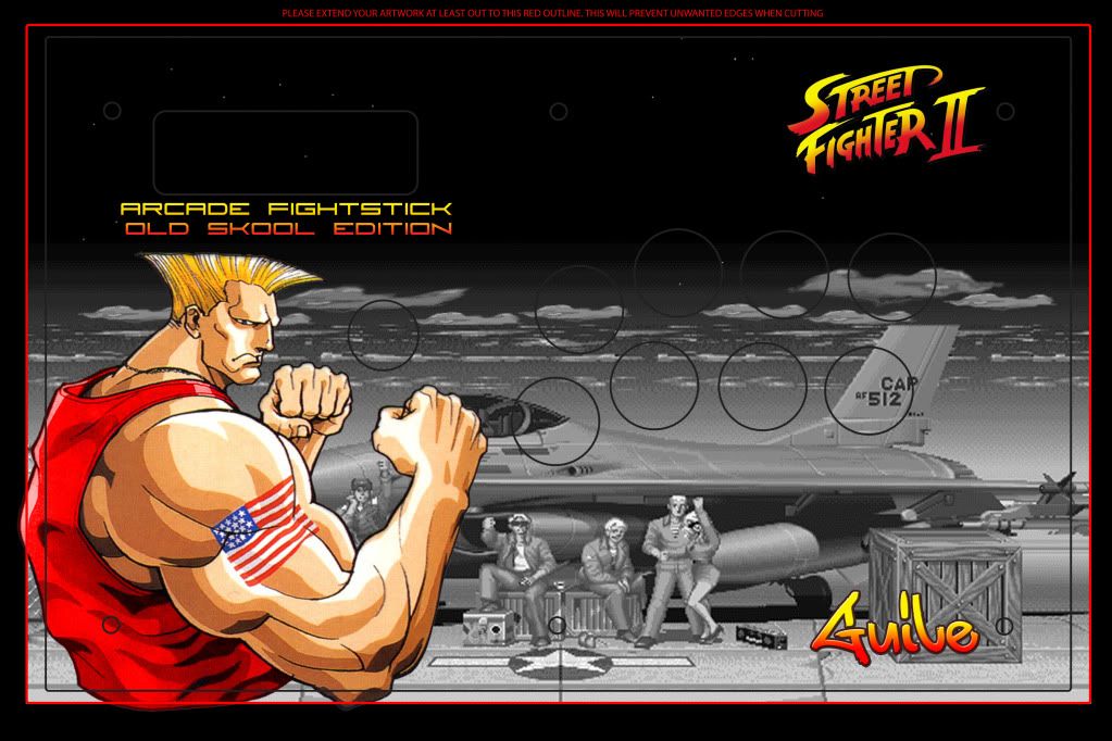
@dwade the guile art is looking better now with the different guile, i’d chande the guile font to maybe match the old school text font your using. Overall looking at the temp it’s a much better improvement then the first.
@yzae b
Me like how the high res akuma brings out the best out of the template nice keep up the good work!
@qweeze
I’d say lower the opacity a tad bit on the gradient map it sticks out a lil to much and feels like the blue overpowers the concept a bit much. As for the second one the spiral going around chun’s looks a lil to blurry.
Updating the clockwork image with psd for anyone that wants it.

That’s how i had it it didnt like it much  but hey that’s y i posted the psd so if someone wants to mess with it make it to their liking their free 2
Does anyone have ideas for a Vega/Claw stick.?
Yea I was looking at that but I’m not exactly sure on how to un-blur it besides using the sharpen tool but I’m affraid that the dragon and the spiral will look too grainy you guys have any other ideas?Also for the 1st one I wanted to make a whitish blue tint to it to match the buttons I got for it is there anything else I should do besides just lowering the opacity? Btw ur clockwork art is simply amazing. Definitely like the flow and color choices u used for it