You can always check the Info Thread is you can’t find something.
Just posting up a bunch more stuff since its been a while. the shonuff was drawn from scratch by me and the naota(baseball) was redrawn from a screencap from FLCL.
http://img683.imageshack.us/img683/4346/beatstick.th.png
http://img155.imageshack.us/img155/8250/greenironmanstick.th.png
http://img804.imageshack.us/img804/4347/bbhoodstick.th.png
http://img43.imageshack.us/img43/3289/akumastick.th.png
http://img846.imageshack.us/img846/1269/yankees.th.png
http://img89.imageshack.us/img89/3828/shonuffstick.th.png
Does anyone have the Blazblue template for the HRAP3?
Still a work in progress, even after completing the Vector for the template:
I’ma work on the largest template first, then edit the work down to my SE.
My photoshop skills ain’t that great, but what do you think?
http://i633.photobucket.com/albums/uu58/kazuyafan94/IronFistEdition.jpg
A work in progress

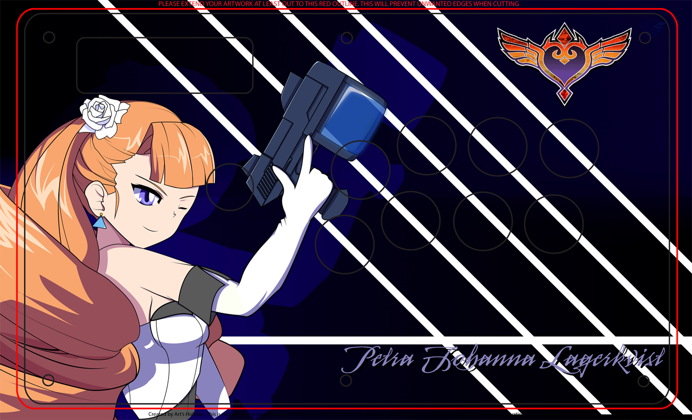
Took Chuu’s word and made a few changes. What do you guys think now? Im pretty pleased with the changes but still looking for a few comments, pointers, and such…
And after uploading i see i have to do some cleaning up on the color for guile but other than that…
Slight edit. Like it though 
So far what I have Hurricane. Still WIP
http://i235.photobucket.com/albums/ee319/DeathOfBlades/One-piece-template-front-6.jpg
Could someone enlighten me about the differences between Art’s TE template and the Madcatz one? I put my artwork on both, and it appears the button holes for Art’s template are a tad smaller, then screw and stick holes a tad bigger.
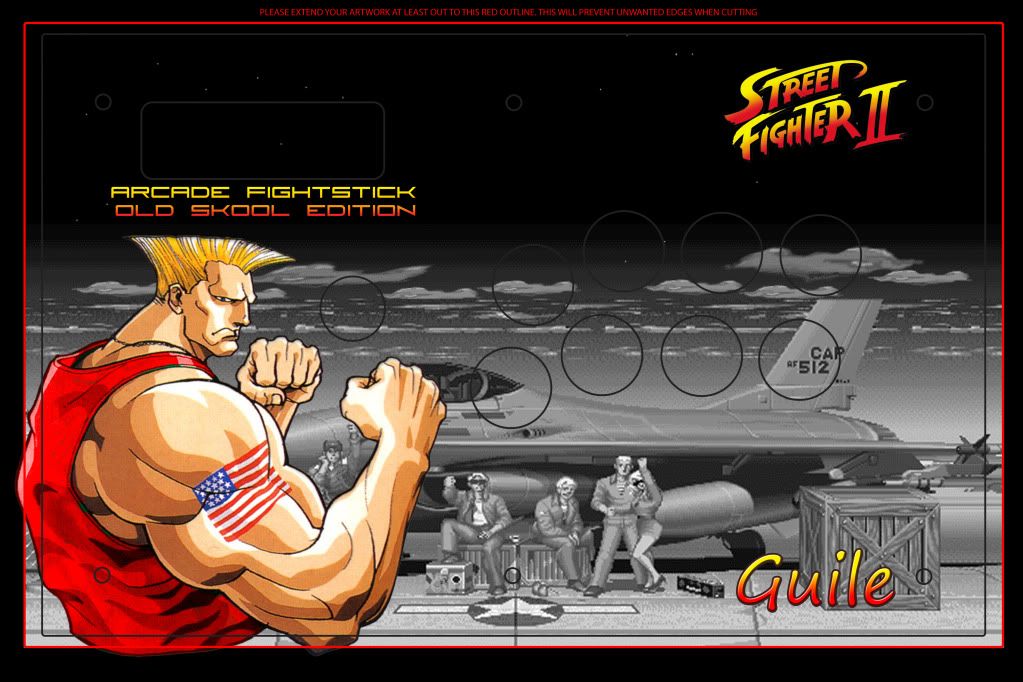
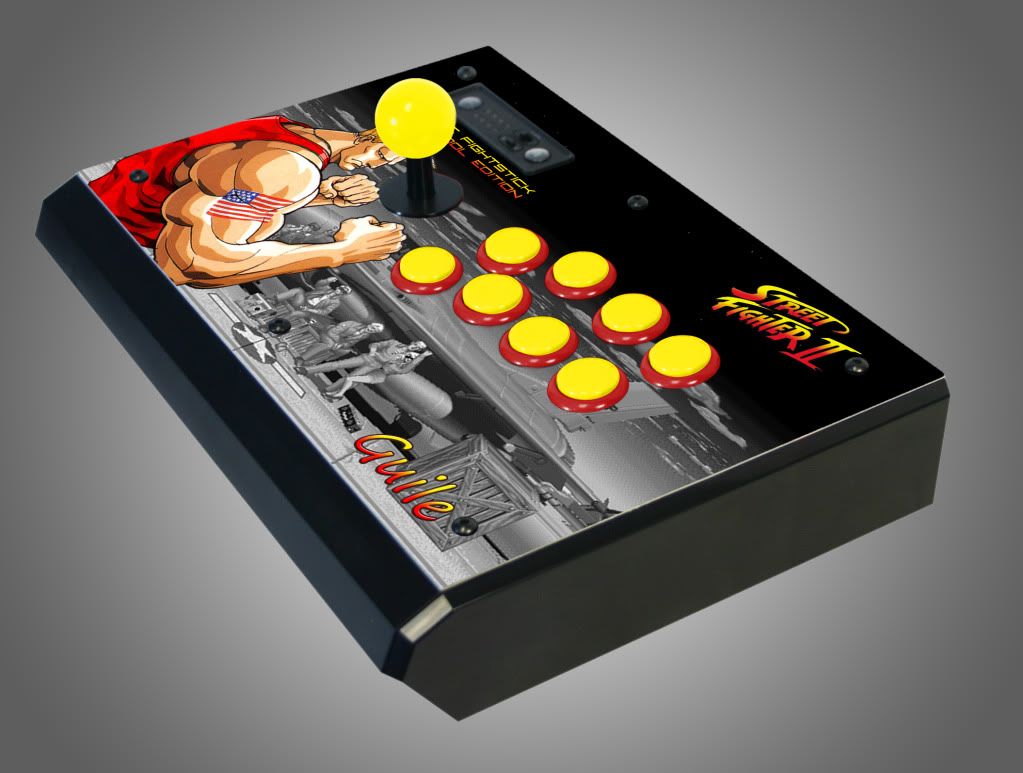
looks cooler, guile does have freakishly big arms though…
Art’s template is spot on. I think the Madcatz one expects you to use a black dustwasher. Not sure.
The MadCatz template does not have accurate button hole placement. Arts templates (and my SE one) do.
Then again what male Street Fighter character doesn’t? Either way I agree. That Guile image does look better. I’d change the font on the “Guile” text though, it doesn’t really go well with the Street Fighter II logo.
If you don’t mind me asking I actually want to do a template with all my fighting game chars … how are you making the boarders to separate each char image ? Can you show me the way lol
I was thinking the same thing as far as the font goes… I just don’t have many to choose from… Any suggestions as to where I can find some to download and try… thats why I did the gradient overlay btw
I used the “line tool” and adjust the width of the line tool on the top toolbar to make my borders into different sizes. Then for nice bold clean borders I right-click on the layer I made with the line tool then go to blending options. I use a combination of satin and stroke. This is dirt easy to do but if you have any questions feel free to ask.
A lil update to the Third Strike Chun art I did:
Plus the original:
I’m making these for a friend but I still don’t think I’m quite finished with either of them so for any of you photoshop artists have any feedback or suggestions I’d appreciate them!
Dragon BG on the second one is a bit blurry.