I’m looking for some juri artwork for a fightstick I’m making, its a hitbox style templete and would pay commission for who ever wants to take the job
Send me a PM.
Sent d3v
Nice 
Well, for something that was thrown together, it sure looks like everything landed in the right place.
Anybody can do a rodimus prime one I have a pic withbyellown orange red and purple… tryung to put chosen one on it but don’t know hownto get the layer to line up. It fro the se stick
i’m still waiting on any sort of feedback on this. I lightened up the image of pam grier a bit but i think overall the art is done. critiques would be nice (by the way the autograph is pulled from a poster i had gotten signed by her in person)
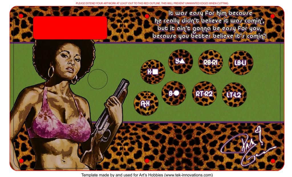
if you remove the text its pretty sweet. autograph is a very nice touch, but i dont care much for the text. i’d try to avoid the turbo panel unless you absolutely must, it ruins a big part of her hair which is crucial to her image imo
except that, it looks solid. i like the green coupled up with the rest. solid art, but as with many other pieces i’ve commented on, i don’t care much for text
I agree with dej, the text kills it. But I don’t like the green, it’s too contrasting.
Also, I hate the text on the buttons. That’s just a preference thing, but I say if you must have the designations, then make them much more subtle, and even move them to the top instead of the buttons.
However, I’m a big fan of subtly, so if your goal is to make something that very in-your-face, then my opinion probably shouldn’t apply.
to Dej: When I get home i’ll see how i feel about the text being removed. The turbo panel is staying, im so used to having one on my last modded TE but i know what you mean about the afro.
To Evolution169: The buttons are staying as is but should look toned down a bit when the stick is finally modded. They are going to be under translucent purple seimitsus. Putting the text outside of the buttons would clutter the sectioned design that i have. Also the green is definitely staying, its keeping with a bold 70’s theme.
Thanks for the input so far.

can I separate this image
can some one do a mock up
rodimus prime chosen one for the SE fightstick
maybe if it didn’t have the deviant art watermark
Since Phreak should be sending them out soon, here’s the design we used for the special MadCatz V.S. stick that was a reward tier for the Link’s Kickstarter.
http://i.imgur.com/4MUoEBI.jpg
http://i.imgur.com/B5HpxjX.jpg
We also tested designs for the Tournament Edition and Fight Stick PRO since we didn’t know at first which stick Phreak would be getting from MadCatz. These however aren’t as polished as the V.S. since we concentrated on refining that once we did get confirmation that we were getting V.S. sticks.
So rad. Really dig the matte finish as well.
Commission for a client. Top and bottom art for a Simplecase Wide Body custom using purple heart wood.
Top panel
http://i.imgur.com/cUN4opV.jpg
Bottom panel
http://i.imgur.com/8tQr0vy.jpg
Gray bits on the bottom panel are supposed to be cut out for the window to see the internals as well as the purple LED on Juri’s eye.
ridicilously good looking. good job d3v
That eye is gonna look awesome when the light’s hooked up to it, great touch.
Really cool, d3v. Why not use the ULTRA logo instead of Super though. Customer preference?
Because Juri came from Super. Also, I don’t have a USFIV logo that size (> 2000px).