
Is there anyone that could help me find this font type. or what it is called?
Make sure to hold down SHIFT when you’re resizing the images. Both of these are squished and warped.
The “S” and “R” look a lot like Federation Classic, but the rest of the lettering like the “F” and “E” don’t match. The rest of the font looks similar to Enamela Condensed (bold italic version).
Have you tried using What Font Is? Probably going to need to blow up the text for the font recognition to work.
or maybe something close to this one
I’m assuming you mean the text on the bottom-right?
Try LHF Convecta Base.
Looks like this:
You could probably do Impact with Vert scale 50% + Horz scale 150% + faux italics for a similar effect.
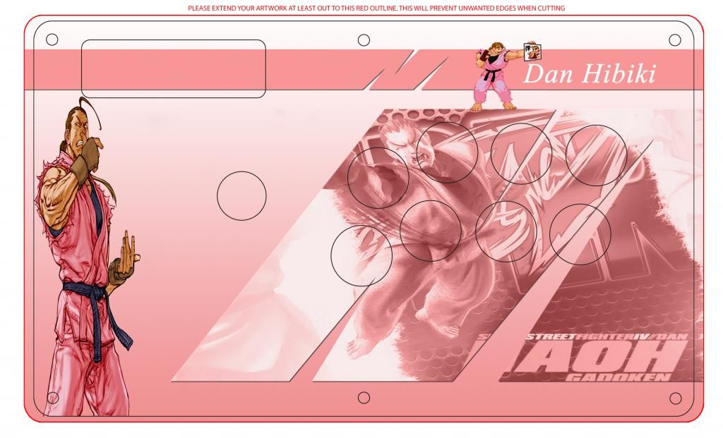
btw were you referring to my arcade stick artwork when you said that? I wasn’t totally sure if it was directed against me when you posted it under my art lol.
I thought it was funny that all the buttons and joystick were missing off of this mockup. I think part of the beauty of the art is seeing how it fits within the parts.
If he was, then he ain’t seen a Chuu stick yet. Probably stop his heart.
Okay I really think it’s missing something, I was thinking of adding the Sfz3 logo but idk. I also tried making the letters look a bit like the ones you’d see in Alpha 3 during the character select screen.
Frankly I’m more offended and grossed out by the fact that when faced with a situation where you are offended by something that most others seem to not mind, your first instinct is to wonder whether something is wrong with the larger community instead of trying to figure out why you can’t get your mind out of the gutter.
I like the composition of panels on this stick art. Good job. Fairy Tail is a great show, though I’m more of a Mirajane fan myself.
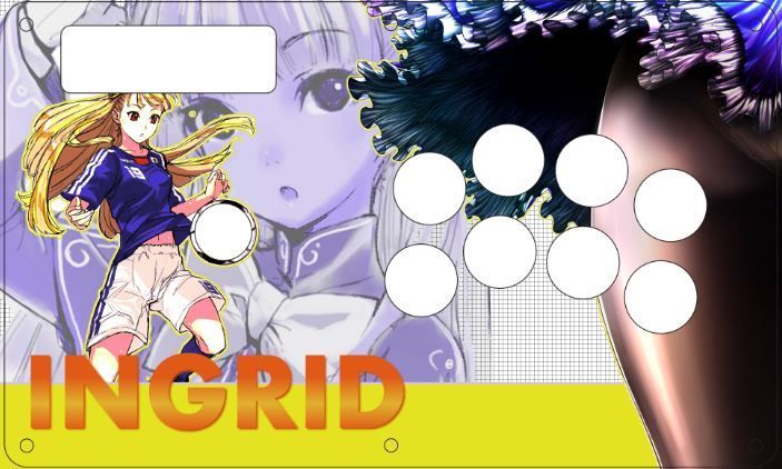
Logo can work in the lower right. At the same time, shrink the size of the letters in her name.
Maaan my bad I’m still new to this forum and forums in general- my bad for not responding sooner. I need to modify my notification settings cause I never got a notification- anyway, ShoutOuts to @deathzerozx he had my back- set me up real nice.
But- thanks for being willing to help out and put yourself out their!
Thank you for your input. I figured I would try putting the logo under the button arc, but please tell me what you think. It would look more "logo"like if it were at the very right corner in my opinion
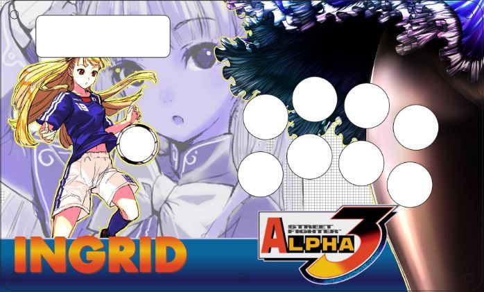
Personally, I’d shrink the name down a bit more to keep it within the blue bar you have, and maybe position it to sit in between the two screws you have there. At the very least move it over to the right a bit to get it away from the screw.
The logo seems out of place to me. What if you made Ingrid and the logo the same size and lined them up on the blue bar, keeping them on the same horizontal level? Or maybe have them the same size and sitting on top of the bar if you want to keep the SFAIII logo right under the arc. If you don’t like that, at least keep in mind where you’re going to have the buttons, reposition it so the button lip doesn’t cover the logo.
And what about resizing the character art a bit to get her head out of the turbo area?

Yet another Sakura template…
I got a MC SCV coming to me this week. Any good templates? I was gonna build a stick from scratch but didn’t have the carpentry resources I expected. I did have an artist friend of mine make me this one for the stick I was gonna do but that won’t fit on the SCV 
Artwork for my in-the-works Black/Gold The Walking Dead themed TE. Going to have Black Rim/Yellow Pushbutton Sanwa’s, and probably an all-black Balltop+Shaft Cover, and ordering the black/smoke TE side panels from Madcatz to replace the white bezel pieces. 
Top:

Bottom:
