It’s not that he’s gotten worse its just different artsyles. Nowadays he’s using the much more simplified artsyles so prevalent from the 2010s. As the cool kids call it, the “Tumblr artsyles”. Skullgirls, Steven Universe that type of thing.
Back in the 90’s the cool thing to do was to make every piece of art as detailed as possible, which IMO, made every piece of art a treat to look at. Wish I could say it’s just nostalgia fueling my boner for old art but nah, it’s better.
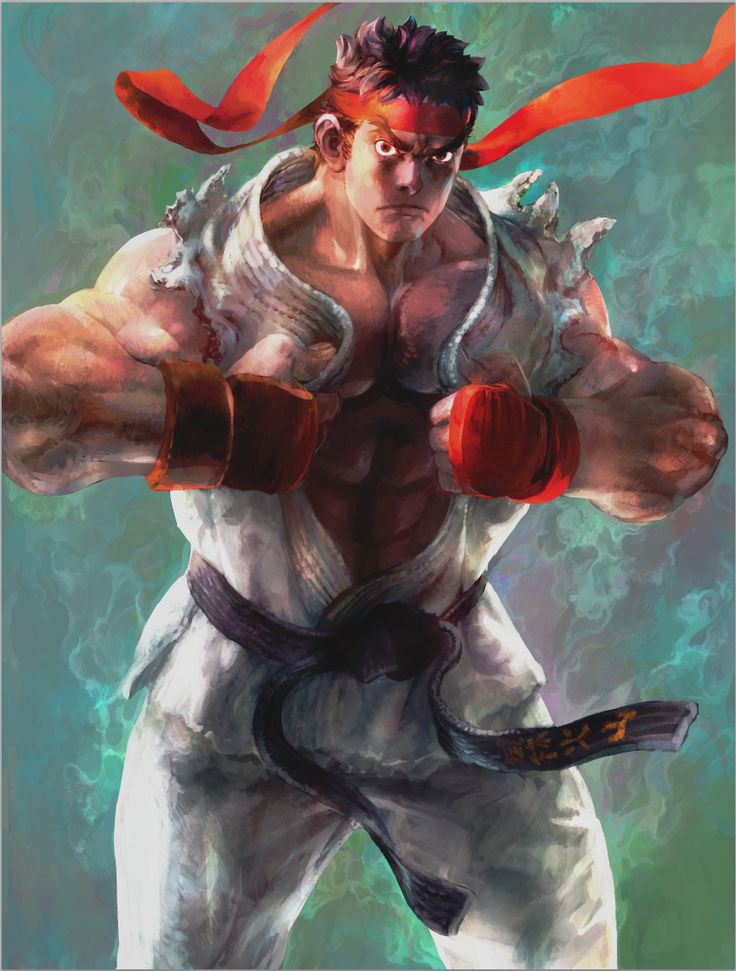
It’s why Kinu Nishimura is my absolute favorite, the level of detail on her work is fucking godlike.
I think the people being so critical of these Bengus drawings are forgetting that these are supposed to be like comic panels, not character portraits or other promotional art.
This artwork is clearly better. And it’s not just a matter of style. It’s actually still in a VERY similar style…but the workmanship is degraded. There’s artistic shortcuts all over the place and it’s a simplified work ethic. The new “style” isn’t a style so much as an approach to be able to crank this stuff out asap. There are basic anatomy, perspective and line-work flaws that are simply atrocious, especially for an artist of Bengus’ incredible caliber.
An example of a similar work degradation is visible in someone like John Romita Jr. Though not as good as Bengus, JRJR was solid and competent, much more so than MANY of the artists prevalent in the 90’s but his artwork has actually gone down in quality as he’s picked up more and more shortcuts, effectively distilling down his own style to a blocky, sketchy pencil-dump on the page. Occasionally he’ll turn in a real effort, but the difference in pure quality is pretty obvious.
Holy shit we must be thinking on the same wave length or something because this was the exact analogy in my head. I still have all the issues of Daredevil: The Man Without Fear, I picked up from a used books store back when I was a kid. That blocky style just fit so perfect with the darker themes and tones those stories presented. Then over time the detail in his work plummeted, all the colors and style were intact but it was the detail was lost.
Could it be that the transition from pen ink and paper to more digital work has somewhat compromised the overall “comic” style feel the artwork is supposed to represent?
I’ll be in the minority when it comes to Bengus work in SFV. I’m loving the work he’s putting into the game. The story mode art is has much more dynamic and flow than you normally see from his promotional art. Understandable that detail gets lost. The lost in detail won’t be a big deal if things were done with comic panels instead of splash pages.
Dude, I have never liked that artist. World War Hulk could have been better if not for that horrible art. What’s with those faces, you know? On the other hand, I didn’t know he worked on X-men. Always good to see some Selene.
Exactly! I mainly just wanted to show two similar scenes and how detailed one is vs the other.
If there’s one thing that Bengus’ work in Street Fighter does is tell a story. He’s done this consistently throughout his career and SFV is no different.
The fact that we can take info from a lot of these new screens and build a possible story around them speaks for itself.
Let’s also keep in mind that Bengus has to do A LOT of still art for the story for the entire game. And assuming there is gonna be more than the 16 chars + 6 DLC ones down the road, can you imagine how many art drawings Bengus has to do? It’s quite an undertaking, especially since Ono wanted SF to have a more detailed and cohesive story tieing everything together. So regardless of whether you like his art style or not, at least respect him and the amount of work he had to do to provide in what we hope to be very solid character stories.
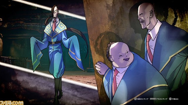
Let’s keep in mind too why they would pick someone like Bengus to do the prologues for the characters. Could it be that maybe he has shown us the likes of Sagat with hair and both eyes, Goutetsu, Zeku, Akuma the fruit seller, and many other plot elements through artwork alone? If anyone is certified to tell Street Fighters story through art it’s that guy.
I don’t think it is a coincidence that they chose him to do the art. He did the Alpha series which in many ways was like a prologue and backstory for SF2. Revisiting the art style seems appropriate for its intended purpose.
Capcom: Hey bengus! we got some new freelance street fighter work for you
Bengus: Cool!
Capcom: but… were kinda tight with money… we cant pay you much…
Bengus: iscool niggas…guys gotta eat right?
Wow we really ARE thinking on the same wavelength because the Daredevil books (specifically when he faces off against Blackout and Mephisto) were precisely what I had in mind in comparison to something like his garbage recent Avengers work, etc.
And even then I never LOVED JRJR’s work, but it was appropriate for the book and still had craftsmanship. His new stuff is lazy garbage.
It’s not Ken, it’s Dante. After Donte took his spot in DMC he needed a job. So Ken hired him to be Mr. Nanny/A Body Double. Notice how he has blue eyes. Ken has brown eyes.
