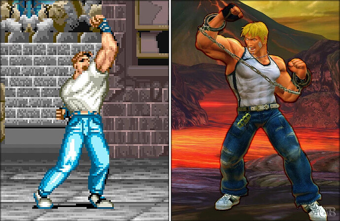
Probably because they don’t want Axel to look like a Cody ripoff.
Axel looks fucking terrible
it’s for the sake of individuality from other very similar from Cody,
Also to avoid being bland and generic.
Axel looks like a hobo nowadays the beard and the fashion works if he is definitely need those stuff around him.
yet the additional denim on top is enough to separate along with the beard.
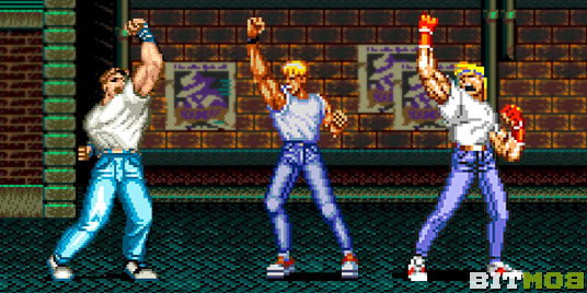
Cody on Riot Zone’s Hawk
Hope they explain Axels a dad now given the dad body. At least theyre not discriminating his man boobs also bounce!
The main problem with the Axel design is he is standing straight on and the jacket covers up his torso making him look like a sausage. A small tweak could improve the silhouette.
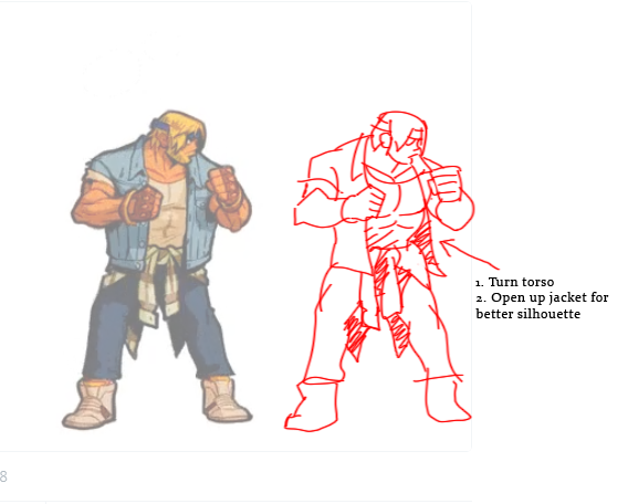
I said early in the thread that errors in the way they made his cloths hang were a major part of people’s hang ups about his alleged “dad bod”.
Stubby legs and highly questionable shoulders and neck are much more of an issue, anatomically.
But the clothing is just mad lazy shit that gives rise to the complaints that people have been voicing.
Also his right foot should be turned in more as well. It looks super weird as is, moreso if you turn his torso
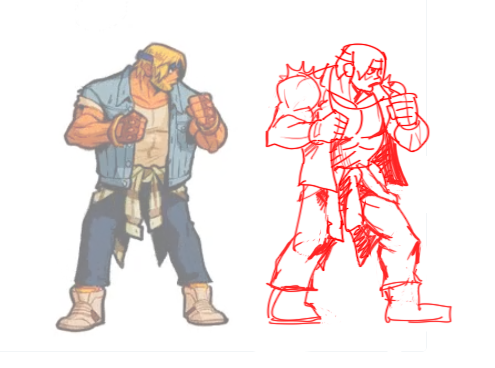
Maybe a little more straight on, but definitely way better than it was
He looks better and still aged but not totally out of shape.
10 minutes photoshop, i don’t like it, but i chosen to don’t modify character design or height
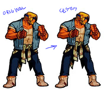
Still bad character design imho, too overdone
Remove the blue jacket will not make it automatically a “Cody clone”
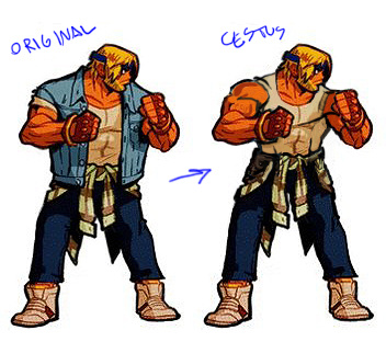
How fucking tempermental is the weather in that city, that he’d need to accessories ahead with THREE shirts?
Because if that isn’t meant to be a long sleeved shirt tied around his waist, he’d benefit from STRAIGHT Eye input, let alone Queer Eye.
Agree, Yet is If he is a hobo that would work
Don’t those young chicks like dad bods???
Classic Axel is being saved for dat 5 dollar DLC lol
Knowing animations/frames work i will not be surprised if they already did classic cool Axl first and then AFTER they added shitty jacket, beard, waist vest etc
Original Axl have a more simple design to animate
First of all, whats up Shoryuken. Random internet person at your service.
I’m gonna preface this by saying I’m pretty excited for SOR4.
That out of the way, I’m on the same page as a lot of others regarding the art style. I’m not a fan of the cartoon look, but I’m happy they didn’t go the pixelart route. I don’t mind the design decisions too much though. I can roll with homeless dadbod Axel. And thicc mombod lactating-t!ts Blaze is OK too I guess.
SOR4 plot speculation: Axel and Blaze hooked up. Blaze carried the kid for some time and it was the beginning of a happy family. But then, Mr. X came back for revenge and gave Blaze an abortion punch when Axel wasn’t looking (think Double Dragon Marian) and left. Right out of the hospital, the inconsolably angry couple set out to avenge their unborn baby by Grand-Appah-ing all the goons in Rage City in their kid-makers.
Anyway, I’m more concerned about the choices of animation. I mean I can live with this art style and these designs if the animation comes across as satisfying. The feel on the stances, idle animations and hit animations at this stage seem off and I don’t want them to remain the same in the final product.
I agree that Axel is better suited to his old squared-on stance than this new sideways one. Blaze’s stances have been known to be awkward (except SOR1), but it’s 2018 now with women’s empowerment and shit rolling along at max speed. So, they really should fix that inwards-knee-girly-stance into a more legit looking stance.
Axel’s idle animation. I like that the animator went the extra distance to add so much motion to an idle animation… but… why is Axel so bouncy? I mean he’s barely even hopping on the ball of his foot. Yet the rest of the body is bouncing like he’s really a water balloon or something.
Anywho, the forum bot is asking me if all this typing is necessary or adds anything to the conversation here. I just wanna get this stuff off my chest.
you must be joking, that tune is already a classic streets fo rage tune (SOR2 1st stage ost ) and is an nth ripoff of Big Fun (1988) by Inner City . Some say it’s Good Life (same year, same group) but it came out a couple of months later and the electronic beat/tune is almost the same.
you mean this:
exactly.
Big fun evolved into Good Life, which then was soon after sampled to death by many other groups like Hithouse’s “move your feet to the rythm of the beat” (1989), https://www.youtube.com/watch?v=p1YK2WoZcI8 notice the dominatrix hookers in the clip.
For those who are interested and not yet aware, here are two vids showing the striking similarities between some commercial tunes and those heard in SOR games :
Streets of Rage 1 Music Similarities - YouTube
Streets of Rage 2 Music Similarities - YouTube
