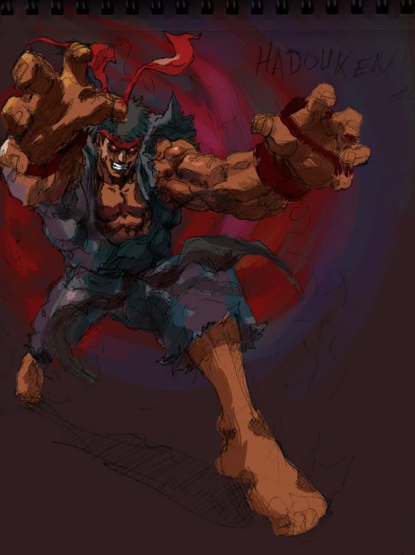
Just some junk I did a few days ago. Miss you guys.
I like how you went from evil, to angel, to childlike innocence, and then back to evil again.
I love that third picture though.

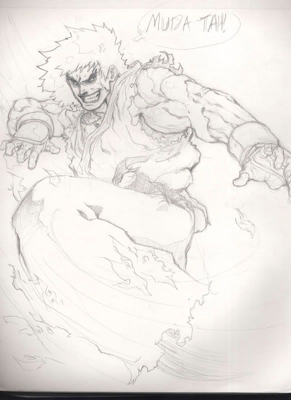
Looking good man! Second one is very nice. I haven’t seen that one yet. So when are you going to color comics for pros? I think you can do it.
To be honest man, I dunno. I’m thinking about submitting some work to Marvel or do some commissions for other aspiring artists sometime in the future. Right now I don’t have a comp and I’m just freestylin, sad-to-say. I really wanna focus on my line art to tell ya the truth. Can you crit me a bit, bro?
Here’s something I just did this at school. Their scanners are terrible. 2 hours. Gotta go, class started and I’m late as hell. Thanks Master Chibi!
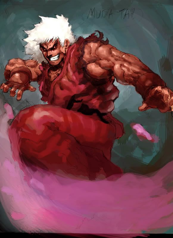
Your drawings are good Kando. You also have to remember that drawing is just not drawing. There is also mathematics to them. Composition, line weight, visual continuity etc…
Ok so your drawing is solid. The elements you are missing out on is energy flow. Since his leg is kicking to our left, the rest of his body is going to swing to our right. That automatically swings his hair, the torn sleeves, and his body suit in the opposite direction.
Composition wise his hands are pretty static. make them flow along with each other so we can capture the feel of the impact. Overall solid work. Just remember that drawing isn’t just drawing cool muscles and fancy lines. Throw in some of those elements and your pic will look ten times better.
Ahh, sweet crit, Pete. I’m definitely gonna use this for future referencing. You got any pointers on Ken’s skintones? I couldn’t really get that warm feeling down without making his skin look the entire sun was on him.
Looking top man. I see that you drew the Fish Guy with a Blue Sky bag haha. If you want to improve your lines just take some figure drawing classes or attend some open sessions. I’ve been going for about a month and it’s helped a lot. Ken’s skin looks pretty warm already. But no matter what his gi is still gonna look warmer since it’s red. So you can get a warmer skintone if you cool down other areas.
Pretty sweet stuff man. The winged girl doesn’t quite look like she’s flying though, I think it’s her legs that’s throwing that feeling off. The little kid in the fish helmet rocks.
DF - I hear you on that man. I’ve been studying figures and perspective alot recently. It’s kinda changing the way I think. I feel like an idiot for drawing the way I did. It was soooo the wrong approach, haha.
General Tso - Yeah, Kando’s actually supposed to be really low from the ground. Kinda looks like she’s on a swing type-thing right? That was kinda what I went for. Kando can’t fly at all :lol:. Thanks man.
Just recently did a collab with Sam Wells. YRP in position.

Here’s his page-> http://liquidxlead.deviantart.com
>/c( /.’)>
hot stuff… .really like the winged Kando 
nice stuff man, who is the last character (version.) based off of mugen
anyways i saw ur stuff on deviantart. the ryu really caught my eye. i saved it to my comp which i dont usually do
I know it’s not yours, but i’m not big fan of the sketch. Your colours though are excellent. Really refined.
Good work!
Ah, yes. Liquidxlead. I can’t say I really like the “plump” treatment, either.
jebus christ kando you are really good! and still, sfmc is always correct hehe
Get to colouring that Ken, stat.
Wow, KANDOKEN, doing really great… You still have the knack for making really effective facial expressions… I love it!.. That Ken was actually very nice by itself IMO, but SFMC made a good point about the rhythm flow as well… Your colourings though are tops… Hard to critique good colourings!.. 
Seba - Go for it! I’m up for any crits!
Here’s something new I did with my buddy Jon.
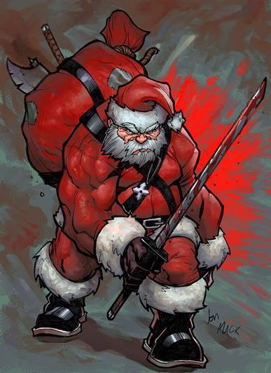
http://jpm1023.deviantart.com’s his site. 
goddamn dude. the red in the background is what makes the picture for me
I always like it when people called their own work “junk” and it turns out to be ridiculously good.
I’ve got no hard critiques on your colourings… It’s your style that you acquired so I can’t be critical about anything (and I’m no expert either)… But so far, they’re all looking grand!.. Which artists are you drawing inspirations from with your colouring?..
Fantastic colouring!.. I’m noticing them creases; well-done!.. And nice touch on the ‘fuzzies’ on his hat, sleeves, and boots… Good job on the boots!..
