Yeah, that works a lot better man. Great job! 
Ryu;
Awesome work!.. Fantastic!..
gives applause
nice rendition of dhal know-one. I’m diggin the slightly buffed up version =]
Here is an early Rose. I did this before I did the Rolento cause I thought she was next. Hanz you must love the artwork for cfj I see. I do also and your pics look cool man.
http://members.lycos.co.uk/shermiefan/jpgs/rose_a.JPG
I’ll try and make a non-chibi one within the following week, and if I do, will decide from there.
I no the fanart for ryu ended a while ago, but i just read about this fanart thing today.
LMK what u guys think. ya. i’m pretty bad w/ backgrounds and shadows, i had to photoshop his shoulders cuz i drew them too low so it might look off.
HOLY SHIT SFMC!
Best Rose Fanart EVER! Thats amazing Man! The lighting the angle the pose everything! I’m blown away! My fav piece in this challenge so far!
Well I’m almost embrassed to post my Rose picture now. Oh well here goes:
http://img230.imageshack.us/img230/4641/rosecolorweb23vi.jpg
A few issues here and there. But oh well.
smartasien: Nice ryu man. The face looks a bit floaty, maybe work on the postioning of the eyes and a bit of work on the nose. And maybe bring the chin up a tad. Other than that looking good. Keep posting man. I wanna see your Sim!
More crits… I dunno when CW is gonna be back on the thread, he just flew to San Diego for a 3 month internship. But he should be getting internet soon.
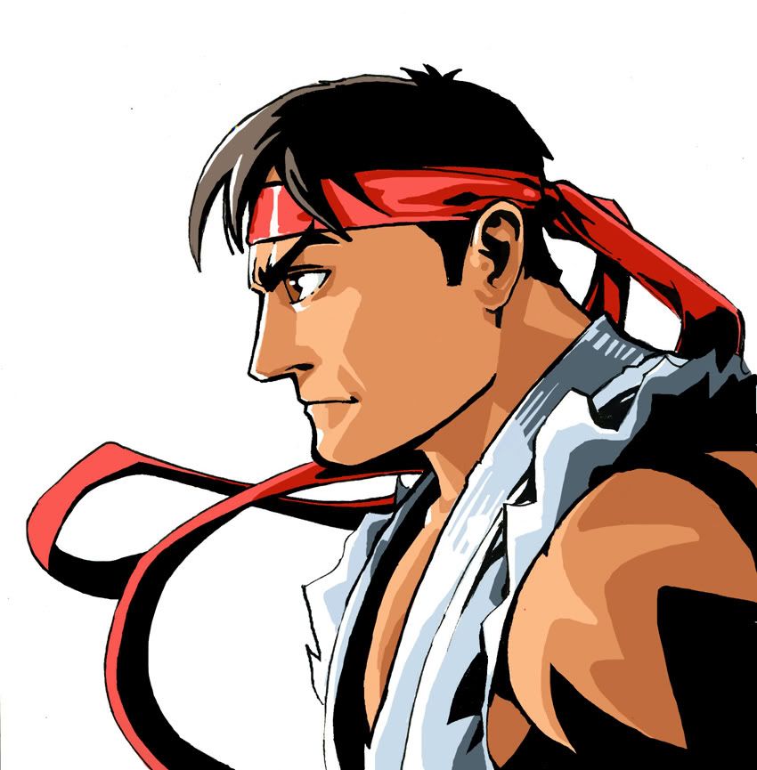
Hanzou: Great Ryu, definately capturing the CFE art. Keep it up, lets see Dhalsim ^_~
SFMC: Awesome Rose man, I’ve loved all of your stuff on this thread and I’m liking the Rose the best of the 4 so far.
Smartasien: Post you info so CW can put you on the artist list. Looks pretty good, I agree with CptMunta. Also watch the width of his neck, looks a bit too beefy.
CptMunta: Good Rose, a couple quick suggestions, watch her hands they look rather masculine. Secondly I think her head should be a little larger, the features are right just give her some more cranium.
Damnit, i was coloring my rolento while using a picture as a reference so i had two documents opened in photoshop. After i was done i closed the wrong document! so no colors for rolen
2:17 AM, just finished Rolento. Gotta wake up at 7AM. No time for a long post for now. Must sleep. I’ll make a real post tomorrow. For now, here’s meh Rolento:
http://ronssketchpad.combovideos.com/csfac/myart/rolento_ronchan.jpg
Thanks! Please do the current character too if you have time!
Here is my, as usual, noncolored entry. Not quite as dynamic as the Dhalsim, but I wanted a more relaxed feel. Rolento doesn’t look like he chills too much, lol. So here is his chance to just pose for the pic. I know his staff does not bend, but I don’t care, I made it a flexible anyways. Also I noticed after I finished the piece, that the staff perspective is off in comparison to his right arm. Oh “F” it man, I’ll be more aware next time around. Enjoy SRK members.
Gotdamn I love this thread. Everyone here just keeps raising the bar in terms of character art. Too many to name individually, but all of you guys are really kicking ass. I hope we can keep this up to the end.
Thanks for the comments SFMC, your Rose looks great. You really caught the mystical mood of the character.
Oh and Bandit, I’ll be posting up 'sim and Rose tonight. 
Ugh, are we on Rose? Did I forget a week?
Anyways…here’s Rol.
A bit too sketchy, but meh. I have never played/drawn this guy before. :tdown:
http://img.photobucket.com/albums/v661/PoisonElf/Rolento.jpg
That’s some tight linework. You and Seba really throw down the tight lines. :tup:
Apathy: Nah, you didn’t miss a week. Rose is due next Friday, these crazy men are getting ahead of the game. I don’t think your Rolento is too sketchy at all, nice action pose, really great and loose. Good foreshortening too.
Oh good, thought I was losing track of time again.
Working 3rd shift really messes with you…
Woooo, I haven’t made a real post in a while, and I’m in a critique mood. Sorry, this will be long, haha. Hopefully my critiques don’t start to annoy people. I feel kind of obligated to give feedback and critique since I started this thing.  Thanks for helping run this while I was MIA, Bandit. Glad you’re helping to critique too.
Know-One: That Sim is sweet as shit, man. Seriously one of the coolest renditions of Dhalsim I’ve seen. The one thing that stands out a bit to me, though, is the skulls. The drawing of Dhalsim himself has a lot of depth and volume, but the skulls seem a little flat in comparison. I think that’s mostly due to the views being only straight up frontal or profile, rather than 3/4 or even seeing them from below.
Good lookin’ Rolento too. Very clean, and great hands. I think a little more variation in the line weights would pay off big depth-wise. Beef up the outside lines a bit as they come closer to us in perspective to make them really pop forward. Right now the close hand and the far hand have the same weight, as do the close end of the stick and the far end of the stick. Here’s a very quick edit:
http://ronssketchpad.combovideos.com/forumpost/know_one2.gif
The stick bending doesn’t bother me at all; I think it’s a cool pose. The way it is bending is just a little odd though. The stress points for the bend are his two hands and his neck, so it should only be bent between those points, but not after it reaches past his hands. Lol, having it bend past his hand makes it look kind of limp.
Good work man! I hope that wasn’t too long winded.
Hanzou: Good job, dude, you emulated the CFJ style almost perfectly. The only thing I can really say is, for a style that is supposed to be as clean and precise as the CFJ style, try to tighten up our linwork more to match. Although, I hear the Shinkirou actually did the CFJ artwork in Illustrator, which is pretty insane, if you ask me. What method are you using to color? Your black shapes aren’t quite opaque and you can see where you’ve painted under them. I can think of a few reasons that might have happened.
SFMC: Beat ass, as usual. Although, I think the arm holding the card is just a little bit off. With the way she is arched back and how her hand is positioned, I think her elbow would be just a little higher so that we see a little bit of the top of her forearm. The hand looks good, but the way she is holding the card doesn’t look like the way someone would hold a card though, so it looks just a little like the card was more of an afterthought. Keep up the ill shiet!
4neqs: Fun lookin Rose chibi. Rose is supposed to be very curvaceous and womanly, so try giving her some wider, rounder hips.
smartasien: Looks good, man. I think the dent in his upper lip is just a little bit too pronounced. Tone it down just a tad so that it doesn’t indent quite and deeply and as sharply. Also, I don’t think the center of his lip should have a highlight there; the whole upper lip faces down, so the whole thing should be in shadow, including the middle. Why such a small pic? I automate the gallery production for the website, so it’s gonna get stretched out to 650 pixels wide, if you have a larger version post it up so this small one doesn’t have to be stretched so much. Give me your info so that I can add you to the participating artists list. Good job!
CptMunta: Pretty cool, man. Bandit was on point about the head, she needs a bit more headspace above her eyes. But rather than make her head bigger, I think the facial features can just be shrunk and adjusted to fit in the head better. The eyes should lie right about directly in the center of the head vertically. Hehe, also, be careful about cutting off people’s feet. Seems like a bad habit a lot of people have. I know several artist friends that tend to do that. To prevent this, start a drawing by drawing a line at the top for the top of the head, and a line at the bottom for the bottom of the feet, and draw the proportions to match that height. Are you using the smudge tool on some of your linework? Most of the time the smudge tool is a no no. It’s best to avoid the smeariness that the smudge tool produces.
DFist: Aw, man, that sucks that you worked on a colored version but forgot to save it. Looks good anyways though. The pose is very cool and very appropriate for Rolento. I think his back is just a little too flat, and a little stretched. Foreshortening is tricky. Try using clothing to accentuate the action of your drawing. Since he is falling, his clothes blowint upward would help show that action more.
HB: Very cool composition. The skintone is lookin a little on the yellowey zombie side. Throw some more reds and pinks in there to liven her up. Try to think about directional lighting and cast shadows more. For instance, if the light is coming from the left, shouldn’t her scarf be casting a shadow onto her body?
Apathy: Very nice foreshortening, and very active posing. I think his head is getting a little stretched a little oddly. Drawing a vertical and horizontal axis on the head can help with keeping the features centered and positioned properly.
jz_chu: Very cool, man! The musculature looks real good. That’s a very challenging view to draw someone from, and I think you pulled it off very well except the head is just a little small, and not quite in th e same perspective as his body.
Great job everyone! I’m glad all you guys are so into this!