What’s up Photoshop All-Stars and weekend warriors, GIMP’d out guerillas, MSPaint Professionals and bitmap badasses?
Time to LEVEL UP! your stick art creation game. Tired of seeing/making the same old character with boring background templates? Tired of ripping off D3V’s designs and feeling proud of yourself? Need a hot, wet, slimy injection of inspiration to help bring your creativity to the next level?
Well fear no more, because:
I CHALLENGE YOU!
This is not a contest, this is a challenge. You are encouraged to provide constructive and emotional feedback to your peers. Anything from a simple “This is great!” or “I don’t like it for some reason” to “I think maybe you should bring the xyz layer into a clipping mask for the thing on the right and add a style to do blah blah blah” is encouraged. After we get a sufficient amount of arts and reactions, I’ll try to post the most popular ones on the first page of this thread. Time to break out your magic wands folks:
Okay, here it is. The art that inspired this round of the challenge. My own personal self-inflicted masochistic creative limitation come to life.
Some of the immediate challenges I noticed when trying to do this was to make it visually dynamic. When you only work with two colors, it’s hard to create any sense of depth using conventional techniques, so perspective, layering and distortion were key here. I decided to use Persona 4: Arena as the subject matter because a lot of the art from the Persona series is very “contrasty” to begin with, so it seemed to fit. I can’t wait to see what you all come up with!
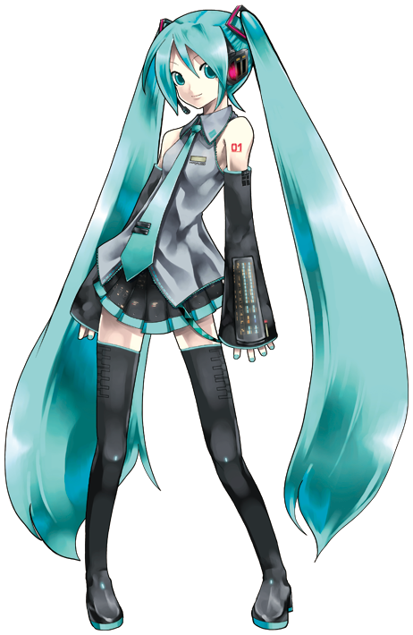
I feel that the outline around her can be made thicker. Also, the way she was turned black and white could use some tweaking as well. For example, you could try keeping her hair black.
I personally like having her eyes + mouth stand out but I’d like it better if the feet were cleaned up (like those little tiny highlights that are super small kind of breakup the flow of the foot imo)


![http://fc04.deviantart.net/fs70/f/2013/197/1/7/miku_equalized_by_jokesontwo-d6dp9ul.jpg[img][/details]](http://fc04.deviantart.net/fs70/f/2013/197/1/7/miku_equalized_by_jokesontwo-d6dp9ul.jpg%5Bimg%5D%5B/details%5D)