Does anybody have some artwork for the injustice stick to post???
Good work. Did you use my method for the button border?
Good work. Did you use my method for the button border?
Thanks 
Yes, but I made filled circles instead of bordered and applied a texture.
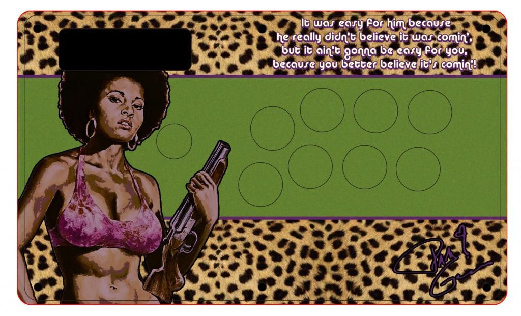
Just started working on art for my pam grier stick. Still havent even gotten the TE yet but i figured id start fleshing out things out before i get the thing. need some ideas on tweaks and possible ideas for button art.
I’m working on a Rikuo/Darkstalkers art but i’m sure my aptitude on PS is not that high =/
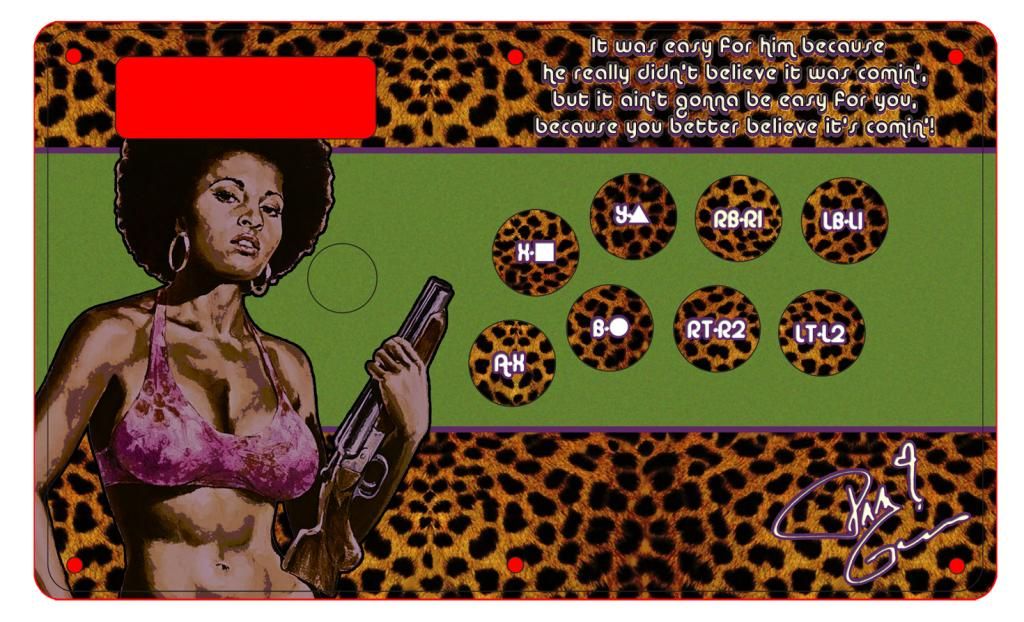
Updated it. I’m pretty sure this will be the final.
anybody know where i can find the original panel artwork for the eightarc sapphire or synthesis?
I would swap the sitting Sakura with the Sakura behind the buttons. I think the action pose would be a lot more interesting to look at instead of hiding her behind the buttons. I would also cut the drop shadow around her, put it on a different layer, then add a transparency effect so it blends better with that blue-lined border you have. Or erase it and add a drop shadow effect.
Hori fighting stick VX/V3 template. Had to do it over myself.
Seems to work just fine with the stick I just did.
As a Nanoha fan, whle I like it, there could be some work done, as I’m not sure if the vector drawing is needed or too unwieldy.
I have the finished product in front of me. It turned out pretty well tbh. He only gave me the vector which he did a while back. The hori V3/VX plate is pretty small so I couldn’t really fit her anywhere without it being oddly cut off so I just used the vector lines to fill the white space since I didn’t know what else was needed from him. Also the button cutouts aren’t there otherwise it’d explain a lot of the art placement
Here is my 1st attempt w/ photoshop. It’s a real pain to convert the Blaz Blue Viewlix to Noir layout. Juri is the star here : ). Any thoughts / ideas on these? I feel like the top is a bit empty.
Edit: move Type SF to top right.
Edit 2: final
[IMG]http://imageshack.com/a/img600/5344/ufht.jpgUploaded with ImageShack.com[/img]
[IMG]http://imageshack.com/a/img560/2429/ladd.jpgUploaded with ImageShack.com[/img]
they feel… very crowded, IDK. feels like there’s too much happening but its also up to you. the top do seem empty compared to the rest.
I like the style, but I agree with dej, there’s a lot of empty space but the space you do take up feels crowded.
Perhaps move the type SF thingy to the top right, or just delete it? xD that’s the only thing I can think of.
The street fighter IV logo looks distorted to me. And there is too much going on.
I’m not sure if this is entirely the right place to ask this, but it seems as good as any.
I’m looking to hire someone to create some Sagat artwork for a TE stick. If anyone is interested, please shoot me a PM!
Hey guys, I apologize if it was already asked but I looked a bit and didn’t see it - when you get this printed out, does it have to be from the .psd directly, or you can bring it in another format to get it printed?
Format does not matter, any format would work.
You would want a lossless format, one that does not compress the image for maximum image quality (example: avoid gif and jpg formats)