haha you sooo right !
Here’s a shop question: How much do you guys up-scale an image for stick art? Can you blow a 2000x1200 image up to full TE size without it getting all grainy?
Thanks a lot deathzerozx! I will check immediately my psd files.
If all goes as planned i should have the Cable and Deadpool art on my stick tomorrow, but man, that Power Rangers art is awesome 
Anyone have a good link to some High Res KoF artwork and Metal Slug artwork? I’m going to be getting a Qanba Q4 that I’m going to turn into a KoF themed stick. Then I’ll use the Metal Slug artwork for my SFxT pro stick. Thanks!
The smaller the original image, the grainier it’ll look when you scale it up in size. Sometimes if you start with a pretty big image it’ll look fine when scaled up a bit. For smaller originals that look too pixelated when upscaled, you might be able to make them look a bit better with blur filters.
I had posted this once before but it had a lot of mistakes. Kinda feel like a revised fixed version deserved an update.
http://img.photobucket.com/albums/v185/redsoul/FSsample01.jpg
One Piece design for a client.
http://i.imgur.com/DXPmvKy.jpg
EDIT:
Nitewalker widebody top and bottom panel designs for FNEX coordinator ShadowYamato. Grey area in the bottom panel is for a “window” to show off the wiring which I believe will be done by @Gummo .


@redsoul: nice work
like the combo of artwork and red joystick LED.
Here in Germany there is nobody who sells the injustice stick :-/
Thanks, that’s actually just a translucent red dust washer and shaft cover.
great placement redsoul, the ball top is like fireball being charged around her hand
I finally went to the printer shop with fixed design and have it laminated with canvas film, very nice feel to touch
[details=Spoiler]

can’t wait for the parts from akishop to arrive[/details]
Does anyone have a Doctor Doom template? Highly appreciated in advanced.
Just read that Dodonpachi Saidaioujou will be region-free and changed my fightstick pro art in a furry of hype. The colored tiles each have a level boss inside them (1-5). Using a clear LS-58 with sanwa clear balltop, and clear+solid OBSFs.
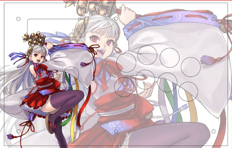
Okay, so remember this that I posted a few days ago? [details=Spoiler]
[/details]
I went ahead and added stuff to it, so it was less plain, I’m taking a liking to it. But do you guys have any critiques on things I might have overlooked?
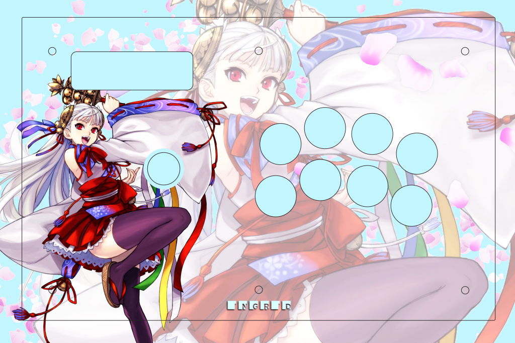
I think drop shadow on that Ingrid kinda ruins it, maybe if you want to keep the shadow, at least keep it non blur by adding “spread” and reducing “size” on the “drop shadow” menu, or
just copy the text layer, rasterize it, made it black and white, then adjust level if you want to make it less black or want to add some tint (or simply use “color overlay” from layer style menu), and then drag it a little so it serves as shadow.
another thing, her bell and knot hanging on the bottom are a little bit too close to the screw, I think you might regret it once installed.
some solutions:
- either put the bell exactly on the screw, so the screw head becomes the bell, where you can paint the screw head bronze later
- or move it away so it doesn’t clutter together there by make it tad smaller, or by rotate it few degree anti clockwise
hell yeah we workin up the dodonpachi themed sticks around here! minor nitpick, because of how the pattern is set up and how the cave logo is, it looks kinda odd, have you tried using the variation with the framed C?
The bright blueish background is kinda making it look unfinished, have you tried using something with more detail? like very subtle clouds and whatnot? since there’s petals blowin’ about, maybe a vague image of trees might be nicer.
I was actually putting an overlayed blur on ingrid to make the colors more saturated. There isn’t a drop shadow on her, but do you think that maybe taking off the blur and adding a dropshadow would look more professional?
As for the bell suggestion, thank you so much; I hadn’t even thought about that. Plus the bronze screw would look pretty neat 
Thanks for the feedback, but this has always been my favorite Cave logo. I couldn’t resist using it.