looks at avatar, looks at post
rofl.
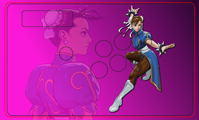
Yeah it bothered me too. I was worried because the original image ended at half of her foot; however, I edited it and it turned out the image ended up perfectly with her foot in the joystick hole. So I fixed the problem guys. Thanks for the feedback though!
Looks a lot better now, having a joystick for a foot is better than a button for a knee. :lol: I’m not a huge fan of the font choice, though.
Really? I picked that font out of 10 and that one was my most favorite and fit the most with the personality of the character.
Well I’m not really familiar with the character, but I find the font tacky-looking in general, and it doesn’t really suit everything else on the stick. I’d personally go for something blockier, but maybe I’m being too picky?
Yeah I’m sure something blocky would work but if you did watch the series then you would understand why I chose that font too. I would appreciate it if you could show me a font you’re talking about.
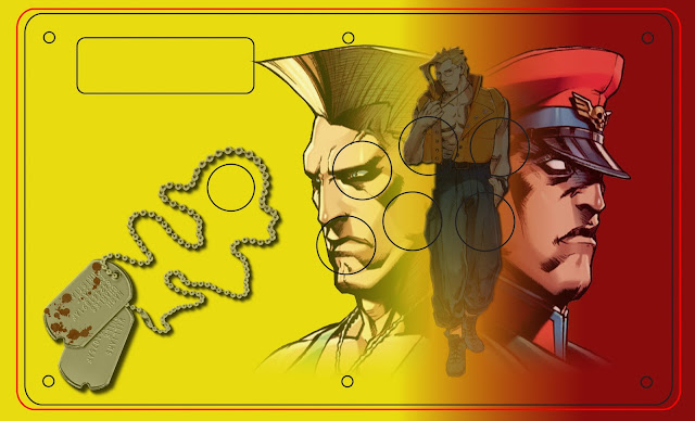
another design. the outline is alittle more thin that it should probably be, but whatever.
Why did you use Circles this time? The rest of the border uses straight lines as opposed to curved ones so, wouldn’t Hexagons work better?
the circles were originally going to be part of another thing i was going to do. i ended up going in a completely different direction, but if i ever end up doing anything with this, i’ll probably go with the hexagons.
Like I said I’m not familiar with the character/series, so if it intrinsically makes sense, then go for it. :tup:
Here are a few examples of what I might use, though:
http://www.dafont.com/transit-display.font?fpp=50&text=KAREN+BEE
http://www.dafont.com/times-new-yorker.font?fpp=50&text=KAREN+BEE
Recent commission:
http://savingprincessdesigns.com/wp-content/uploads/2012/04/Aerokun-Chun-Li-TE.png
Going once! Going twice! SOLD! To the man with the Domo in the suit! The Transit-Display was genius! Kudos. I changed the font now! I’m not sure if the text is better up top or bottom. hmmmm
I just got news from a friend that i might actually be getting a TE if i can pay for the shipping… in my haste and excitement, i made myself a 6-button TE design.
Decided to make a SDM themed stick, tried to keep it as simple as possible. Let me know what you think.
I will probably thin the black outline of the right character when I get the chance.

Something I’m working on at the moment. Feedback/suggestions would be greatly appreciated.
Hey guys…long time fan of a lot of art on here and a keen AE player…
Here’s a couple of my first pieces for TE sticks. Extended templates.
Old art from my girl’s stick…and then mine…pretty simple and plain I guess…
design for butteroj’s foehammer case. made the template myself from his scan of the plexi so i hope it fits,
http://img560.imageshack.us/img560/9607/foehammerroughtemplateg.png
Hey guys does anyone know the name or where i can find the font for the madcatz tournament edition text. Im looking for the typeface that goes right under the home buttons Im working on a design for a stick dont know where to find it, or the name of it, if its existing already
fireye gf.
thanks buddy…you da best mang!