Unfortunately, all indications seem to indicate that the new Smash may have as many if not less characters then Brawl due to the mandate of it sharing the same roster as the 3DS version. So most are expecting the usual 2, because Marth is mandatory so we should expect one more, if they follow the pseudo tradition it will be a character featured in a upcoming or recent Fire Emblem release. So short of them advertising for Fire Emblem x Shin Megami Tensei or a brand new unannounced game, it probably will be someone from the Awakening cast.
Theres a post here that shows graphical update from Brawl to this latest installment.
Link’s hair is pretty.
Edit: CURSE YOU DOUBLE POSTING!!!
Edit 2: It seems Eventhubs posted up an article on it with a couple of extra images.
Very interesting. Thank you for posting the comparisons, Swedish Chef. A few things stand out… though before I say anything, please let me admit up front I am not an art expert, merely someone who has taken a few lessons on color and lighting in art to help in some of my work.
-
The proportions on Pit’s blades have changed. Look at the spot JUST beyond the hilts. In Brawl, these are very thin. In Smash 4, they’re thicker. Yet many other parts of the model look almost identical aside from a resolution increase. This suggests (it does not confirm, just suggest) they were smart about this during Brawl and designed art way above the Wii’s specifications… then toned it down to fit the hardware. Nonetheless they have gone back to edit some things here and there. Notice Pit’s hair is slightly different too, for example.
-
Mario’s design is largely unchanged, except that the skin going over the model now has less color detail. This was probably a conscious art style decision to make him as ‘primary color’ oriented as possible, which others have already mentioned (I’m just reiterating it since we have comparison stills now). Bowser likewise reflects this trend of reduced texturing/detail on the skin in favor of going with bold, obvious colors for each section.*
-
The above approach actually works a lot better for Donkey Kong! His design comes across as more vivid… having details blur together makes him look more animalistic (which he should). I didn’t like it with Mario or Bowser, but it’s a much better idea here.
-
Increasing the resolution on Link made it easier for them to show certain details, like something underneath his tunic… chain armor, perhaps?
-
Fox also shows this conscious use of primary colors or brighter versions of a previous color. However, unlike Mario they added detail to him, making his fur more distinct (especially around the face) and adding more definition to parts of his coat; esp. around the neck, shoulder, and collarbone regions.
-
Kirby looks about the same, though his Smash 4 image in the comparison video suggests either the source image was notably compressed or his visuals in Smash 4 aren’t done yet; the lines bordering his eyes look all jagged as if there were JPEG artifacts affecting them. Weird. Hopefully that’s a problem in the image and not the in-game art because otherwise they made him look worse?
-
Pikachu seems to have gone through the same simplification process Mario did; notice the black trim/edging of his ears is less detailed in Smash 4 (unless this is pending a change, and it might be; this could just be a temporary skin!). Brighter colors as usual compared to Brawl, though his proportions seem less slim now. Probably an intentional decision to make him more cute?
-
Mario’s second comparison image lends weight to the idea we might not have seen final skins in some cases, merely ‘near final, pending one last pass for adding details’. We see there that he hasn’t lost as much detail as the first images implied. Some of it has indeed been lost, but this is partially the consequence of using brighter colors. I prefer his Brawl look, but the Smash 4 one is fine and consistent with what they’re trying to do this time around. And in some cases, detail loss appears to be intentional; notice Mario has lost some detail yet Link is more detailed despite also obeying the “use brighter colors” art direction.
There are more comparison images in the video, but I’m going to stop here because I’ll start repeating myself if I say any more. Suffice to say though this is interesting to look at in a side-by-side fashion and makes one appreciate the jump to higher resolutions… for characters hailing from high-detail series like Zelda, Fire Emblem, Kid Icarus, Star Fox, and so on this is definitely going to pay off. It’s not a big deal for more ‘childish’ (in a neutral sense, I mean no offense to any fans of these franchises) things like Mario and Pokemon however, as most of their details came across fine even at the original Wii’s resolution.
Man…I knew Samus’ Super Metroid design was chunky but good lord. Putting it side by side like that with her Other M counterpart opened my eyes to more things that differ between them. I still prefer her SM/Prime design for her arm cannon though.
If it’s one thing I think Nintendo does best more than most other devs, it’s their understanding of color. They’re so good with it.
Bass and Protoman should show up as assist trophies in this game. When Protoman shows up his whistle theme plays for the first few seconds he shows up.
Looking through those pics, it seems like Kirby finally got the visual upgrade he was jipped on from the Brawl reveal trailer(continuity nod?)
Like Sonichuman said, I never really noticed just how bulky Samus’ Super Metroid design was. Other M design is definitely an improvement outside of the arm cannon.
I’m really digging Bowser’s redesign… If I hadn’t swore on my first born to support Mega Man 100%, I would probably be playing Bowser and Luigi in this new Smash.
Daily image has updated. Pretty clever one, too! Scroll up a lot if you can’t see it on this page (presuming default layout/etc).
As much crap as I like to give other M I did like the design of Samus’ power suit in that game, I still preferred the one in the Prime series but I still though it looked good, very sleek and futuristic, compared to the more bulky power suits from past games (or that garish blue thing in fusion, although that gets better later on).
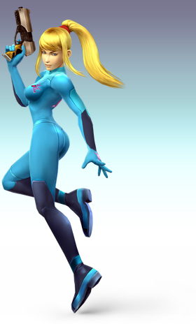
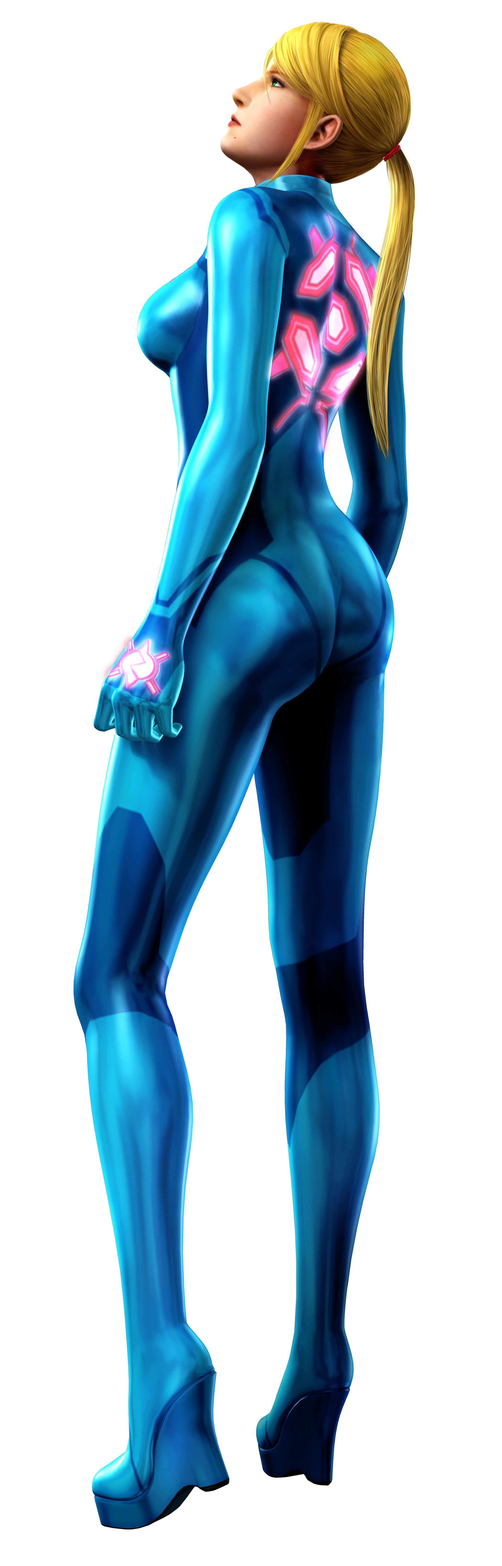
If Zero Suit Samus makes it into the game (Samus does have the same final smash as in Brawl so it’s likely) I hope they keep the design they used in Brawl for her rather than the Other M design. Because seriously whose idea was it to give her high heels?
Oh no! Kirby has taken control of the yellow devil and plans to destroy us all…but he looks so adorable! awwwwwww…
Also for those who didn’t play Other M and never will here’s some shots of ZSS from Brawl and then some shots of her from Other M for comparison.
Spoiler
http://www.ssbwiki.com/images/1/10/Zero_Suit_Samus_SSBB.jpg
http://fc03.deviantart.net/fs25/f/2008/070/9/e/_Zero_Suit_Samus_SSBB__by_DarkShadowRage.jpg
http://images1.wikia.nocookie.net/__cb20100808054410/metroid/images/1/17/Zerosuitothermrender.jpg
top pictures are from brawl bottom is Other M.
What exactly is that giant yellow thing in the daily image?
I know you’re trolling, but anyway:
The Yellow Devil. A recurring boss of the Megaman games that appears near the end of the game during the Wily Stages
Notable for being considered one of the most difficult bosses in the series although there is also a well known exploit to defeat it with ease.
DAT ELEC MAN PAUSE DOE
He actually isn’t too bad once you get the pattern down. It’s just a supreme amount of concentration needed since it’ll quickly get monotonous.
I’m no good at that though so for me it’s difficult as hell. ^_^’
I’m not. I’ve never played the original Mega Man games so I wouldn’t know.
But I noticed that I missed Sonichuman’s post, which said who it was, so I’ve enlightened myself now.
I apologize then for the snarky post. I still find it hard to believe that there are people who have never played the original Mega Man games, or even the X series, for that matter…
It is really interesting and quite telling when I look at the current gaming landscape what kinds of games certain developers and their audience prefer versus what games they’ve been raised on.
Yellow Devil + Kirby = WADDLE DOOM.
The curse of getting old: you find yourself completely amazed when people don’t know what you’re talking about… then you remember you’re talking about something from last century.
…at least that’s how I feel when I start talking about Castlevania NES to someone who’s first Castlevania game was a DS game. T.T
Definitely an interesting point as far as developers/audience preference.
I have played Mega Man… Zero. :\
Man, I really hope I don’t get snarky when I realize someone hasn’t played X popular game.
Just realized I missed the WFT pic of the day. I was wondering why the posts didn’t match the pic lol.
You will. It is inevitable. :-p
sooo stoked for megaman