As bad as I was saying that it is? I did say it was nitpicky.
…seriously.
As bad as I was saying that it is? I did say it was nitpicky.
…seriously.
Boy… I used whatever the basic template that was floating around was. I think the one linked in the official thread about the MadCatz stuff over in the Tech Talk forum.
I think the problem is, unless you’re somebody who can hand-cut exactly along the edge, you’re going to have the chance of the artwork not looking good in the end. One little mistake in a cut, and your art won’t look like it’s stock atwork (which is what I’d think the goal should be).
Plus, you know, any little thing about the printing process could get the sizing off just slightly as well. So, for many reasons, I think it just makes more sense to mod the template file to give you more art around the edges, and then trim it off afterward.
Well, two reasons. One, I thought it might be a real mess to get it off, and two, I’m the type of person who would rather keep the art on there should I ever one day decide I want to use it again. I also think keeping the stock art on will make it a bit easier to take my custom art off should I ever want to, which is another plus.
Somebody asked me in PM about getting the artwork positioned properly on the stick if you indeed make the borders a bit bigger, and since I can’t send PMs yet, here’s me reply:
Yeah, I kind of realized afterward that lining everything up might be a bit tricky. So, what I did was, trim to the very edge of the outer edge of the artwork except for the curves: this was okay, because since I had edited the template to give myself extra on all edges, then cutting to those edges wouldn’t screw up the final trim.
Then, I cut the hole for the joystick to size (since that hole would be covered up), and used that hole as my first basis for positioning. I then tried to line it up so that, as much as possible, I had an equal amount of excess art on all four of the main sides. I peeled about an inch of the backing off of the upper-right corner, used scissors to cut the backing, and then stuck that corner on while being sure to hold the artwork firm into place. Then, since that corner was stuck, I could lift the art from the opposite edge and peel off the rest of the backing without losing my positioning.
My art is just slightly too far to the left, but in the end it isn’t going to make much of a different I don’t think. How exact you really have to be with positioning all depends on what you do with your art. For me, I had art around the buttons that really called for being centered. If you don’t, then getting it exact won’t be as big of a deal.
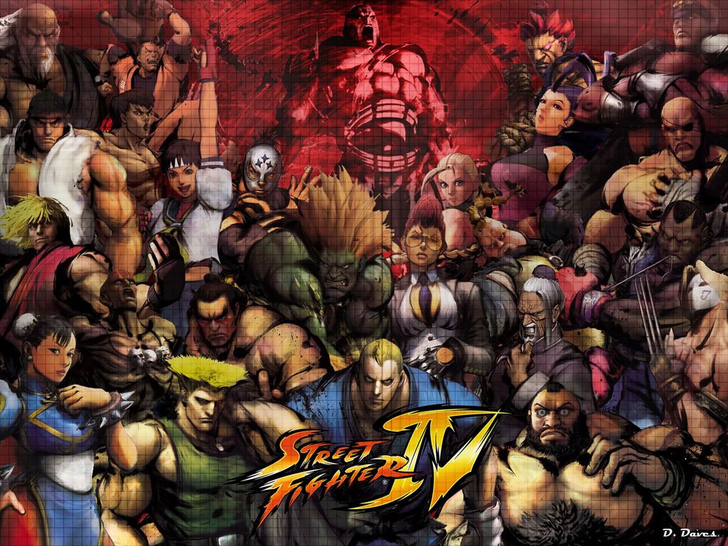
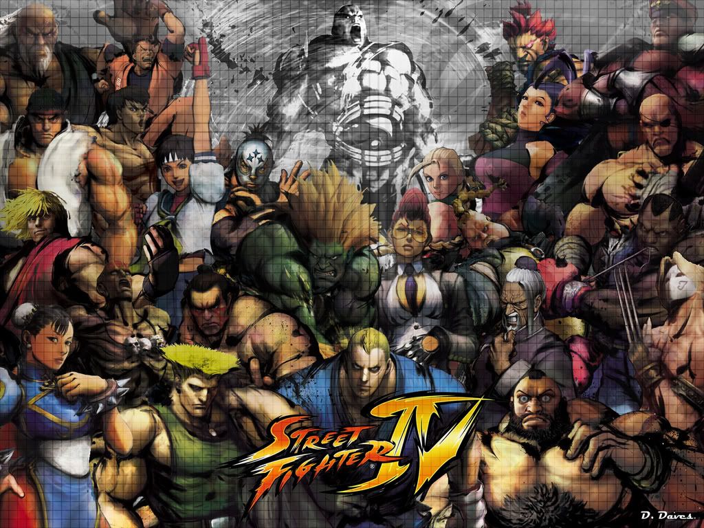
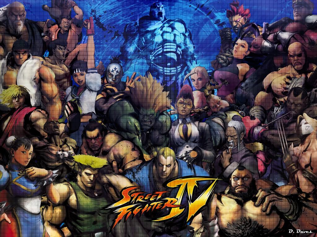
ok i wanted to show off this art for a while now
i designed this just as like a wallpaper, but now im going to make this into a stick image cause I just love how it turned out
Red
White
Blue
Ok here is my stick mock up
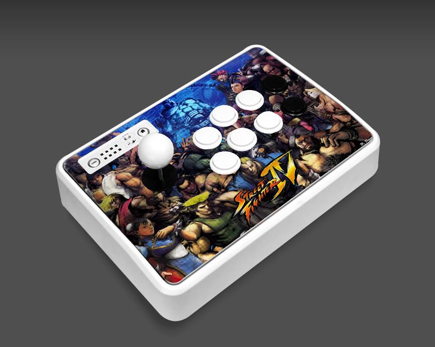
Yeah i know i have to rearrange the characters to better fit the stick but this was a quick stick mock up
give me about a day and ill see what i come up with
if you plan on using clear buttons that mock up will work out just fine. I’m doing a similar thing to my stick art, just using non SFIV art style things. It ends up looking a little strange with all the different art styles being meshed together but I like it.

…nah.
Going to go to Kinkos and get this done today so thought I might share. One is for me the other is for others.
Posted this on another thread that I thought was this one.
Thanks for your response! I was actually thinking about a similar method with using one of the button holes, but your method is much better since the dust cover would be placed there. Good point. Keep up the good work, and keep us posted on how the rest of the mods go.
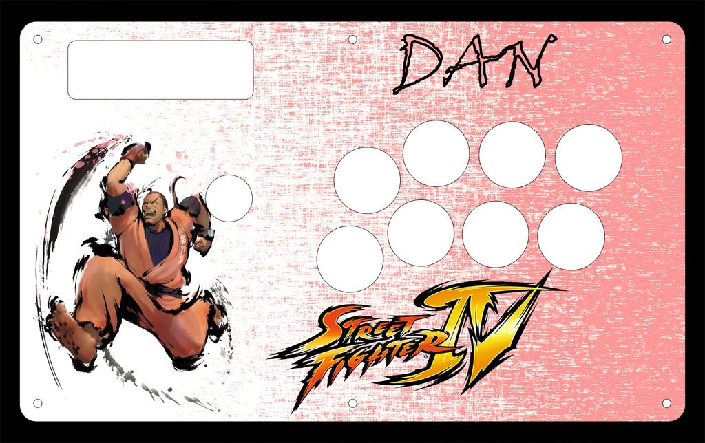
Here is some images for a dan stick… as much as i love my full roster pic I just Love this Dan pic more
Dan in all his pink goodness

Host it on imageshack and I can see it; then I can offer any comments that come to mind.
Edit Ah, not bad - just get rid of the splatter in the top left corner (or at least enough so that Claw’s head isn’t covered)
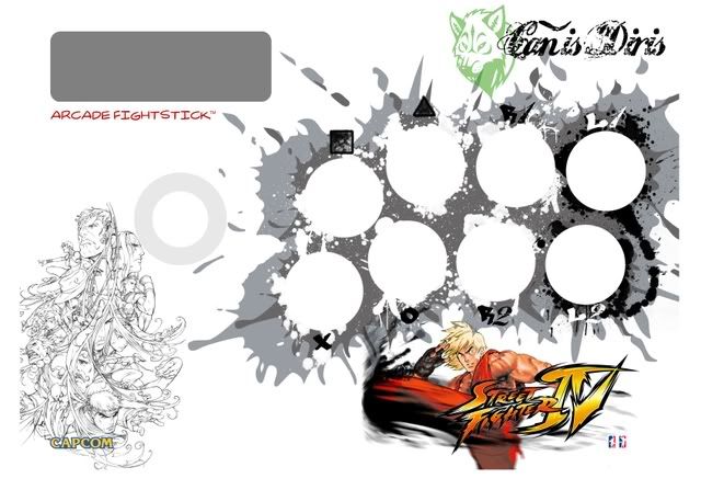
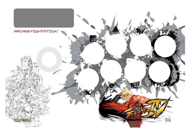
here’s the final template I ended up going with
http://photos-e.ak.fbcdn.net/hphotos-ak-snc1/hs017.snc1/2200_20643433923580484_922_n.jpg
Holy shit, my wife gave me a notebook last year with that same design on it.
…seriously.
EDIT: Ok, not exactly the same, but similar:

^those both look like copies of The Great Wave off Kanagawa http://en.wikipedia.org/wiki/The_Great_Wave_off_Kanagawa
Great work, Viper!
That’s a cropped version of Great Wave off of Kanagawa by Katsushika Hokusai - High Res version here
I’ll join in on the fun.
Keep 'em coming guys!
I’m still adding paint to my Chun art, so I might be reuploading the mockup just now. @_@
Here’s my first template
I’d probably never use that notebook. Looks too dope.
Unless I was hella talented at drawing/doodling. Then I’d fill that thing up proper.
love the kidrobot rep…i wanna do a dunny one