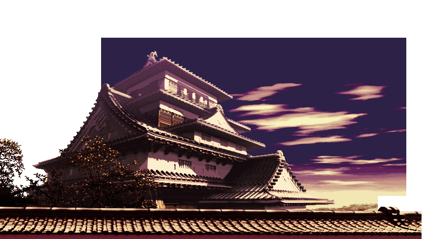
OK, I tried really hard with this one…

tested it with my own edits and to me it still looked a bit weird… maybe the sky is the problem, what do you think?
you can find it along with my other tries on ESN’s site.
OK, I tried really hard with this one…

tested it with my own edits and to me it still looked a bit weird… maybe the sky is the problem, what do you think?
you can find it along with my other tries on ESN’s site.
I like it very stylized.
I say try messing with the contrast but that might mess up the colors.
thanks Jed,
edited the sky, in fact it was too dark… we gain some contrast that way, I’m just half sure it works with my edits now, but it’s better this way

I may add blue to the temple’s shades and roof to separate it from the sky.
Also, for your interest, I used mostly photoshop’s command :
Image>Mode>Grayscale
then put the grayscale image into
Image>Mode>Duotone (hope my translation is accurate as my photoshop is in french)
That is beautiful. I love those colors, don’t edit it again.
thanks, the beauty of ESN’s site is that you can still access to the previous steps of any palette by clicking on the “HIST” button, so, no matter what I do next, this one is not lost.
I’ll play on GGPO with this one for some time and go back to editing if needed. I just feel that maybe the darkest areas on the roof and temple are too dark compared to my edited chars.
My Dudley palettes.
Finally I have finished editing my palettes for the most stylish boxer/gentleman of all time.
However I did not touch HP and LK, simply because they already looked perfect and editing those color schemes would be a severe crime of undignity and anyone who does that would deserve to be Corkskrew Blown to the crotch.
…wait, what.
Enjoy. For HK I went with a prisoner sorta look, although I originally intended to make his clothes yellow with blue gloves, but I liked the convict look on him. It’s kinda like a joke costume now. 
nice, I think the HK one works best volume-wise, eventhough it’s a bit too orange for me, blue+yellow gloves sounds fun !
I did a dud that I’ll add to ESN’s and it looks like a stretch from your MP.
EDIT
btw, on this japanese forum that Jed linked to, there was a file called “colorhack katei all” or something, with inside, an IPS file, I checked it recently and it had some console colours a few originals, and some of LET, Poot, probably a couple EveryFlowerFlow and maybe a couple of mine in there too!
hehe
Funny some of our stuff made it to japan !
Jed, as you’re the one that found this forum, maybe you have some japanese knowledge, as in the jap file there were also three text files that I couldn’t read, could you translate anything maybe ?
We don’t need Japanese votes of confidence - but it’s nice that they made it 
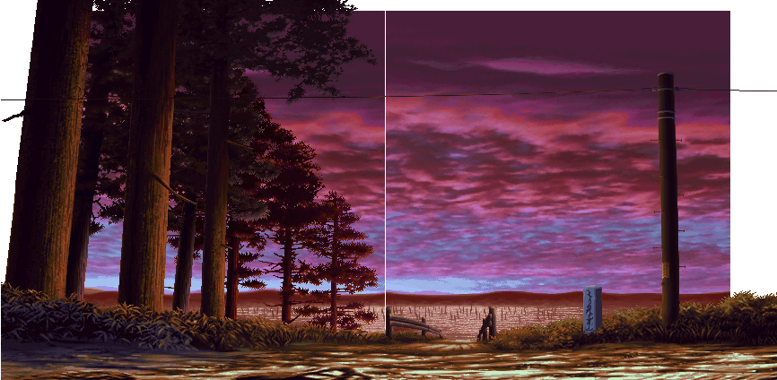
Alien - palette looks nice, I think it could use more range in hue (I liked the purple sky tones) and less contrast. Specifically, if the background is darker than characters’ outlines, it pops and you get a visual disconnect. It looks like that could happen here, but test it out in-game and take screenies to be sure 
Just to mention - it looks very believable, which is the hardest thing to achieve if you ask me, so props due!
Anotak was the one who found that forum actually by looking for more info on yumeji’s xcopy. And my Japanese is more limited then my German so its next to non-existent.
Thanks LET, you stated precisely my sentiment about colour range and contrast, but I must say that I’m getting lazy with this stage as I find this one really hard to edit, and surprisingly, after a bit of testing… I think it works with my edits.
What do you think ?
http://i130.photobucket.com/albums/p270/akubin/RyuStagedisplay.png
Should I get my darker tones a little down and add some more colours ?
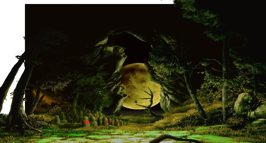
Also, as I couldn’t wait anymore ^^ so, I ported your gouki stage draft on arcade graphics… it’s been a bit painstaking at some points (as DC rips and arcade don’t match on this stage) and it’s not the exact same thing you did, but I thought that was good enough. You tell me.
http://i130.photobucket.com/albums/p270/akubin/goukiStagedisplay.png
plus the white gouki is a port of my red oro, may need a couple adjustements before I’m done maybe.
Also I think I forgot to rip the owl’s eyes when uploading the matrix image on ESN’s… no big deal and easy to fix.
Jed, thanks for your answer, I was hoping we’d find some japanese colour edit site maybe, but, bah… I don’t care that much in the end… if I can display the text (as it shows up as gibberish on this comp), google translate may be good enough.
Oh, and I broke my pad, stick is at work, so I can’t make that video I was telling you, LET.
Doh, shame about the vid.
That Gouki came out better than I recall. Though, I still think both BGs have way too much black as a result of ‘multiply’ layers in Photoshop maybe (I do this too much).
The sprites don’t pop too much or look out of place, but I think it’s bad form for BGs to have big chunks of darkness, even in the distance like on the Gouki mod. I thought it would add depth if I made the shadows darker and the foreground moss lighter and more saturated, but in the end it looks too busy, at least in stills.
Trouble is, just toning the contrast down (via brightness/contrast slider) is like sticking a grey filter over the whole BG. This is why I find these edits hard, it’s not a problem with sprites. I’m also no expert in Photoshop, even though I’ve been using it for decades 
Yes, surprisingly, I found sprites don’t pop that much in the end.
I’ll get a closer look from original sprites in original stages to moded as it actually could work as I enforced volume on chars compared to originals I probably have more range in darkness with stages as well.
Also…
did this from your draft, LET, as I found it very nice and different enough from the original stage, I’ll edit with ingame shots later

sadly I discovered that this stage’s matrix is flawed. a few things have not been ripped, seems like an address range related problem rather than something we forgot, which is bad luck as it probably mean reripping it all, well maybe not we’ll see.
I’m running a fast check of what stages fully work, or have problems.
I’ll post the full list later.
So far,
*working : Oro , sean, ryu, gouki/shin gouki(jjst forgot the owls eyes, shin gouki is the same), hugo, necro, makoto, elena, yun , dudley, urien
*flawed (missing part): alex, ken, ibuki, twelve, yang (just forgot some rain, quick fix possible)
*completely fucked ? : remy ?, Gill ?, chun ? for those, the site wouldn’t answer.
also , here’s the gouki preview

EDIT :::
ok here are screenies of ingame ibuki, you can see the little glitches, shiny water and on the right and left, the sky stayed the same
http://i130.photobucket.com/albums/p270/akubin/IbukiStagedisplay.png
edited the list of working not working stages, some may need very minor fixes, some may need redoing
can someone give me a link and or upload the character icons that are the top of the screen next to the life bar? thank you please 
Hey, I’m not sure what you mean…
If you want to edit the lifebars portraits, you can do that in PALMOD, which you can download on the first page of this thread.
If you mean you want the ripped graphics, we never ripped them (I mean as something downloadable on ESN’s site) as SuupaaBu already added them into PALMOD, which came before we started ripping stuff.
Closest thing to that is the select screen and warrior path icons I ripped and uploaded on ESN’s site. click here or if for some reason my link doesn’t work, check the palettes index on ESN’s and filter “interface”.
Made few tweaks on the 3sPalMod.php, it’s waaaayyyy faster now and no more crash so far.
Edit Mode doesn’t work but i think no one is using it, so it can wait!
wicked !
I already added a check palette for chun and remy (I’ll have a look later) but Gill fails to load, here’s the error message :
Fatal error: Allowed memory size of 33554432 bytes exhausted (tried to allocate 1518165 bytes) in /mnt/163/sdb/f/e/ensabahnur/3S_Pal_Mod/Class/Pal.php on line 401
I’ll report and edit my previous message later on stages states, cheers
Weird, i tested with biggest palettes available, like Remy stage, and it worked fine.
I’ll check that tonight…
Ken palettes. I didn’t really edit HK’s main palette, just the portrait a bit but included them anyway.
Who should I edit next? I don’t want to touch Ryu yet.
Irish Ken looks especially cool 
I like EX the best though.
Next? IMO, Sean or Oro…
hey, I like EX and HP best, sean is dope, go for it !
btw, I work again on a well calibrated screen lately and I discovered the true colors of my latest edits, ugh, I’ll try and fix it when I get an hour.
Also, a few days back, ESN tested some new scripts on his site to import pals directly from 51 files or ACT files, generate some previews too.
So all my pals are accessible now, that makes almost the whole game edited, and I had released next to none so far.
Also since ESN’s new script allows mass import of palettes, some palettes that are not mine and were on my 51 ended up labelled as mine.
I’ll try and add credit where due later but mostly it’s LET’s work, a couple of Poot and maybe one of EFF, sometimes remixed sometimes not.
cheers