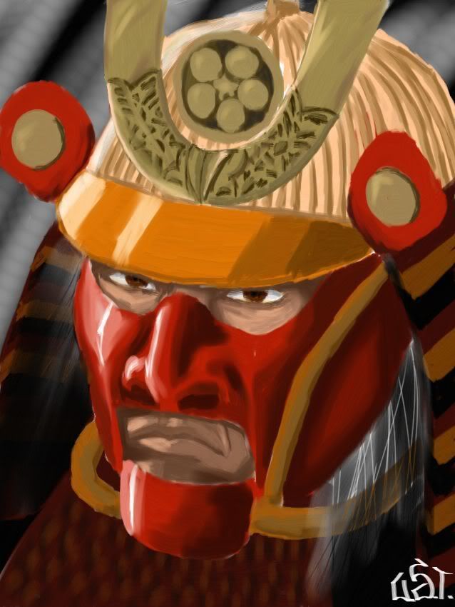
~2 hours in painter, refs used for the helmet design. I know the top of the helmet is so-so , I kind of half-assed it because I’m getting tired. C&C welcome
looks like someone’s improving. only thing is that the part of the helmet below his left cheek looks like it’s sticking out. the red/gold circle on the right (his left) of his helmet is bothering me a bit, but i can’t pick out exactly what. i wanna say it’s where you put the shadow, but i dunno. overall good stuff.
Very slick.
