that last one is great! excellent use of color
Awesome pics Rook!
that last one is flipping sweeeeeet! placement, illustration, right on!
I’m with everyone else on how that last one is golden.
I’ll say i agree, especially the way the white swallows so much of the image.
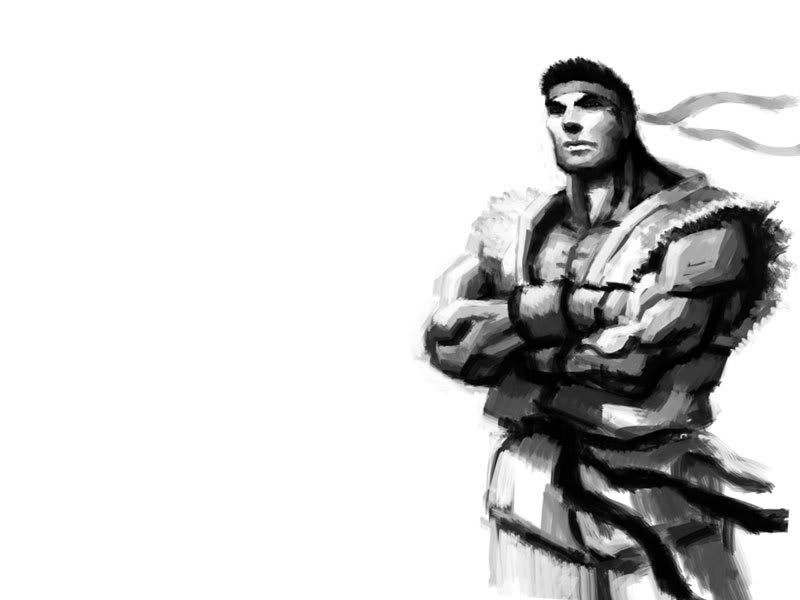
but also, I gotta say I really like your Ryu, very 3rd strike.
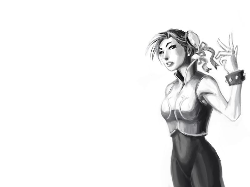
That chun li is nice, but she kinda reminds me of that chick from ‘Beyond good and evil’.
Like that’s a bad thing
I like the Ryu, at first I thought it was a MGS piece, because the style fits the game’s
agreed!


