dude…i definitely like your comic man!! pure awsome…your style is bad ass, nice coloring, and nice start action…keep up the good job man, i cant wait to see the rest from you…
Looking great man. I like the colors and the artworks alot.
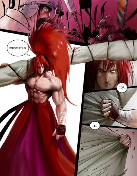
First page - you dont really need his hair covering the guys face from the first panel. It ruins the picture and composition. His sword out of the frame emphasizes on the mass of his sword rather than his hair and sword.
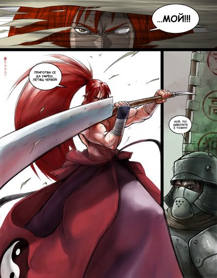
Second page - Same goes for this one as well. Not all of his body needs to extend beyond the panels. If I were you I’d just stick his leg out and cut back the rest. The guy on the right side seems too crunched in due to the helmet being tangent to the black border on the panel.
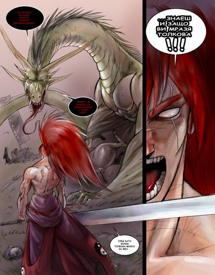
3rd page is fine.
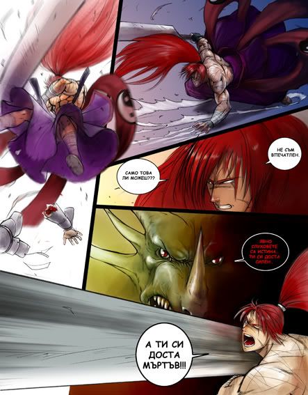
4th page - The third panel looks like his hair is all the way let out and not tied in a pony tail. You could lower his entire head and show the ribbon that ties his hair. If he is a different character than nevermind haha.
where did the dragon come from? Why does the dragon change colors? Are those pages consecutive? I cant tell what the story is just from the pictures and thats important to me in comics. The art looks great.
SFMC - u r right about all. These are some problems I knew, but I didn’t fixed, cuz I had no time 4 this. I see u have an expirience in this area:) Exept all u said i can also mention the right panel on 3rd page - the space under the sword’s blade looks not good. It’s only a part of a neck muscle and a chest and if u hide the upper part it will look like nothing:) I would be happy if we can have more often conversations about comics and manga arts. I saw some of your art and i think we could share a lot of knowledge:looney:
It’s a chameleon dragon:rofl: The pages are consecutive, only that between 3rd and 4th is this one: