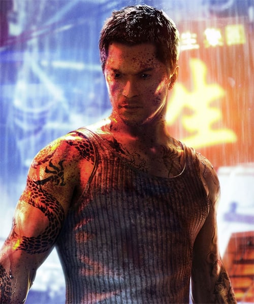
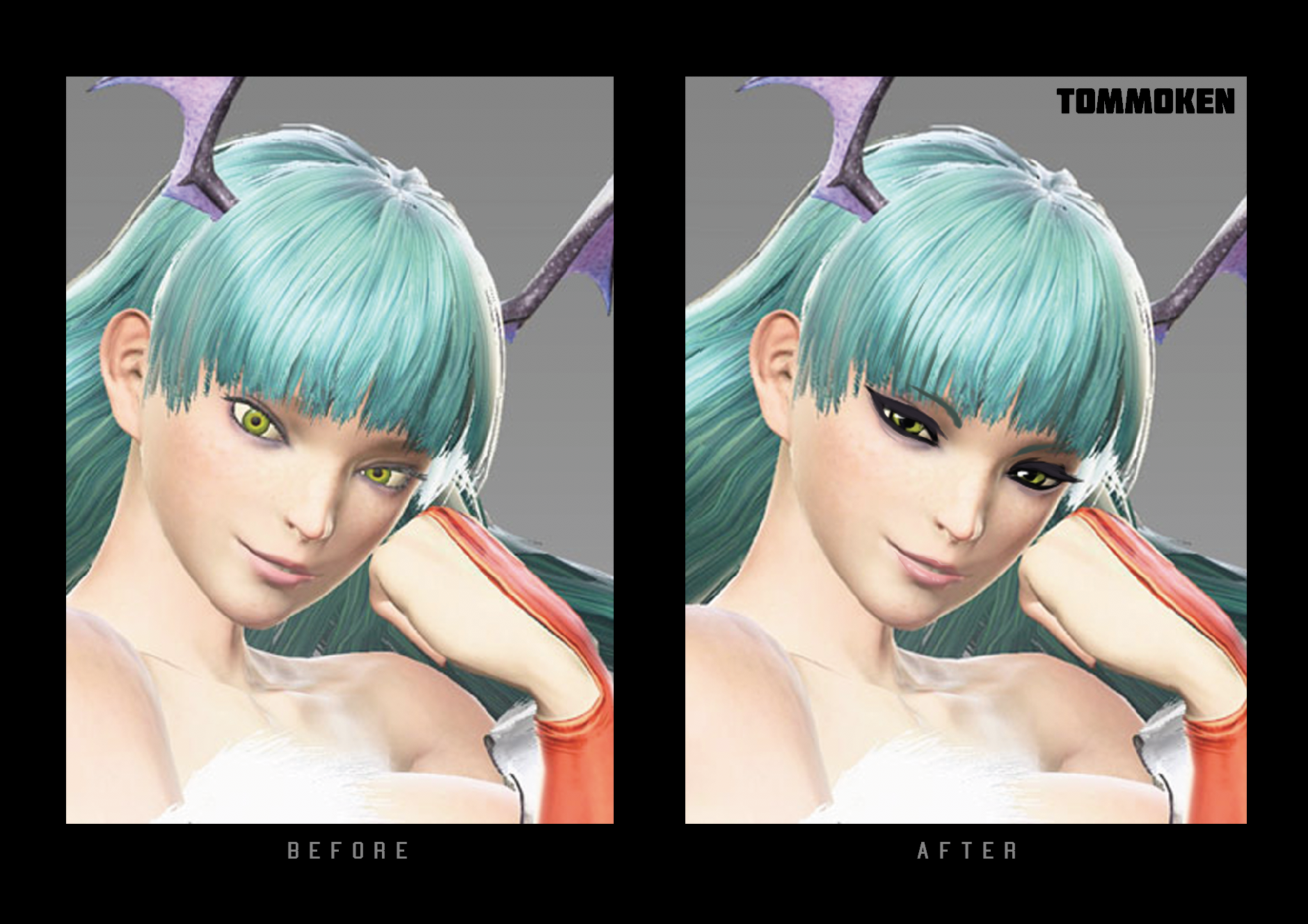
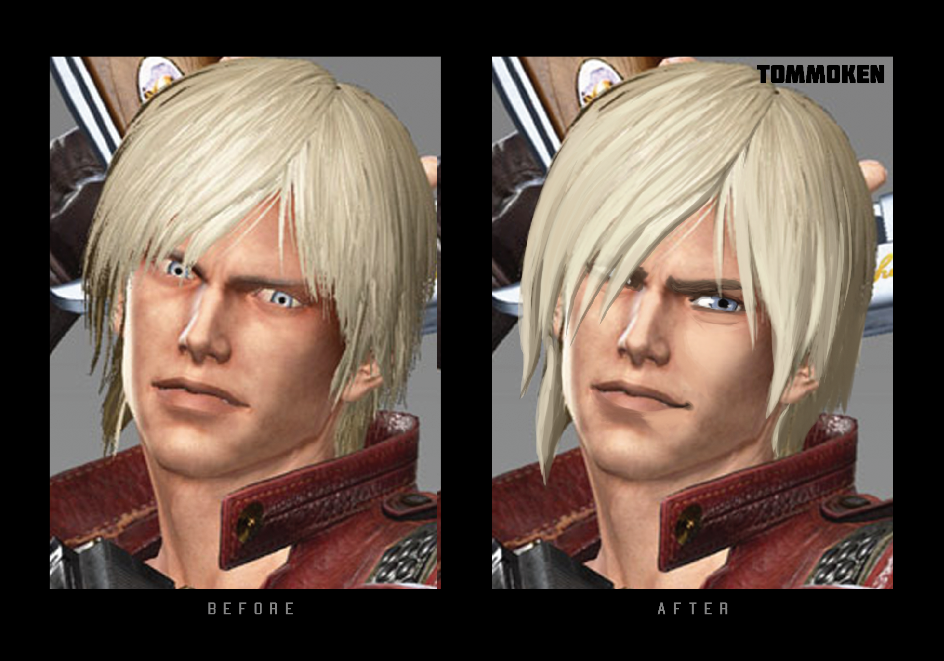
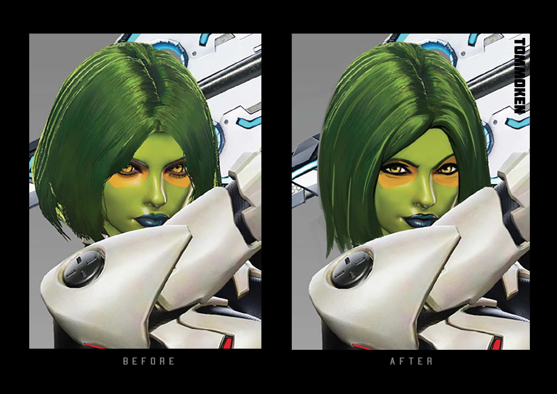
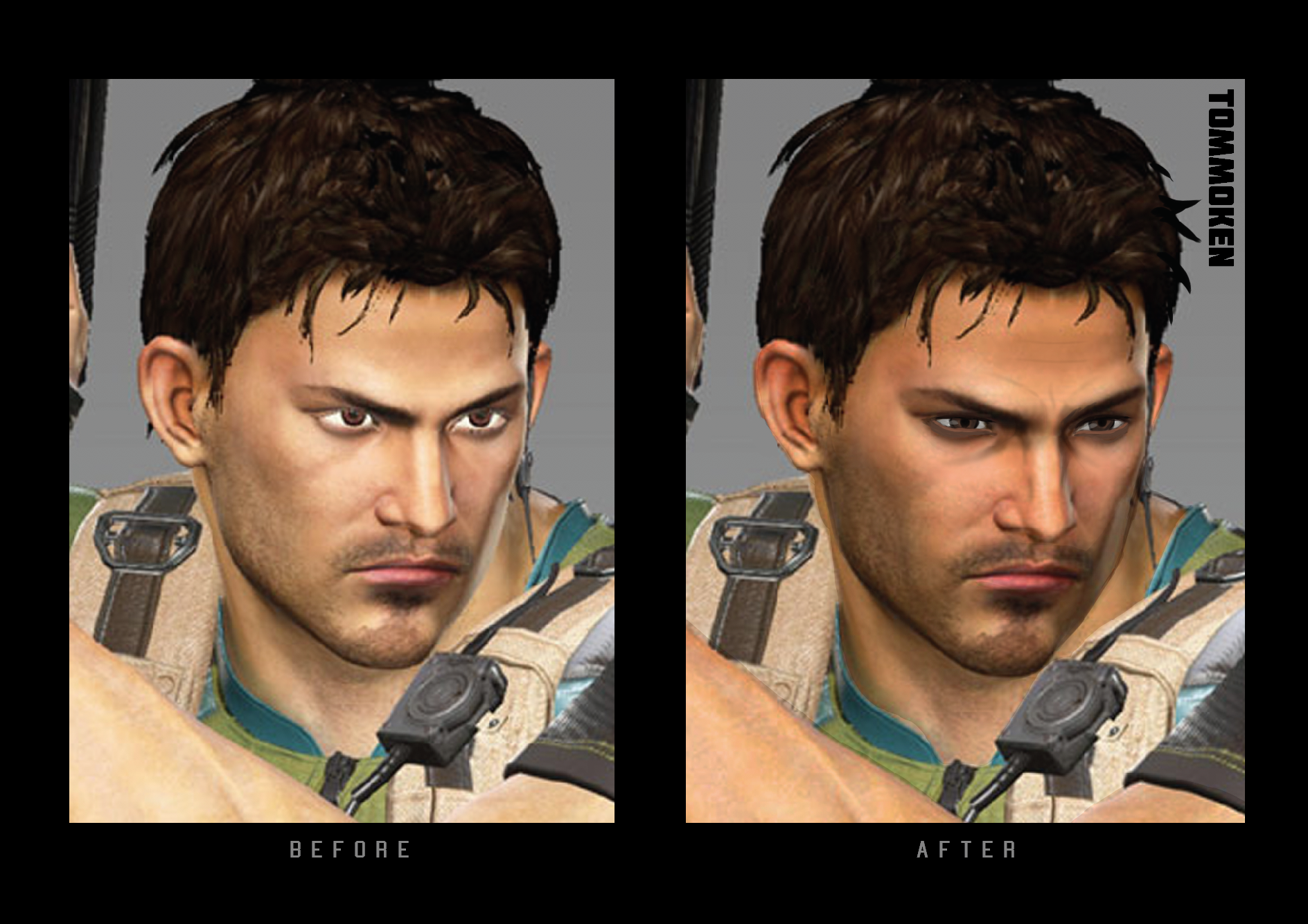
Ok for starters I’m totally looking forward to this game and I’m sorry but what happened to capcom’s normally AMAZING characters portraits/models/illustrations/designs?!
I’m so so depressed by the current ones (with exceptions to captain marvel, zero, megaman, & black panther who all look amazing especially Captain Marvel!).
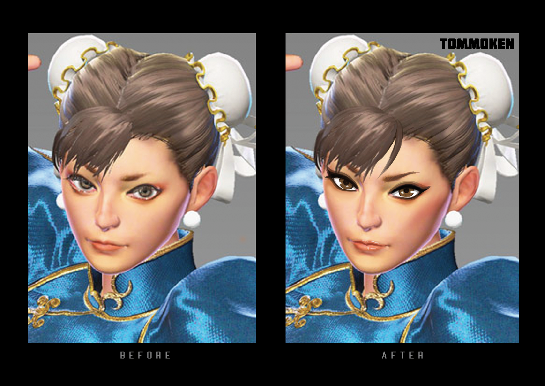
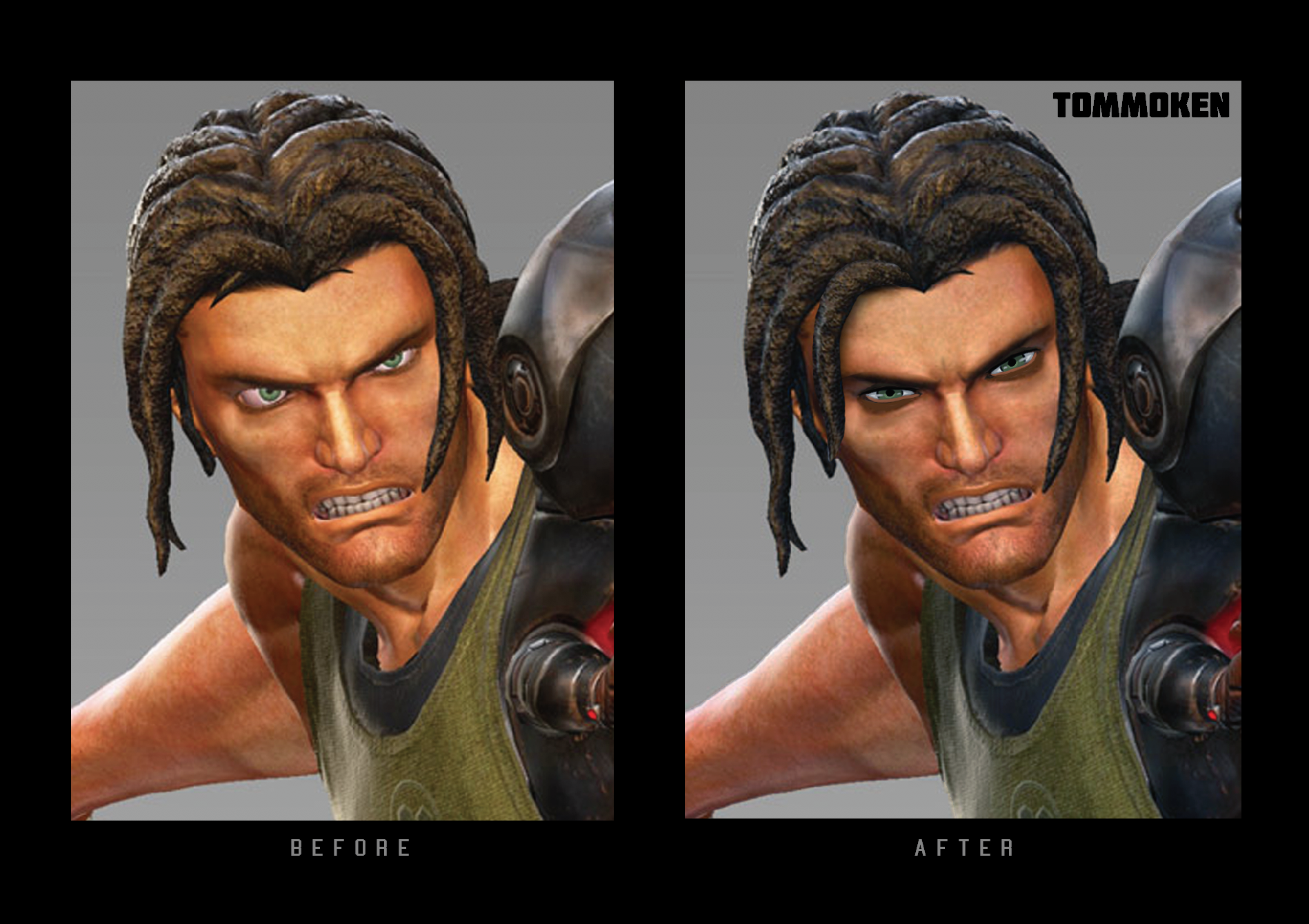
I’m sad that Shinkiro isn’t involved with the artworks and I could deal with that but the character artworks for Morrigan, Dante, Chris, Gamora?! Chunli?!! Gamora and chunli look horrific, Chun Li looks special needs and Gamora looks like something out of an 80s horror movie with those small pupil eyes. It’s like a completely different company has gotten creative control. I’m not sure what’s happened- has the America design team had more designers involved or has the quality suffered for the tight deadline. Capcom always had amazing styled designs (even in the 2d sprite days). These new 3D models look like something ugly NRS should be done  please please please Capcom sort out and rerelease the characters artwork! I ve bought every capcom design works book that has ever been released due to the great quality and art style. I feel like their normally amazing art style has been sacrificed for a generic ‘more realistic’ NRS / more mainstream look which just looks awful.
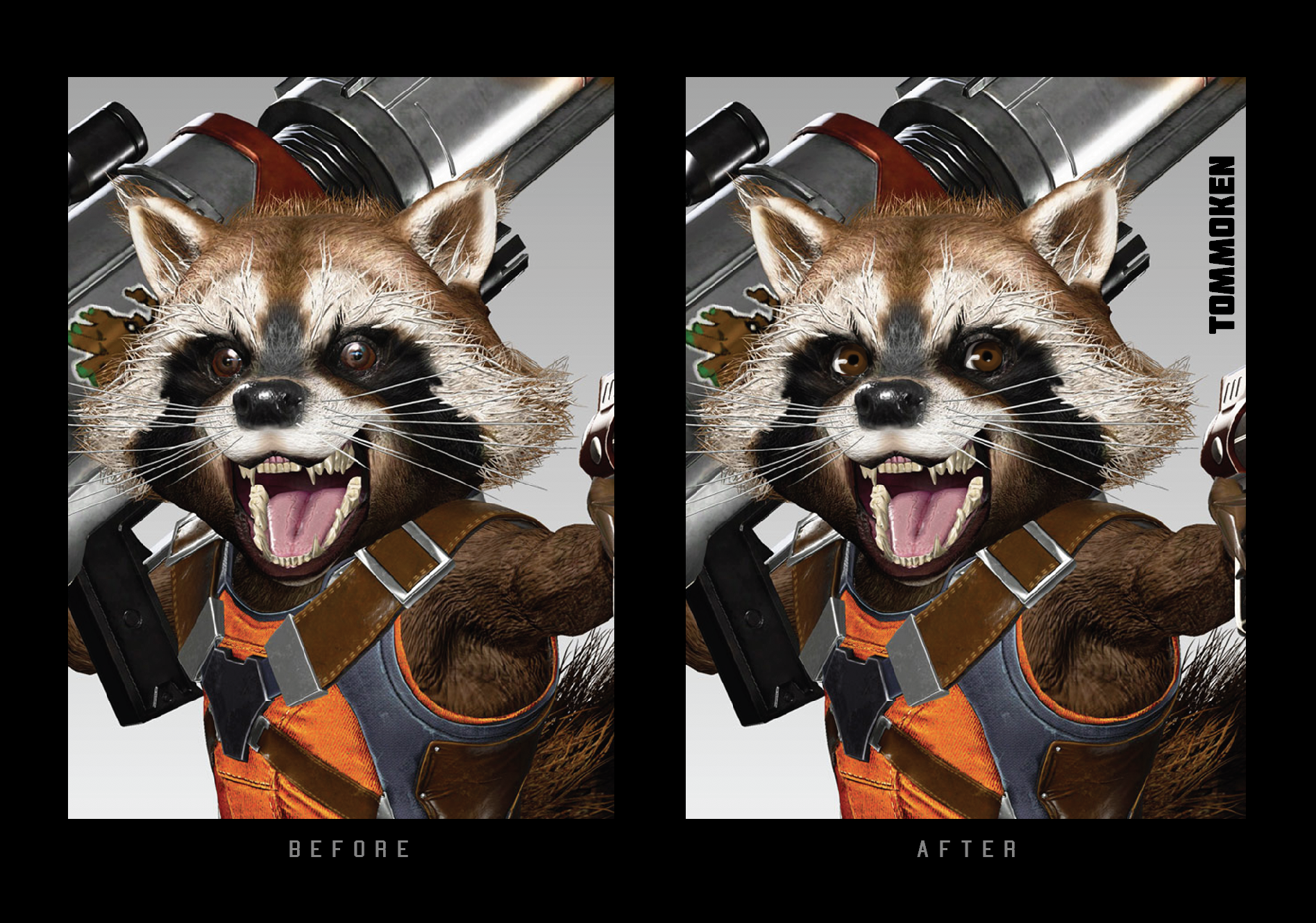
Capcom please sort and make the men and more importantly the WOMEN look vaguely attractive and unique… also please make sure Rocket doesn’t look like he has rabies!
I know the UMVC3 style was very comicbook but I d take that style over this one. SF5 improved the graphics of SF4 but still retained that style and essence. I just wish Capcom could do the same for MVCi?
I know the game is still being made but the fact they release those awful ‘character art’ is nuts!
ok. Rant. Over. 
ps - also i tried to do a quick mockup of some to make vaguely attractive …i dont think it d take much just need to sort out their faces - bodies are fine.
