Makoto fightstick template art

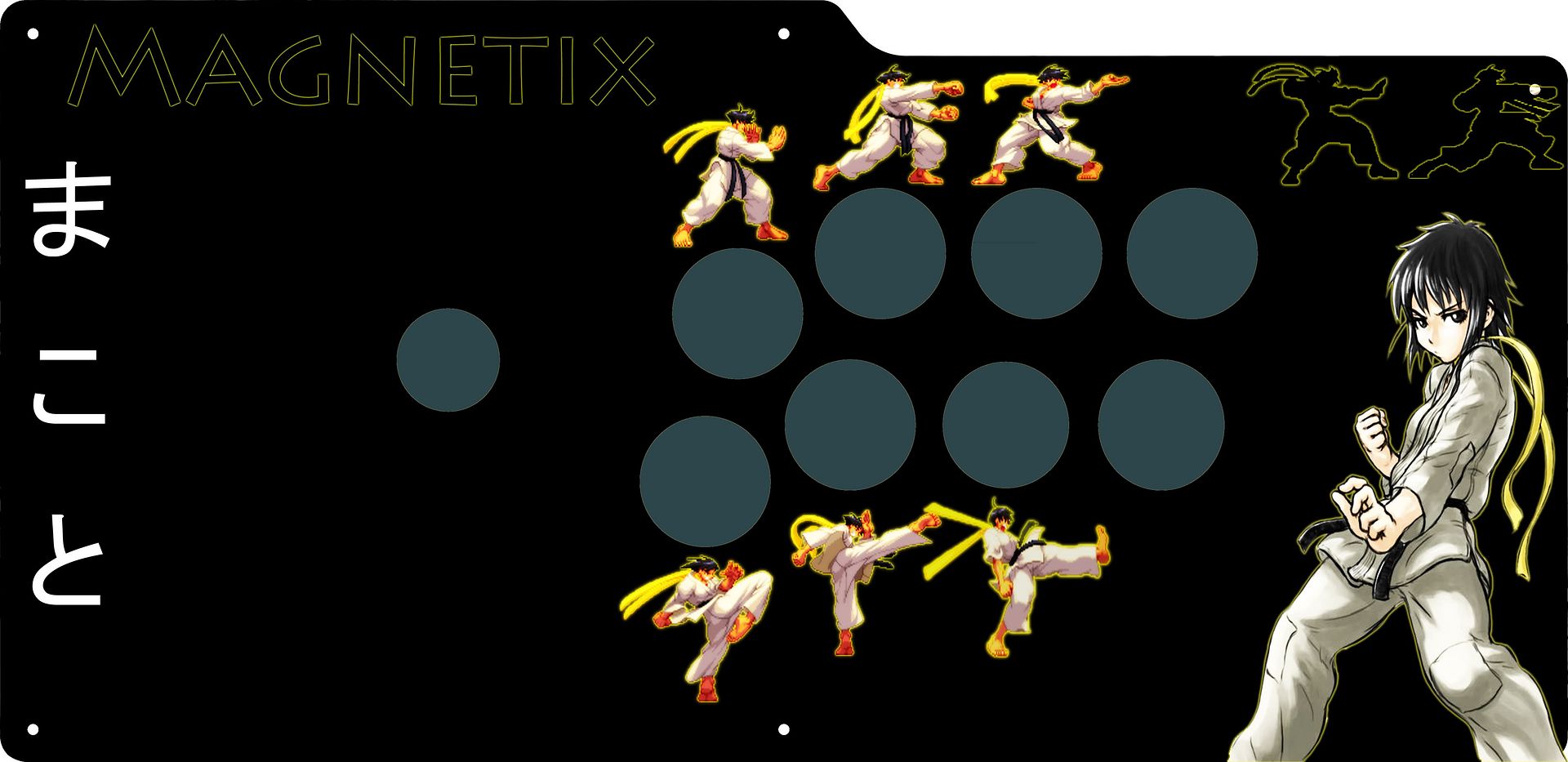
Nice work! I’m a fan of both your teal and yellow ones. One thing you could do is try adding some more graphics or text around the edging to help balance them out. I really like strider_hiryu973’s design on the first page in that he uses text (“Arcade Stick: Tournament Edition”) as well as the SSF4 logo and Capcom logo to balance out the design, since Makoto’s presence is so strong in the lower left corner. It keeps the design interesting without being too cluttered, and kind of frames in the space above and below the buttons. One thing about both your Teal and Yellow designs is they are very focused in certain places and could be spaced out a bit to help the flow. For instance the space above the buttons from the top-middle to the top-right is a bit blank in both your teal and yellow designs. You could try adding something in that space, or in the yellow one you could draw another crack from the tear, running up to the top right.

I also like the color themes, but you could also add in some contrasting colors. In the teal one I really like how the pink of her bra and the orange of her skirt really pop against the teal/blue background. You could further this by sampling and using one of those colors on her name to make it pop out, as now it’s very close in color to the background. I guess it’s kind of a weird mix of wanting everything tonally similar, but with different, interesting colors also.

Oh one other thing to look out for is using several different pictures from varying resolutions. In your yellow design for instance the SSF4 logo in the background looks very crisp whiles the tear in the middle and Mak’s U1 screenshot look to be of a lower resolution or have maybe been sized up. Sometimes these can appear okay on the screen, but when you print them out certain aspects may become very pixelated. It sucks because you sometimes can’t tell until you’ve spent the time and money for print- just something to look out for.

Oh! Another quick thing as a general rule when working on designs for print is to have your file be 300dpi. You can see in Photoshop when you create a new document you can choose the dimensions, as well as the dpi. 300 will ensure that it comes out looking nice and crisp. If you’ve already created a file at a lower resolution (you can check by opening your file and selecting Image > Image Size) you won’t be able to size it up as this creates pixelation, so could be just something in future designs. Again sometimes it looks okay on the screen but looks a lot different when you print it out. Good luck!

Gentlemen. I was hoping to get a little feedback on this…had to redesign the artwork for a case I just received since the original art I had wound up not fitting. The original had both Makotos from SF and BB since I play them both, thought that was a clever little touch, but honestly I’m digging this one more now (and I rarely play BB anymore…waiting for that new Guilty Gear :frowning: ). If it looks kinda brown, that’s intentional; the case is quilted maple with a dark brown stain, hence I wanted to keep the “dark/milk chocolate” tones. Think a tiger’s eye gemstone and you’ve pretty much got the case colors. The buttons are transparent orange, yellow, and white (for 3P/3K) Seimitsus, and the balltop is a custom from Buttero (see other pic below). All of it’s going to be LED lit, so keep that in mind for feedback; I think it’ll look pretty cool lit up. If there’s anything I’m missing or something someone would add, feel free to let me know, it always helps to get a second (third, fourth) pair of eyes on something.

http://img845.imageshack.us/img845/8388/stick3roughredosmall.th.jpg

The balltop:

http://img840.imageshack.us/img840/9884/dscn0210f.jpg

haha, it says chesto? right? my kata is terrible lol.

Looks really good though, i like it at least.

tbh i think thats the wrong spelling for her name or i dont think thats the right kanji that capcom uses, i think they just stick with the hiragana, which is just
まこと
plus i think thats makoto spelled as if they were a boy. Other than that, i might have to steal this sometime lol, looks real good, like the bb touch.

It could very well be that “Makoto” as it means “sincerity” or “truth”. Names like that are not gender specific. However, Capcom hasn’t stated whether that’s the intended kanji for her anyway and they stick to the hiragana.

Thanks for the feedback guys!

Um as far as the name goes, i just typed it in google translate. so i’m lucky that it even says Makoto. Could’ve come out saying something that translates back to english meaing “dishwasher” lol. But i’ll change it. I trust you guys. If you guys like any of these designs and want to use them or have any ideas on how to change this stuff to help me out I can provide the .psd files. Just let me know.

I’m glad you like it though. Yes it is very blazblue’y. i’m probably going to put this on my TE soon (maybe next month). I have 2 sticks that i’m working on for EVO. I want to have them done by February. Maybe I"ll sell one :). Who knows. I really do appreciate the love though. I’ll post an update and some more art soon.

Man thanks so much for your tips! I just started using Photoshop and there were many things i was still working out. Still am. I will look into all of your tips and try to get more refined products. Thanks so much! I’ll post an update soon.

Yup, that’d be CHESTO…took me a while to find the katakana and I was paranoid I’d be embarassing myself by posting something wrong on here…thanks for the vote of confidence in any event :slight_smile:

Mossad, I also dig the BB effect on yours; Makoto’s a character that kind of lends herself to more rustic themes, so seeing something a little futuristic is very different. Good stuff.

One complaint I got from a friend was that it isn’t immediately apparent that that’s Makoto on my art…I agree, the hair is a little different, and it’s probably easy to tell in context considering this is the Makoto forum…but it’s alright otherwise, right? Ugh…I always wind up changing my stick art every 6 months or so anyway, might as well roll with this…any more feedback? Feel like I might need something in the top left…maybe a string of leaves, or the kanji for “Rindoukan” going down, or something…

I bought a stick a few days ago (Eightarc Fusion) and I simply love Makoto, so now I’m making a custom art for her but I still need ideas for a background.
Here’s my rough outline:

If anyone has any suggestions or wants to help me, here’s the PSD (http://www.fileswap.com/dl/yqfguEJb9g/MakotoStickDesign.psd.html)

I got one made by Lord British over at the Image Mishmash forum:

http://img703.imageshack.us/img703/7201/magnetix.jpg

Really looks awesome imo but Imma change a few things on it. If anyone wants to mess with it, here’s the PSD: http://www.mediafire.com/?e1y41nw4dkt8wq4

Hey guys, long time lurker around here.

So I finally got my first stick yesterday, the WWE Allstars Brawk Stick from Gamestop for $30. It’s serving me well so far but The Rock and hulk Hogan or whoever he is, they simply MUST go as soon as possible.

Been working on some rough draft designs today, thoughts?


Edit: Flash of inspiration! A question: About how much space will the little plastic circle on the stick take up, you know the one covering the stick hole? Whatever that is called. You can see that right now the hole is perfectly placed but I don’t know if this template considers that extra plastic circle.

Hmmm, I got an idea for stick art. I guess I’d just have to get around to actually drawing it up and then getting it into photoshop. :\

Request I posted in the stick artwork request forum to no avail… can anyone help?NEED IDEAS

Spoiler

Hey guys, I’m looking for ideas! I just bought a HRAP VX SA, and I’m looking to make some nice art for it. I want to include these pictures:

Images

Spoiler

http://i949.photobucket.com/albums/ad335/andredevine/sample_2563871e09bea2c1b26e6c9bda914acbc43dd97f.jpg

http://i949.photobucket.com/albums/ad335/andredevine/Juri_Super_Street_Fighter_IV_by_GJMattos.jpg

http://i949.photobucket.com/albums/ad335/andredevine/49259190b54873a8a832d151e500a302d6d01962.png

Of course I just want the figure from Makoto. I was wondering if you guys had any idea how I can make these three work on one canvas? I’ll probably build something soon and show it to you guys, but i’m just fishing for ideas while i’m here at work.

FYI I’m ok at making stick art. Here’s a couple of examples of my other stick art. I know the Mak pic is used already, but i love love love that picture so i’m def. gonna use it again.

old stick art

Spoiler

http://i949.photobucket.com/albums/ad335/andredevine/TEKCase_v1_Vewlix.jpg

http://i949.photobucket.com/albums/ad335/andredevine/BBType-D3V-1.png

Thanks!

hey guys… looking for a little critique/advice for this art for a HRAP VX SA. I want all of this art on here and I’m trying to find a way to make this mesh together. Kind of lost and been brainstorming for a few days. got photoshop block. any ideas appreciated…

Never got the chance to respond when you 1st posted the images, I was at work and never made it back when I was home. What you did on the right of the stick was similar to one of the ideas I had,similar to a Charlie’s Angels pose (Mossad’s Angels-you should put that on the stick j/k).

It almost seems like a little too much with both sets of ladies on the stick, but I usually prefer minimalist design when working on my own stick art . That is personal preference though. The difference in the renderings on the right kind of bothers me. Unfortunately, my undergrad was in traditional fine art not digital art. I simply click around in photoshop and can’t give any helpful tips to make them more adhesive. It may not even bother you and something you aren’t worried about.

Nitpicky art stuff (not really much help in the way you are asking)

[details=Spoiler]One general tip I can give is when overlapping objects, or in this case ladies, be mindful of the way the edges of the ladies interact. When two object come together and barley overlap or almost overlap it creates tension or ambiguity. I notice it mainly in the left group. The most noticeable to me are where Makoto’s left and Cammy’s left feet overlap, and where Juri’s right hand comes in contact with Makoto’s ribcage. Of course, the Juri image is at a different perspective which causes issues. Moving the figures around a little more could help and may do away with Makoto’s appearance of a tail caused by Cammy’s hair.

Of course that is all nitpicking, I mean when you take out all those student loans to go to college for fine art they have to teach you a bunch of rules to help create art and critique other works of art. If not you might start to wonder why you went into debt to set around and draw and paint all day when you could have done that at home for nothing ;)[/details]

Things that may or may not get the juices flowing

Spoiler

You could think about breaking up the space into three distinct areas each one containing one of the characters. You could take those parallelograms that you are using in the back and put each lady in one of them side by side Or any other shape doesn’t have to be the parallelograms. Here is an example I found online http://imageshack.us/photo/my-images/407/prototypeback.png/

Or it doesn’t even have to be a set shape you could do something like that Ken/Ryu/Akuma image that has been floating around for a while.
http://i716.photobucket.com/albums/ww167/chaos123x/Picture8.png

You could even take the group on the left and make them fade into the background similar to this
http://i17.photobucket.com/albums/b65/ninebreaker2000/socal.jpg

None of that is very innovative per se but may get the juices flowing.

One thing I really loved in your old stick art is when you took the picture of Makoto on the right(I think that is one of my favorite pictures of her) and turned it into a silhouette. Maybe you could silhouette one of the groups of ladies. Not sure layout wise which way I would go with that.

All this makes me want to start working on my stick art again. I scrapped my old one from before and have been working on a new one but it has been a few months since I touched it.

thanks for the feedback. I’ve made a few changes based on your suggestions:

1-Tried to fix points where girls overlap. Let me know if you see anything out of place.
2-Fixed juri’s right foot to look more like she’s standing close to Makoto and in the correct perspective
3-faded out right ladies, and added one of D3Vs borders that i used before. Stretched to accomodate the new stick
4-cut ladies at the top and the bottom to make room for (future) additions. I think its nice, and i think i’ll be able to add something decent in top and bottom borders as well. .
5-fixed random stuff. for instance positioning of the girls on the right has changed slightly, particularly Cammy, as I"m trying to decide what i dont’ mind being cut out by the joystick. I think i want to keep her hand. Also, background has been very slightly modified.

Let me know what you think! Love the suggestions… i’m taking what I can (of couse i cant take it all). I’m very interested to know if you like the borders, and if so, if you have any ideas of what I can do with them. I just feel like they opened up a lo of free space without sacrificing my original vision.

thanks!

I think it looks great, all those tweaks and changes add up. I really like the borders and the fact that the borders place the two sets of ladies on different planes in the image. That along with the fading really sets them apart so that both sets aren’t vying for attention at the same time. Placement of the girls in both sets looks nice now. You created some nice negative space between them.

As for the extra space the borders create, I have always been partial to text of some sort. Weather it is your name/handle, maybe some type of quote, lyric etc that you relate to fighting games or whatever (maybe something from Bruce Lee, Sun Tzu etc…thought that may be too cliche) Text is a simple way to personalize the stick. At one point I was going to put some tsrugi xu setups on my stick before 2012.

I personally wouldn’t add anymore images, but that is personal preference, it is looking very sleek right now, professional. I have the ps3 version of this stick and I love it. Also been messing around with Cammy some as well, but that is just randomness.

Nice work on the artwork!!! If you decide to add anything post it up so I can check it out.

Thanks a lot man. I think it is nearly complete. But I was looking to put a little text on there. My creative side refuses to put any logos or characters names… I just want something simple.

I’m going to clean up the images a good bit more, but for the most part I like it too! Oh and the stick is amazing. Seriously for anyone that’s never used one… It feels… Man so much better than any other joystick. Inputs are crisp and clean. No lag. No double inputs. All sides of the joystick feel accessible. I know my sticks were Sanwa before but this Hori is craaaazy lol. Tsurugi no problem. Kara kara, both sides no problem. Shit is amazing.

If I make any changes (im sure i will) I’ll repost. Thanks!

UPDATE.

Let me know what you think! I’mstill trying to figure out what to do with the top and bottom borders…

maybe like, big letters of all 3 characters specials/supers or something to fill in space. like http://rss.warnerbros.com/watchmen/assets_c/2009/03/score-thumb-350x350.jpg

Man I’ve tried all kinds of text lol. Honestly the best thing I think I did was just typing my name at the bottom right in, maybe 30 point TNR font lol. Really simple and elegant, but I felt like it was a cop out lol. There’s SOMETHING that can fit in that space… Just not sure what it is…

I’m thinking of getting a Makoto/Sakura artwork stick since I picked up Makoto recently and I like the Makoto/Sakura team thing going :stuck_out_tongue:

I dig it. I do miss the purple a little but think the background is nice. Not sure what to tell you about the borders.