

Awesome, the Balrog looks even cooler colored!
again… secksi.
Boy I must have missed these! Great stuff man. Getting too good.
Who drew that Leo? Looks fierce! The Rog and Ruffhouse coloring is dope too. One thing I notice you doing a lot is layering your darks over your light, when it should be the other way around. For digital work it doesn’t matter as much but I still see a little transparency in your highlights when they should be more opaque.
Awesome balrog!
Great Raoh, Ken’s face is most excellent.
If SFIV was in full 2D, then this is what his official art would look like (or aspire to). :tup:
whoa~!
it’s like you’re channeling Kinu Nishimura… the face sure as heck looks like her art style. you’ve got it down pat.
fierce Ken. nice impact. is that for the SF4 console inside cover contest thing, or just something you cooked up for fun?
minor crit: his torso looks a bit too short.
OW, DAMN! It almost feels like I got kicked in the face after seeing that picture. Seriously, he’s hitting me through the monitor.
Powerfully well done man. Powerfully well done.
agreed with everyone man. i can feel those crazy kicks. and the way the ink comes off as fire is genius. good luck dude.
i agree man. alot of ppl might say “wow it looks just like akiman drew it.” kinu is prolly my fave capcom artist
also, to kandoken, i wont say that new ken is my favorite one of yours, yet it felt like for a second you posted up some new capcom artwork. the inking effects there were just enough, i think too many people throw on too much black ink.
um… what blur is that? I see a bunch of people use it and I always mean to ask but now I actually remembered to do so. Great picture btw and if its for the contest, I wish you the best of luck. This is some seriously professional quality stuff. The ONLY thing I think you could work on now is just making some backgrounds?
Truly amazing.
Great stuff Kandoken!! I agree with Fistofryustar… you put JUST the right amount of inksplotches. not overdoing it.


man!!! thanks alot you guys, my bad for sucking at keeping up and stuff. i’m finally getting portfolio together to see if i can be a working illustrator. so expect some bgs vehicles and anthro.
That C. Viper is better 'n mine!!! Darn you dude!
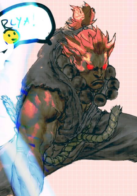
Very nice Rafael and Akuma too! I really like the way you do colors man. And I look forward to your next works. I’m curious about how you handle anthros now.
ryu with eyes that arent blue? its a lie… optical illusion