Just a little wip… Sadly I lost the Psylocke… I lost the hdd…

No one bothers anymore? I know I’m slow lately but still
Just a little wip… Sadly I lost the Psylocke… I lost the hdd…
No one bothers anymore? I know I’m slow lately but still
yeah it’s been a while
Not really new. Much better then before though.

updated the first post with this info in case people r still using the first post as reference.
I’m still not going to change my work! lol. I do some resizing on my pixel art, because some of the original art just doesn’t scale properly.
You improve a lot in 2 years though.
http://i179.photobucket.com/albums/w297/ryuushiro/Vs_zpsf29b5845.png
Makes me want to go back and fix a lot of my old work but… I will make an honest effort to do her stance animation.
Something a little different… Hope fully the game makes it to the light of day, but for now yatagarasu attack on cataclysm is stuck in limbo it seems.
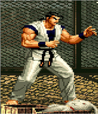
Hanzo
http://i179.photobucket.com/albums/w297/ryuushiro/Hanzo_zpsd9229b19.png
wow that’s the first Yatagarasu hd sprite i’ve seen
Sadly it’s not the first. When I saw the original samples on an image board, I knew I had to do something. Sadly in my search I found a KOF 13 style one. I did however find rips from the demo version of Yatagarasu AOC. So I have basically all the sprites.
Screw it, I did another one:
http://i179.photobucket.com/albums/w297/ryuushiro/Hanzo2_zps2dc31afe.png
Found what appears to be the original artist for the game’s DA account http://styleos.deviantart.com/
a lot of awesome artwork in this thread. damn.
i’m following pootnannies’s tutorial, trying to make one of those. It’s not finished, but it’s seeming off to me…i’m probably taking a wrong patch somewhere. Can you guys give me some advice/critique? I’m new to this (and doing it with a mouse :p)
i recommend you first do it exactly like the original sprite so you have an insight on to why it looks the way it does and how that makes it likeable. that means using the same original colors, not just for the bigger areas of pixels like his clothing and shadows but also any outlines and detail lines (make sure that’s on a separate layer so you can change it later).
because you’re remaking it in much higher definition than the original, your lines will be much thinner and harder to see. it probably needs to be more dynamic so you may want to stray away from the original and use darker colors on his definition lines (clothing folds, muscle definition, etc.). this will make the thinness of the detail lines pop out more instead of fading in too much with everything else. if the end result seems that those lines pop out too much and you don’t like it, just go back to the line art layer and recolor those lines to a slightly lighter color than previous (or try with a thicker line). because this is a KOF sprite and lacks definitive outlines and detail lines, you need to pay special attention to the shadows because those will show the illusion of overlapping.
it can be hard to interpret low definition pixel art from up close. i noticed that in the final outline, his right shoulder/deltoid is not like the original or at least what the original seems to suggest and looks unnatural and pointy. try to smooth it out a bit. i’m also noticing something similar with his right hand. hands can be hard to draw so you may want to use reference. it might help to zoom out while retracing and see the illusion of what the original pixels are trying to convey for stuff like the face and hands, then go in close to see what needs to be changed.
it doesn’t look too bad so far so it’s ok if you don’t get it just right in your first attempt. keep trying and you’ll figure out what you don’t like about it and why. the tutorials i put up are mostly for sf2 and 3 sprites but can be used for just about any sprite. even still, there are areas where there is no real formula to follow and you’ll have to try to figure it out on instinct. it can be a trial and error sort of thing so just keep at it :tup:
just get my hands in some images from the planning phase of “under night in-birth” (the new game from the developers of melty blood). Some of those are from a trailer, others from a guide handbook and some from their streams.
The final sprites that have gone in the game are a little more detailed in light/shadows, and have some anti-aliasing…but those 2 are still somewhat “weak points”. Maybe they have determined that it would be too time consuming. Still interesting to give a look
So, what happened?
The artists of this thread are all dead or this thread moved out and I don’t know?
we all died
This is sad, Poot, I loved to see all drawings of the artists. ):
I was taking a look on your tutorial and it gave me a crazy will to try, and I tried.
I found the old gif in another forum and it became a idea. Back in time I loved Super Mario World, so then I decided to do it.
Take a look:
Old Sprite:
Direct link
New, by me:
Direct Link (Link updated, no more NSFW!)
As you can see, the old one is without Bowser and without the wink animation. Sorry, I used the old gif from the other forum without editing it. The gif has some problems, but that is because my Adobe Flash wasn’t working, so I used an Online Gif Creator.
This is my 1st attempt, so hints and feedback are appreciated! (:
i’m going through so much personal and health problems that i wish i could keep this thread going 
first things first: you should repost that second link because there are porn ads on the top and bottom of the sprite.
as far as tips go, try to not use black outlines unless they are really thin because the shadows on the sprite aren’t cel shaded. i would change the outline to a darker green first like the OG sprite and then go through and change the outline to something like a darker version of the color it’s outlining. you don’t want the outline to take all the attention like it is right now.
i noticed there is some jumpiness in the animation. how about making him bob up and down slowly. at the peak of his bobs, up and down, use a lot more frames so it looks more natural when coming to a stop before bobbing in the other direction.
i’m liking the blinking from Bowser and the machine so i don’t think you need to change anything there. the shadows are a little too soft and gradient and can take away from the “cartoon” look of the sprite but if you change the outlines to very thin and less noticeable, i think it will still work out.
i’m glad you are still contributing and i hope you continue to get better. if you need anymore advice just hit this thread up and i’ll do my best to help. peace :tup:
Fun thing: I don’t even have a idea of why but the site rated as NSFW and put it together with the others +18 pics. Well, I really find this crazy. I deleted the file and uploaded again, lets see.
I tried to keep the cartoonish look of the Super Mario World, but I tried to combine with a realist looking colors and shades. As you can see, that really didn’t worked fine. But, how could I make the sprite in HD without all the smooth? It wouldn’t become worst?
I was thinking in make the animation bouncing, since a vehicle like that wouldn’t have stability. Buuuuut, my Adobe Flash is crashing, so I will need to wait some time. Thanks for all advices, I will take a break on that sprite and later I get back, because then I don’t get bored.
Hey, I have some little questions and I would be glad if you gave me your opinion:
1 - If you would launch a HD Sprited Fighting game, what would be the average proportions of EACH sprite? I think that if you did an entire character as your Mai remake, it would be a huge game (not for the work, but for the engine handle it).
2 - Do you think that is necessary put a signature on each sprite/image that you do? I don’t, but this made me think a while.
3 - Can you explain me the use of soft shadows as your Mai remake? I don’t know where I should use and where don’t.
Sorry about using your Mai remake for explain everything, it is my personal favorite :J
thanks for fixing the link.
1- i’m not sure, probably around the same size on screen as 3rd Strike but i’m not sure about the pixel count. the sprite technique i used on Mai can be scaled easily but i wouldn’t want it too small. i would also probably use 4:3.
2- i’ve seen people use some of the sprites i’ve done on other sites but the sprite isn’t mine to begin with. i mostly retraced what the original artists did but in HD. i probably would use a signature on something original though.
3- it’s hard to explain but i’ll try. if you look at a cone, the widest part should have more secondary shadow then the narrowest part. sort of imagine the character in cones. for example, the thigh would have a bigger secondary shadow area than the knee. some parts are much harder so you just have to experiment.
i noticed all my pics from imageshack are gone. this sucks 