I’m earning a degree in Web Design/Programming. I’m still kind of a begginner but I just learned Dreamweaver and I’m messing around with CGI. I’m pretty good with CSS and XHTML. My friend is going to teach me mySQL. He also showed me this Web Site to reference. http://www.spoono.com/index.php?setstyle=7
After reading some of these comments you guys are really inspiring me to get into Graphic Design. I thinking about getting an Associate Degree in Graphic/Web Design since I’ve been making a few graphics here and there online. I’m still little sketchy about doing print though.
Here’s my website and some designs that I made. www.rakux.com
I’ve never heard of them but I find it strange that my webhost doesn’t provide me with MySQL and charges me but yours does. Either I’m getting ripped off, or they are pulling something fishy.
Dynamo-G, those layouts are really good. I may have to hit up some of the people in this thread for layouts in the future :lovin:
I read a couple reviews about them, and people say that FTP has problems connecting to their server and if you use their file manager, it rewrites your code. The main turn off is that they are down 50% of the time.
They have a premium plan that you can upgrade to… maybe they have better service when you actually pay for it. lol, that could be the con… annoy people enough so that they consider upgrading to the premium package, even though they stil risk people getting pissed off and just leaving.
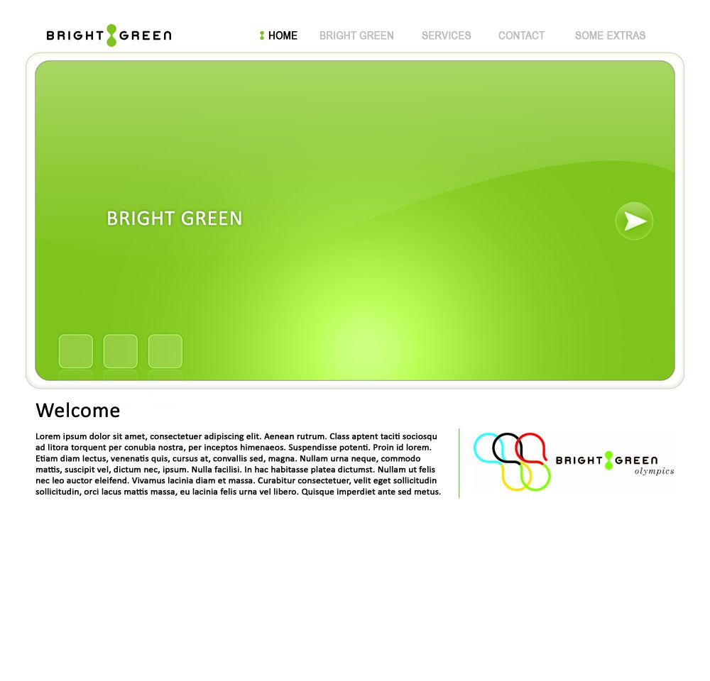
Pretty much done with the design but I don’t really like the “To Learn More…” panel. The wording is pretty much a place holder for now but I’m not really feeling the arrows. The goal for them is to kind of catch the eye and direct a new/potential customer as to where to go next. Any input on that or the design as a whole would be appreciated.
I think the arrows look fine but maybe only limit it to one at the bottom… or you could have the message you want to deliver and have a “Learn More?” link, either with regular hypertext or a graphic with a hover effect. But from my perspective I think everything looks fine. Are you going to put an image or flash, above the main body of text… I was just curious.
Nice! A graphic design / web design thread! I recently started my own company and I was wondering if someone could design a banner for me? My company is Deals In Motion and its a hassle-free car buying service. Im horrible with Photoshop and the banner I currently have up is pretty mundane. I can provide all of the images for the banner so if you would like to help, please PM me or respond to this thread. Thanks!
ok, so i’ve been working on and off on my site using Nvu. mostly, i’ve just been using the site as an image host for the stick boxes i sell on SRK i need to finish it but i’m still a noob at website building. i’ve come to the conclusion that i want a horizontal site. yes i know it’s visually unnatural, but i don’t care. it fits how i want my stuff to be showcased. i really dig Alex Flueras’s site and i would like to model my site like his slightly. i looked at his page source and… :looney:… how is this style done?
here’s my first page laugh as much as you want. (and yes i will be changing my lame logo. almost all the pictures are place holders for other pictures)
He’s using a CSS external style sheet to position all his elements on the page. The <div> tags are what he is using to reference the id attributes that he set in the external style sheet, meaning his navigation, pictures, and footer at the bottom.
The container is where all the white is and the slide show. I think he’s using JavaScript to get the slide show effect that returns the screen to the id tag.
I’m not sure if that helps.
EDIT:
It would be pretty cool to use some JavaScript or Flash and make the stick interactive with some mouse over effects, like having the buttons go down and highlight to make a selection.
yeah i’m using a rudimentary CSS sheet on mine i wrote out. every time i try to add something to the page, the navigation menu messes up for effects i’d like to use a js scroll app and js lightbox, maybe. i’m not a big fan of flash websites though :bluu:
i really need to get a working website up first though
The only options that I can suggest for the navigation menu is to take it out of the container and set directly underneath the body so anything that you put in the container won’t affect the navigation menu. If you notice on that photography site he does not have his navigation in his container.
or
use a table for the navigation menu via
<table>
<tr>
<td>
Navigation goes here
</td>
</tr>
</table>
Don’t quote me on this, but from what I believe anything that is put outside of the table should not affect what is in it.
There’s couple other trouble shoot stuff, but that’s all I have time for at the minute.
All and all I like where you are going with it, from a user perspective, my only issue the color of the hypertext blending with the color of the joystick case. It could just be my browser but at first glance I could not even see it.
cool, thanks for the info! :tup: i’ll try it tonight! and i’ll be changing the colors around to make everything more visible on different browsers (maybe).
Anyone experienced looking for some work, I have a site that needs to be converted into CSS and pass WC3 validation. There are about 25 pages PM me and I send you the link.
Man. I love web design so much. I have mastered XHTML/CSS. I’m pretty good at graphic design through Photoshop. All that’s left is for me to learn some PHP/MySQL and maybe that AJAX stuff that’s so popular nowadays.
Can’t wait for college to be over. I want to start a company already.
 i need to finish it but i’m still a noob at website building. i’ve come to the conclusion that i want a horizontal site. yes i know it’s visually unnatural, but i don’t care. it fits how i want my stuff to be showcased. i really dig