So yeah this is my first stick design tell me what you guys think and let me know what i should do about the buttons color wise.
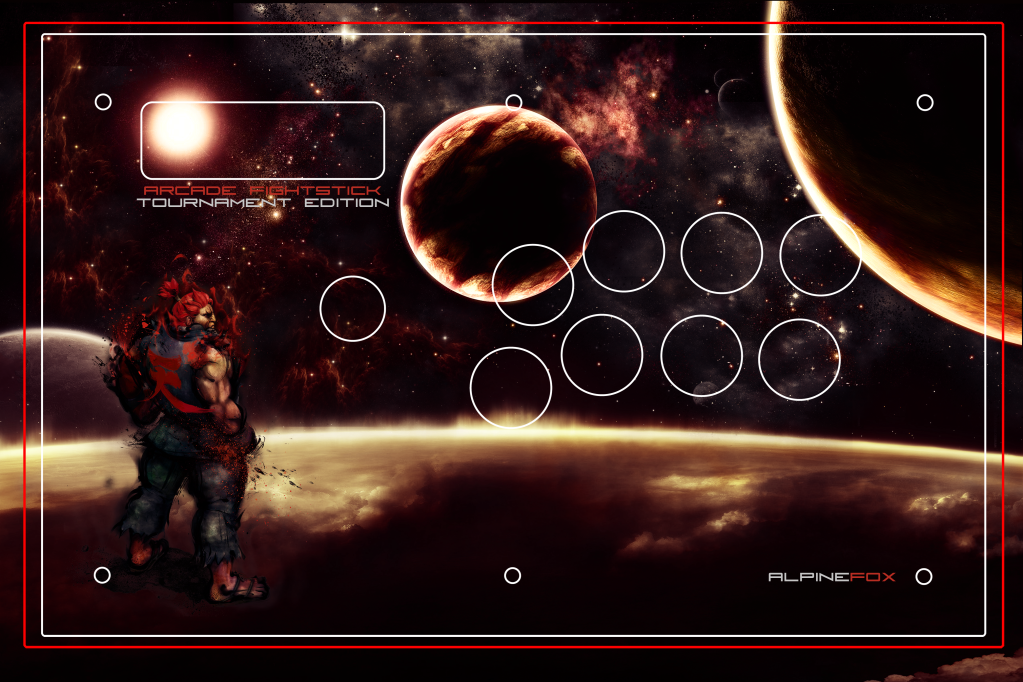
So yeah this is my first stick design tell me what you guys think and let me know what i should do about the buttons color wise.
Not bad. There’s a little too much going on for my taste, but I’m not the one using this stick. Colors are cool.
If it was me I’d use the majority of the lower right area (directly underneath the buttons) for text, seeing as I like my text BIG, but thats more personal preference than anything. Keep in mind though that the area outside of the border won’t make it on to the stick itself. Same goes for the lens flare in the upper left where the home/turbo buttons will be.
Not a bad first attempt at all though. Keep at it!
Thanks dude I was thinking about taking out that lens flare since it would look a bit odd with just that little bit of it sticking out. And normally i tend to be more of a minimalistic guy but idk i guess this just looked nice enough for me.