Lupin: is that Bison with a signature 'Psycho Power Purple Martini?
Dang, how did I miss this thread?!? Lets see, I already did a Bison and Sagat pic, but have yet to do a Vega. I’d say I’m right on time. One vega underway. Perhaps you’ll see it later today.
http://i3.photobucket.com/albums/y85/Teapot-phx/Vega_Claw.jpg
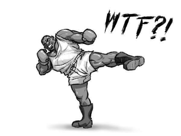
Here ya go! Vega as promised. Who’s next? Balrog/boxer, right?
This thread is making me cry. So much awesomeness.
Neo I am so excited to see your take on the SF cast. You’re managing to somehow expand my world of Street Fighter. I see Sagat in a whole new light. I wonder if Capcom shares your level of passion.
Fire-Tisane, sick Vega. Clean lines. How I wish SF4 Vega did him justice. 
Nice work guys. Just found out about this thread. Guess I’ll start with Vega.
I have no idea how/if this pose would/could even work.  I also forgot how to draw certain parts of the back and I didn’t feel like looking it up. So there.
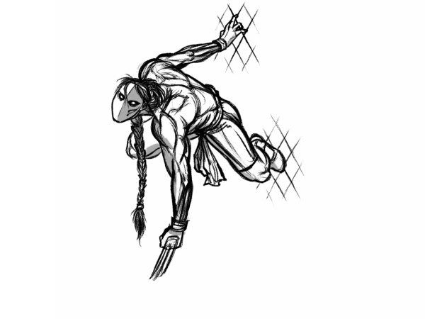
Bob Sagat: bring back that fence! Just last night I was telling my lady about old school Vega’s fence climb.
ooh man I gotta get in on this action. ( Im so effing late)
Nice Vega Bob! Very nice.
I had to do this today because next week I’m not going to have time, so sorry for posting this early dudes! Don’t taze me bro’s!
ROFL! That is awesome bob. Totally hilarious.
hot shit guys.
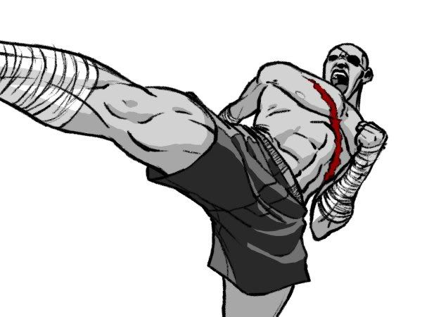
FUnny Boxer, Bob. Hahaha. I’d say the same if I ever catch him doing that. The sagat piece is dope too. I would twist his pose more and more his left arm out more to make it more dynamic. I like the simple shading and single color but I wonder if you could push that even further. Like it would look really sick if you take away the lines and pump up the chroma on the red. Just an idea.
Neoblood: Cool redesign. I like the shoulder pads but I wonder if it might look better if you just put the jacket on him instead of just the shoulder pads. Right now they look kind of tacked on. HIgher waisted pants are nice too. The font is killing it though. Right now I just wanna read the text since it has more contrast with the bg than your drawing. There’s too much space between the letters and the typeface doesn’t feel like it belongs with your art style. I’d pick something thinner and more decorative and drop the black to maybe a medium brown. Something like “cardinal” but not as decorative so you can still read it will probably work better. I thought I’d mention it since the text is so dominant on the piece but they don’t have any kind of design elements thought out for them.
You’re right dude. Part of me wanted to give him the whole jacket, but then his snake tattoo would be covered up. It would look better though and I suppose I could still leave his chest underneath the jacket bare and that would show some of the tat. Ill try out a different font and whatnot on the next peice and also spend more time cleaning/adjusting the artwork itself to stand out more. In fact, I think if I have time Ill try and redo Vega and maybe change things around a bit on the first two.
Sf4!
br79: Yeah servin up some sort of purple stuff.
wippy preview
http://farm3.static.flickr.com/2466/3658865313_60becb7b1d_m.jpghttp://farm4.static.flickr.com/3404/3454216011_e08b173032_m.jpghttp://farm3.static.flickr.com/2554/3670778665_8b265d8ec4_m.jpghttp://farm4.static.flickr.com/3593/3462461148_4aa6fbe860.jpg
Awesome stuff everyone!
Here’s my half assed entry:

Been busy with a commish for earth hour and a piece for my sisters wedding. Was going to do a Taboo joke.
Probably the last one from me for a while. Wish i had the time to finish it.
To round off the 4 Kings art saga, I’m gonna do a piece of the four of them, but it’ll take a while.
Some variations on a theme to hold you over. 
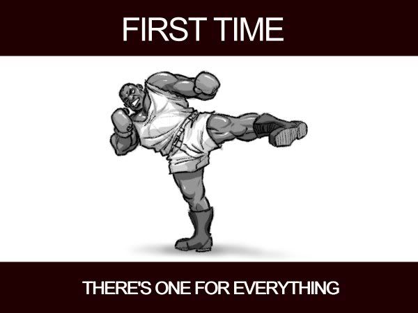
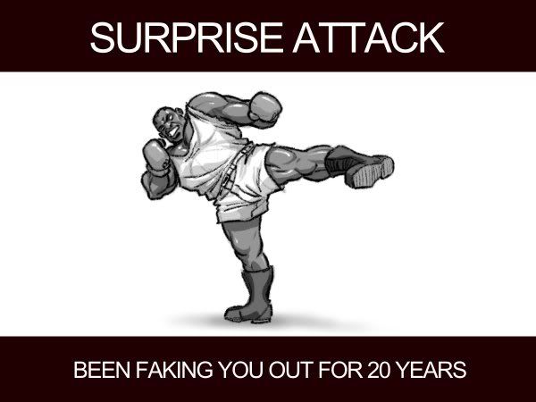
Seriously, it should have been his focus attack.
No gag from me this week folks, just an homage, a tribute if you will, to the Greatest Of All Time:
http://img.photobucket.com/albums/v137/shining4ce/CSFACBoxercopy.jpg
NeoBlood, for reals, your stuff is totally amazing. I seriously look forward to your character redesign sketches. Could you ever be convinced to do custom art for an arcade stick?
