Hey, I’m just curious as to why you dropped the character-select-screen layout you used for CSFAC Round 1?
Man, I’m behind, and I have the KOF challenge to attend to as well. D: I’ll catch up when school isn’t bugging me.
Question, can one draw an x-copy Twelve, or does it have to be the base creature?
*is tempted to submit a blank and pass it off as Twelve’s hp+hk 
Ron’s not doing the character select screen this time around cause he doesn’t have the time to update it himself personally, that’s why we’re using the blog site with the communal password so everyone can easily log in and post their own work. That way everyone is in charge of updating all the time time, rather than Ron sitting down once a week and grinding through all the work himself.
I do miss the select screen though :sad:
I posted my Yun on the Multiply site, I’ll probably post it up here either tonight or tommorow.
SNIPERSIGHT: I thank you on behalf of CW for the Ibuki… :wgrin: J/K!.. Don’t kill me!.. Very nice colouring on Twelve!.. I’m no expert in musculature (see any of my works, they suck), but I don’t see any problems in Twelve’s arm… The background, however, seems out of place… Hmmm… And you’re Ibuki isn’t that bad either… The colours seem to make the skin so shiny and slippery-smooth though…
ROOK: Ah!.. Fantastic job on the shadows… Love the shadowed out feet and overall anatomy!.. I think everybody uses the hard round edge brushes set in low apacity, right?.. Dude, you were the one who posted that ItchStudios tutorial!.. I use it a lot you know (thanks for posting that)!..
SHENG-LONG: Twelve’s looking great so far!.. Only, smoothen him a bit more?..  This online tutorial can help, but I dunno about glass and water, I don’t know how to do that myself… —> ( http://www.itchstudios.com/psg/art_tut.htm )
4NEQS: Damn it!.. I was gonna suggest that invisibility thing!..:wgrin:
JZ_CHU237: Delicate, eh?.. I guess that’s a nice compliment… My :lovin: to yours and everybody else’s crits…
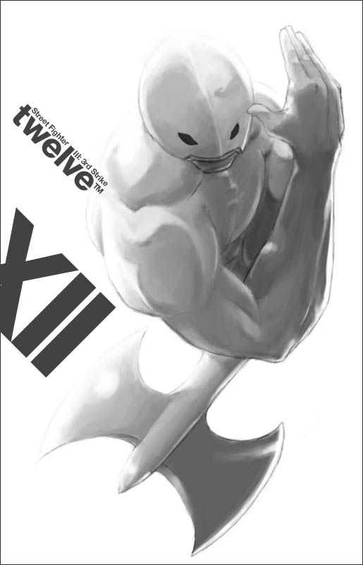
And here’s my Twelve… Took three/four hours minimum to paint… I don’t paint very efficiently, since it seems slow to just shade for me… (PS. I winged the muscles)… Twelve’s so black and white to paint, sigh!..

damn! nuice looking 12 seb. I thinkt he axe thing could have been left out. or give his other hand a “weapon” too. I like how you render the muscles. I also updated my yun’s on the csfac site too.
sheng-long: nice concept man. There’s a nice story to that pic, almost emotional even 
snipersight: nice scary-ass Ibuki. her right hand looks a bit stiff and unnatural stuck so close to her side though.
seba: VERY nice job! It looks Ikeno-ish even. I also like the typography on the left (around his trapezius), but the “XII” seems a bit too isolated… personally I’d move it and place the type closer together.
Photon: LOL @ HP+HK. “personal action.jpg”
also thx everyone for the brush recommendations!
Snipersight: I love the blurred background technique to simulate distance! Nice clean coloring too.
Seba_boi: nice looking Twelve! That looks like official Capcom artwork.
Here’s my Twelve:
http://img130.imageshack.us/img130/8647/sltwelve4pv.jpg
Background textures were made in much smaller resolution (pixel art) then image resized. I repainted Twelve’s hand because the angle looked awkward and it originally looked like he was gonna grab the other Twelve and kiss it (LOL). Background to the right was flat then photoshop’s EDIT > transform > skew function was applied to make it look like its in an angle. The same technique was applied to make the background inside the tube look like its curving (skew function applied to several little sections one at a time).
I dunno how to make it look like it has water inside, I stretched the Twelve inside the tube to make it look like he’s water displaced but wasn’t happy with it. I was also thinking of adding bubbles floating up but it looked ugly so I just scrapped the whole idea.
EDIT: With the inspiration from Snipersight’s work, I blurred the background to make the foreground standout.
EDIT 2: Last changes I guess. Faint yellow light to blend better witht he background. Made the tube green and made it look more “tubular” by adding another metal siding.
EDIT 3: With bubbles! Thanks to Rabid Wombat.
Damn, Seba you’re killin it with that Twelve bro! Sheng Long that’s a nice BG you added from the last one. Really UFO-like. Sniper sight, that’s a nice Ibuki, really clean.
And here’s my crap.
Twelve: MAN, I LOVE BEING a… What da F*%K AM I!?
http://img.photobucket.com/albums/v637/kandoken/3s_twelve.jpg
In reference to the TMNT 1 movie.
I LOVE THAT PICTURE! It’s just wonderful, I have no idea what to say, but that is such a great picture It just looks…:speechless:
Umm… Im just glad i could help Sheng Long! :bgrin:
That looks really nice with the background added in! Nice one! :tup:
PS: are you still doing the KOF fanart as well Sheng?
Thanks
yep I’m still doing it, next up is Elisabeth I believe, should be done by Sunday night if I find time tomorrow.
SICK dude. really came together nicely. looks GREAT w/ the green lighting. bubbles would prob look good.
http://img516.imageshack.us/img516/9743/sltwelve6rz3ff.jpg
i added bubbles…i wanted to see how it would look, so i figured i would show you how it came out
Here’s mine.
Twelve says:“Choose Breakfast”
http://img.photobucket.com/albums/v259/Midnight12345/twelve_breakfast.jpg
ha the spoonhand rocks.
The artwork here is MADNESS! Hats off Have left crits on the site.
Here’s my puttu rushed 12:
http://img521.imageshack.us/img521/1688/12web2vq.jpg
May color it later. Was gonna have 12 xcopy into chuck Norris but ran out of time.
SHENG-LONG: It’s looking fantastic!.. I kinda like the first one since his hand is somewhat becoming translucent and light is passing through a bit… But the one with the green glow is definitely better overall… Good thing you receded the bubbles a bit… :wgrin: since it’s too bright to be behind glass…
KANDOKEN: Ha!.. I don’t even remember the movie… But where are you painting these?.. Painter?.. I’d like to get those textures you’re doing…
-MIDNIGHT-: :lovin: :lovin: :lovin: But is his hand heat proof and Tefloned for cooking?..
CPTMUNTA: Good action!.. With those thick brush strokes, I bet those olden style Japanese colour pallette would definitely work!..
ROOK & MASTER 25 DAYS: Thanx for the crits… I’ll take note of those typography isolations and all that…  Kinda Ikeno-ish eh?.. That’s cool…
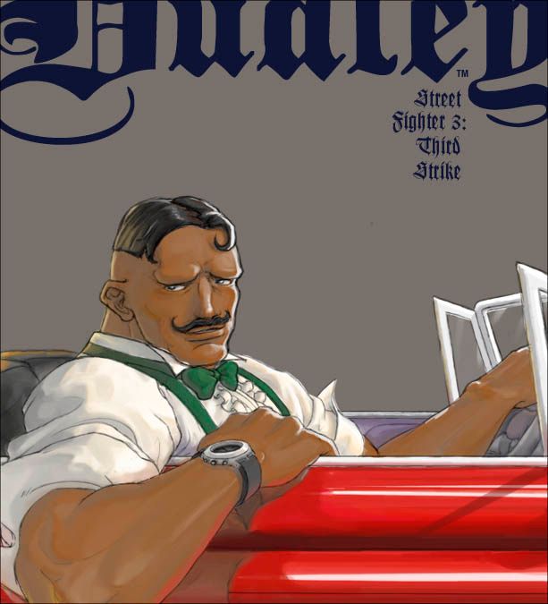
Here’s the Dudley… Crits! Crits! Crits please!.. :wasted: Completely unsatisfied with it… Still needs to rework those glossy surfaces and forgot to get rid of those thick lines in his friggin’ face… :wasted:

damn thats pretty damnnnnn good seb. I think the shadows could be darker, they look less saturated than the midtone but also kind of lighter. and his car looks a bit small, might be because of the cropping. Looks very much like dudley though. You nailed his expression. I think the thick lines aren’t that thick at all.
@ Seba:
He he, niiiiice. Pimp looking Dudley there !
The problem with ur dudley pic is that he has no boxing gloves lol. J/k. I don’t know why ur unsatisfied with ur pic; it’s sick imo. I’m gonna agree with DF that the ride looks a bit small though.