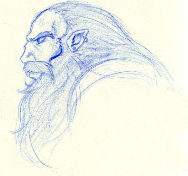
They look fine to me. I like the simple look in the Cammy because nothing isn’t TOO overboard. Her face seems to be leaning more to the center on the left side more than the right though. I’m just goin by your facial guidelines. But for the second guy, I like the sketch ALOT. Everything seems very well-planned in this sketch. And you have a good sense of anatomy. Keep it up.
TY, I’ve been thinking about WHY I do those facial guidelines lately… Problem is… I don’t even use them.
Silly of me eh?
both pics look pretty good, imho.
Cammy’s right & left boots could stand to be a little closer in size but it’s nothing major.
liking the dwarf/elf profile thing too.
hoping to see mroe from you 
cheers!
good
Its all good cuz you have the idea of roughly where the angle of the face is supposed to be at…as well as rough guidlines for the markings of the eyes…nose etc…good work man… :tup:

