Thanks it did!
Birdie looks boss in that pic. Nice job man.
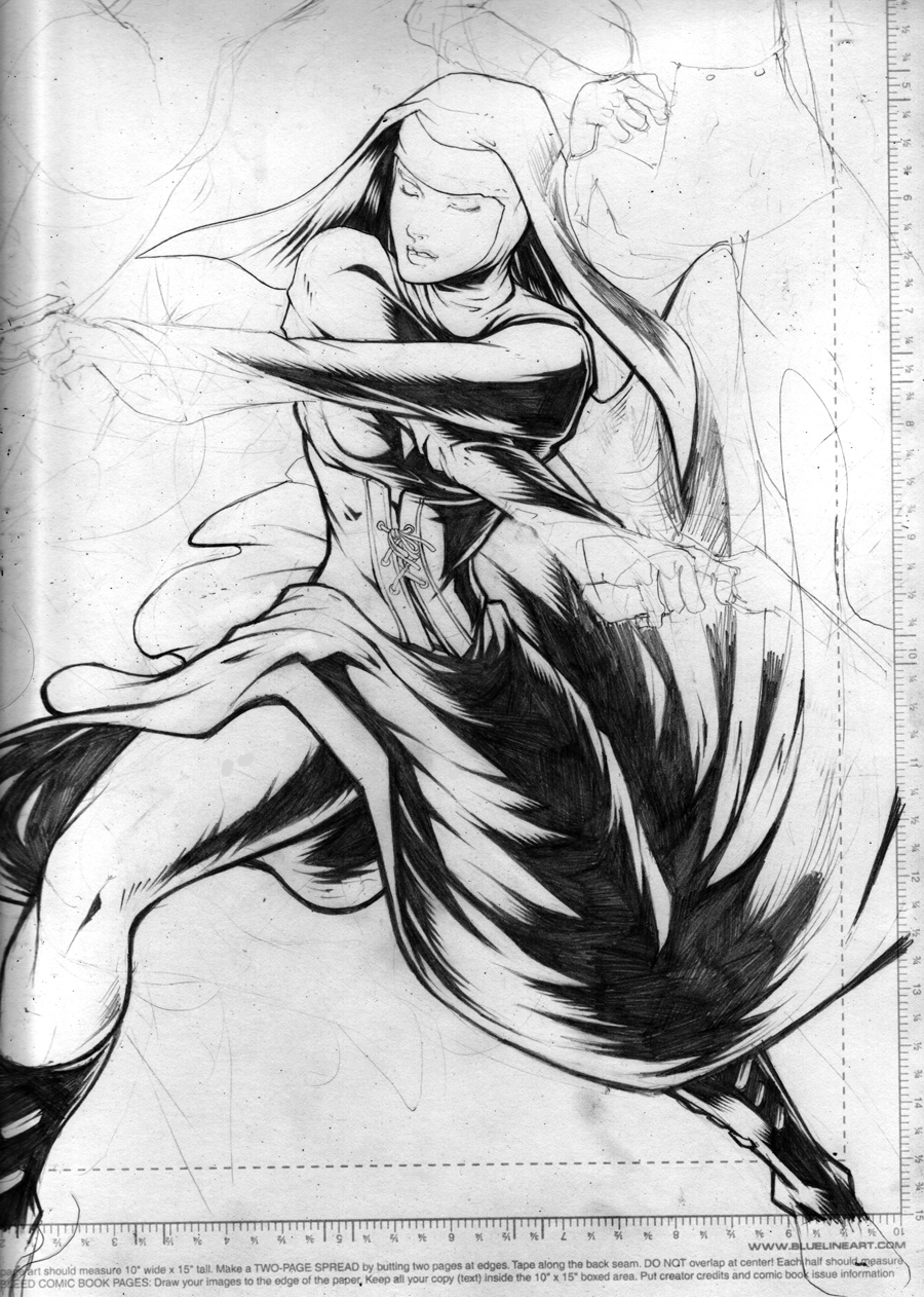
Your stuff is amazing man. I really like the early stuff in the thread. I’m a fan of pencil stuff.
new portfolio site. i want to know what you guys think. crits + comments are always welcome =]
www.edwinhuang.com
thanks! i enjoy doing penciled work the most, but i feel that i should grow out of just doing linework of characters.
the sfa pic is almost done, still haven’t cleaned it up. since i didn’t ink the thing, i need to sharpen up to pencils to look like it’s inked =[
Please let me know what you did to ink them in ps. I’ve been experimenting Photoshop with ways of inking my pencils without physically inking them and they work somewhat but I still where its dusty and whatnot.
Thanks!
for me, the most important thing is to try to simulate inking through the penciling stages. since i’m somewhat forced to only use black and white for comics and splashes, i try to keep the black a consistent shade when penciling. after that, i scan it in and use curves to up the contrast. i also use a preset ‘action’ to convert my stuff to cmyk, but i don’t think that helps ‘simulate inking’
I do something similar with adjusting levels–but to me it doesn’t look totally inked and sometimes I have to sacrifice lines so im trying to find another way. Looks like I’ll just be inking literally in PS.
finished the first page of my sinister comic.
it’s the latest update in my sequentials section of my site
your site portfolio is great! i must say tho unless you plan on constantly creating link banners yourself, you would be better off using a standard size like 200 x 40 for the links section of your site. it also helps to leave a banner encouraging others to link back to you, too
too nice
i’ll update my links page with proper sizing sometime soon. i guess i need to reformat the whole page.
but right now, sd comic con!!
here’s my 200X40 link if you or anyone else wants to link me
http://edwinhuang.com/blog/me.jpg
sweet, added
added you as well!!
in celebration of street fighter 4, i replaced chun with c.viper =]

their heads are way too big =[
and i had some trouble with foreshortening viper’s arms
finished the mai/viper image

i plan on doing P2 colors for this sometime soon. but i was wondering if c.viper has a different color scheme other than her default and all white outfit.
Hey man, thats looking awesome. Your lines and colors are just coming out great. I’m always looking forward to all your stuff.
F’in Incredible!
Getting way better man! Give you 2 more years before you unleash the beast within. Keep it up man.
thanks for the positive comments, guys!
two years? maybe 10 haha
here’s an intro to wolverine vs silver samurai that i uploaded to edwinhuang.com
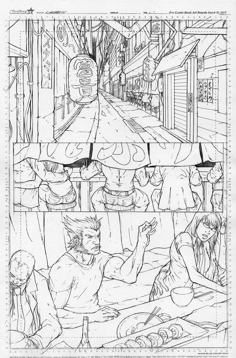
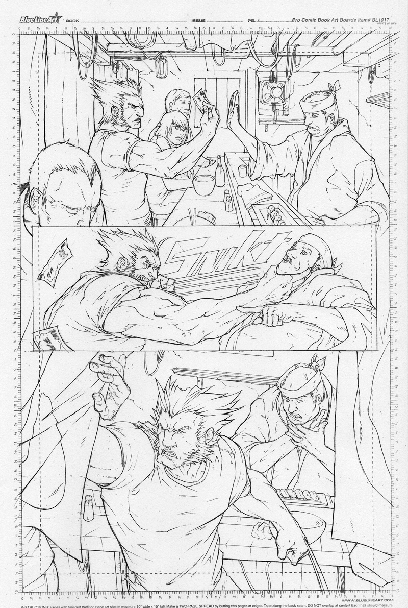
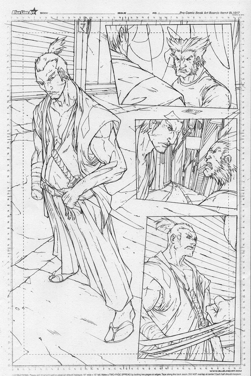
These are great dude. The action flows and reads very well. I appreciate the interior details and the nub on the samurai. On the 2nd panel in page 2, Wolverine’s grip on the guy’s neck doesn’t
seem like it’s strong enough. 1st panel page 1, I can’t tell if the lantern light closest to us is suppose to be hung at the same height as the others. If it’s suppose to be the same height, it should be higher since it’s cutting across the horizon line while the other two on the right are above it. Other than that, you did a great job on these.
thanks for the comment, DF. yeah, the lantern closest to us doesn’t line up with the others =[
i’m thinking about lowering the lanterns in the background. and i did kinda have a hard time with the chocking scene. i tried to have some of the dude’s neck fat show, i guess it wasn’t executed right.
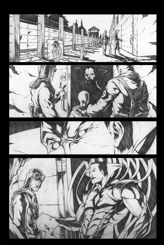
here’s a blitzkampf splash page that i’m working on for chibi. WIP