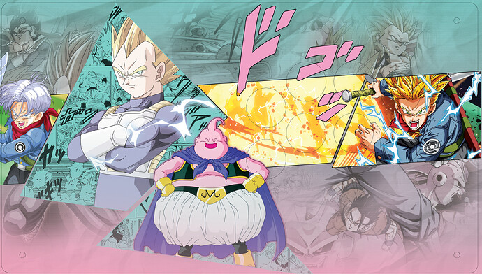
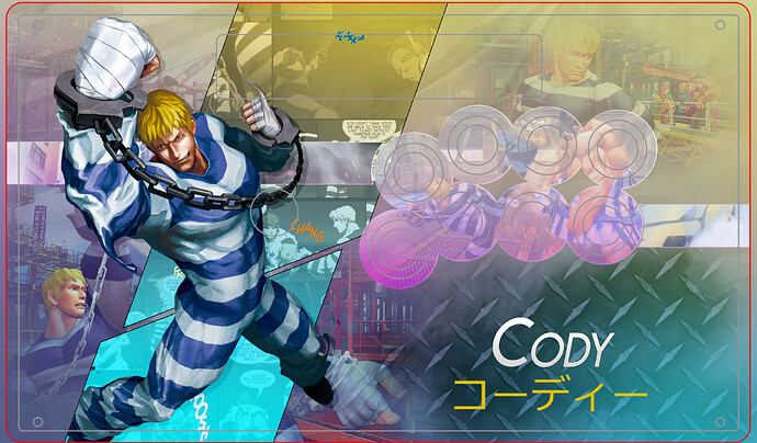
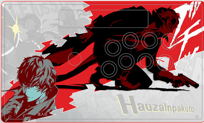
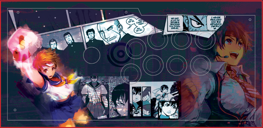
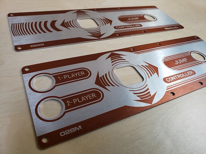
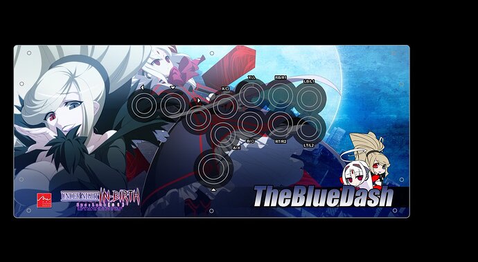
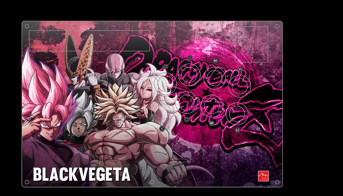
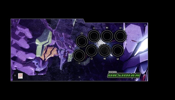
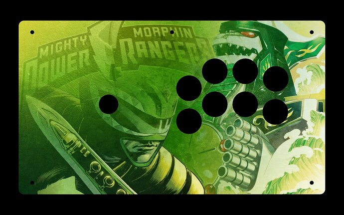
More work from one of my clients, still open for commissions!
https://discourse-cdn-aws1.com/shoryuken/original/3X/5/1/51a17ccd03f0159ea0b0872b31b0ed1d3c80b3b6.jpeg
Logos stand out too much. Blend it in more.
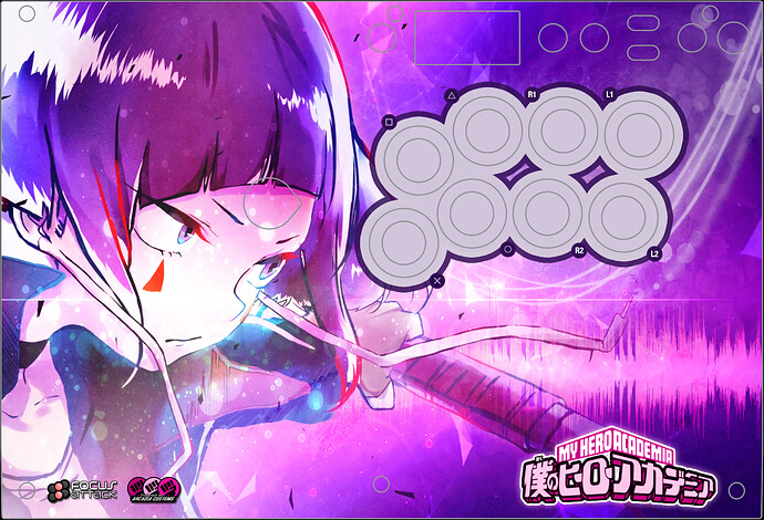
As requested by a prize winner, a design themed around kyouka from MHA done for a Panthera EVO I’ve made in collaboration with Focus Attack as part of their giveaway they did a few weeks back.
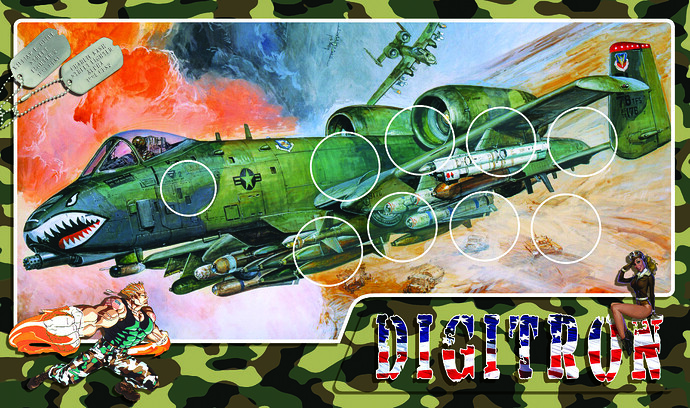
So my pal digidigi got the Foehammer case that was for sale here, tremendous deal BTW. Figured I’d be down to flake the rust off since my last CPO. He wanted an A-10 Warthog theme, at first I staretd with actual pictures, nice high rez takes too but I ended up opting for the illustration due to it having more vivid colors and explosions, lol. I almost did the legendary smoked one but it doesn’t translate well for this job and the case which is a nice light wood finish. As always any advice or criticism is appreciated.
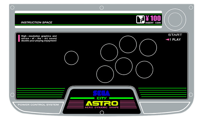
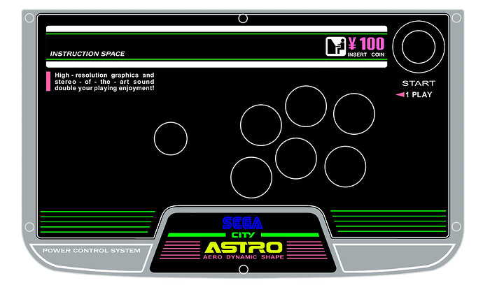
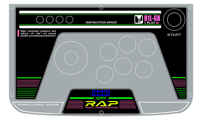
I don’t think I got to post this HRAP Astro CPO I came up with a while ago, mind as well share. Have a bunch of different versions, changes are minimal and consist mainly of border thickness except for a 1P CPO variation I wanted to do.
This one is my favorite out of all of the different versions.
Different top…
1L6B CPO variation with Hori logos.
Very nice. Perhaps a change in opacity in the camp background. If you wanted the font and guile image to stand out more you can lower it so when someone looks at it their attention is drawn to the main picture and small details 
Thanks for the advice.
At first there was no Guile, just the dog tags but my pal wanted a guile in there due to having an etched “Sonic Boom” on the plexi, I used HF Guile and made a color swap to match the illustration. I could make the guile smaller. The illustration is all one piece, how can I go about changing opacity in certain areas? Sorry to ask, not super fluent on this type of work. I’ll see what I can do, thanks again.
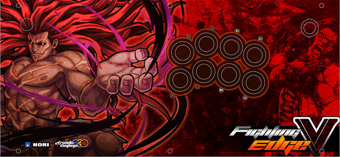
A necalli themed Hori Fighting Edge design I recently did for client.
Currently open and available for accepting requests so if interested, PM me for Portfolio and rate.
Thanks again Electric! I love it! I finally had time to print it, cut it and get in on this bad mamma-jamma <3
I may be in the market soon to have some work commissioned for my Qanba Obsidian. Waiting on a few things, including a talk with my wife to happen before I can commit to something.
Hit me up if you’re interested in a cool design.
Looks clean! I’m glad you’re happy with it and had the time to finish it! Congrats!
can you make something like this but with ken instead of ryu?
I did this eons ago before Hori started using line art on their later HRAPs…Inspired from the DK Jr. Cocktail CP, that’s what gave me the idea of the line art wrapping around buttons and such.
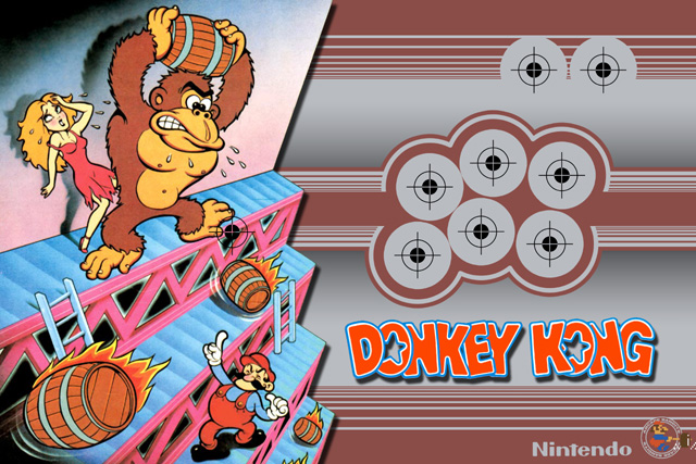
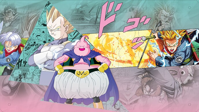
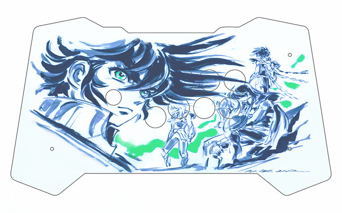
A few designs coming in that I’ve done for a few clients recently.
Always open for more requests so if interested, PM me for pricing and portfolio.
I’m currently working on some mishmash artwork for a couple of my sticks, but I want to try printing it myself too.
Just curious if any of you guys are printing your own art at a Kinkos or other local print shops? I could use some tips on how to go about doing this, and the proper steps to take when saving the file, which format to use (.pdf, .tiff, .psd, or .png?), how to make sure it’s correctly scaled, etc…
And sorry if this has been answered already, but I figured it would be nice to have this sort of info in this thread anyway.
