lmao, thats some great shiz OC
Awesome, but you have a typo:
“SO FAR ITO SPACE…”
Not anymore. LOLLERCOST.
OC
OMG oc!!! i love you.
We ALL love him.
omfg! That’s the stupidest av ever. 
I was, like, “what the hell is oc talking about? blasting off into space…!?”
You should probably make Vanessa punch a little faster. It’s abnormal seeing her punch so slow…hell…any sprite punching slow. I figure you’re trying to make her seem more cocky by taking her time, but still…
That was your best idea so far OC.
sumthin new,any tips?

rar…
^hawt!!!
oh shit fosh.
it cumms out my pants!.
you fiend, falcoon will have your head.
j/k.
Blackadde: that looks hot as fuck. Although I do have some kinda feeling towards the red border around the text. It just seems a bit off I don’t know if you have to cut away from the top part or not.
Here’s an av I’ve been working on, but 9K oversized…damnit.

blacks- liking that a lot. not sure about that pattern-change surrounding the orangish outline
Colors =\
Two quickie Star Wars 3 avatars with captions
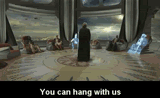
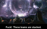
Take them if you want to
OC
HAHA, on the second ava, when c3po say’s AWW SNAP, i was drinking some coke and it made me crack up so it spewed outta my nose!!. haha
To me it looks like a pale red which would complement the pale green. While the use of negative space in the vectored girls is my personal favorite part of the piece (me being a humanist and all), I also thought the star & plug icons in the bottom right hand corner, and the thin red borders at the right of the piece which curl near the bottom were a very subtle, very nice touch. The girls also look like they have Byzantine-era halos. Religious much? Also, the blue/red/yellow test bar at the bottom left hand corner looks out of place, but it’s supposed to be. I want to know why black put that there especially.