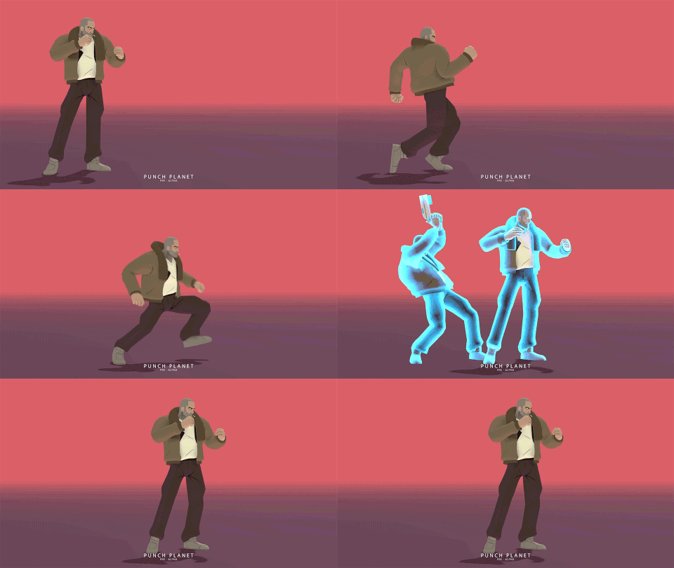
Here’s some match footage FT5
https://www.youtube.com/watch?v=XjVyqkJGlgk
So I really like the clean aesthetic but I think you could afford to add a bit more detail. For instance, Roy could maybe have a futuristic tattoo, maybe a barcode on his cheek. Maybe a patch on his jacket?
Word thanks for the suggestions. None of the art is final right now, will definitely go through some more iterations.
I don’t think Roy should be sporting anything that should make him noticeable. he is out on the run.
I think the simplicity is this game strongest design choice. Not everything needs to be eye catching to be appealing.
That’s true. But it depends on who he’s trying to blend in with. I have no idea what the average inhabitants of K-O look like but I assume since this is a sci-fi setting that there will be aliens, robots, mutants, etc.
Sweet deco look.
K-0 natives collect the heads of would-bes to the Punch Planet throne as currency? You guys are rolling in the cheese! Looking forward to this development.
Must make paying for lunch a chore. Cheeseburger and fries, that’ll be 6 infidel heads, please.
When are we gonna see Tyara, I demand to know.
I actually really like the simple visual style. You’ve managed to bring something really unique looking the genre. I don’t think anything else looks anything like this at all. So cool on that.
I think the only things that slightly bother me are the hit sparks are pretty underwhelming and the super portrait should probably be layered under the characters. Maybe that’s just a personal preference, but right now they seem to cover your character’s super animation at certain ranges.
Mechanically the game looks pretty solid.
Looking forward to seeing more
Thanks for the feedback yall, I’m in Mexico right now so not really posting much.
The hit sparks are ass, we threw them in to convert over to be full animation based (no particles, for rollback). Hit sparks and some more FX in general will for sure be a focus before we put up our greenlight.
Super portrait being behind the characters is a little tricky in Unity, layering isn’t super easy to do when mixing 2D and 3D objects (same reason the top health bars cover the chars). Every few weeks I take a stab at it but haven’t found a great solution that doesn’t have other serious drawbacks. That and being able to render chars full on top of each other are both big things I want to fix.
I did something like this in an experimental project a bit ago (in Unity). What I did was have 3 cameras set up for the scene. 1 camera was UI, one was for characters, and the last was for stage backgrounds. I then adjusted the depth accordingly to get it layers like this: Characters>UI>Stage. Having said that, the project was pretty simple and I didn’t have any performance issues because of it. Not sure if youve tried this and found it not to work well.
You lose character to stage shadow projections when you do that. I haven’t profiled rendering the character on both layers yet however, bit I’d like to avoid rendering them twice.
Oh right. I didn’t used shadows for that project. Forgot about that.
[quote=“spudmastaflash, post:21, topic:181064”]
Here’s some match footage FT5
[/quote]WOW! It´s just me or walkspeed is way faster now? I LOVE IT. I like a lot the aestethic look of the game too. Also loving how meaties have lots of active frames so opponent can´t just jump out of wakeup. Really OG that.
When is it coming out on Greenlight? (This year? Maybe the next one?)
Yeah I upped the walk speed a bit, wanted more mobility for sure. Glad you like a lotta active frames, I do too!
Hopefully in the next few weeks.
This thread needs more GIFS!

