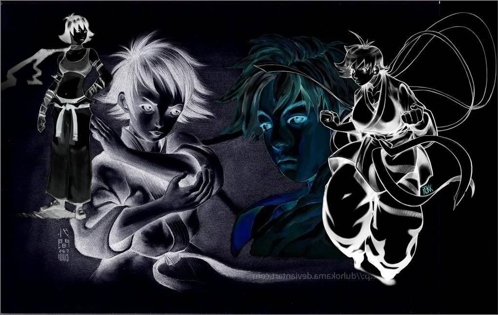
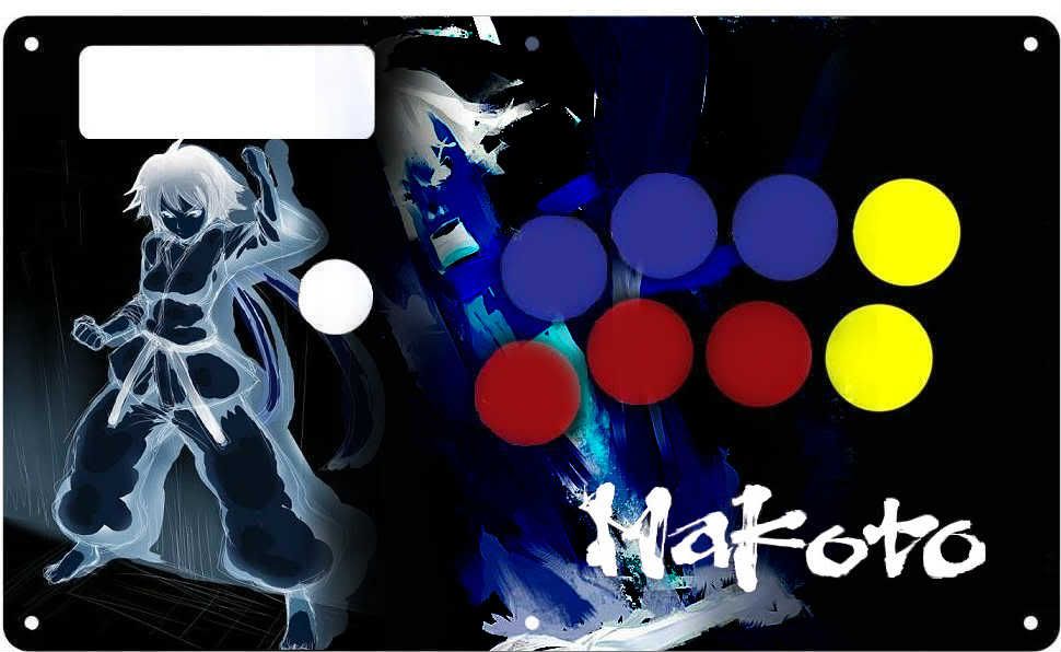
Man I could really use some TE fightstick art. I have no idea where to start though… 
Ok guy i made a template for Makoto stick Few years ago!
here we go
http://img197.imageshack.us/img197/3488/makototepaneltemplate.jpg
http://www.megaupload.com/?d=8YYU19ED
Hey guys i’m working on putting together a front and back cover for my fightstick… I have all of the images, but i’m still waiting for the artists permission lol. I’ve spoken with them, and i have a few, but some just havent’ responded back… if they don’t hurry up i’m going to go ahead and build it…
I might not even use these photos, but i just wanted to start practicing my editing since i’ve never done it before. What do you guys think??


EDIT - OH I forgot i’m not done with the front part…still need ideas…
If you have photoshop, I can give ya some pointers. I have a few years of experience with it. I’ve made 1 stick art before (not makoto), so I won’t claim to be an expert. But the front could use a bit of editing, I mean, if you’re gonna put the work in and want to be satisfied then you should look into a few things. 1. Color Scheme. I know I have the regular SF4 TE stick, which is red, white and black. I wouldn’t want to go all over the place in terms of color, or it would look bad. Gradient maps put on soft light, around 40% opacity help this. 2. Make sure you’re happy with the pics and the effects if you want to add them. Right now that effect next to makoto’s arm looks choppy. I’d smudge that to smooth it out. Something that bothers me is the pic in the bg of makoto (SSF4). It seems kind of plain. Nothing wrong with the pic itself.
Note that I just said this stuff as a fan of art, and I know it takes time and money to put these things together, so I would want anyone to be happy with their result. In no way shape or form am I intending this critique as a dis.
Some nice work in here. Keep it up guys.
Both of these I did when I heard my favorite Rindoukan Karate student was coming to Super sometime last year:

Just a simple art, button and ball-top swap on an Xbox TE. The original art isn’t mine, but there was quite a bit of editing done to it, including some actual drawing to fill in as original pic cuts off at her left shoulder, just past her fingertips. The background is some simple smudge painting in Photoshop, the micro text above “MAKOTO” lists her special moves and under that her supers.

This is my first fully custom stick. Everything done from the ground, up. Some heavy editing to get Viper and Juri to blend right with the rest of the girls. I wanted to get all the girls from all iterations of SF and make a true Femme Fatale stick(with Makoto and Chun Li being predominant), but I couldn’t find a pic that I really liked of those who were left out.  Cammy is covered by the ball-top in the picture, but she is in there.
Edit: Sorry for the super-flash in the pics. Didn’t realize it was that bad till I had already posted them.
I really like the first one. The background is very simple but looks neat. Looking back at my design (which I STILL haven’t put on my stick) I wonder if maybe you have an idea for a good background?
Man thanks for the critiques! Actually I dont’ have photoshop. I did the editing on Splashup. I’m not very good at stuff like this but i figured what the hell, lets try something new, you know. I’ll see if I can do some of the things you said on Splashup. If not, I may have to get a copy of photoshop. Thanks man… really appreciate it.
If you need any help I’d be happy to give you a hand. A friend of mine uses other image editing software, and some of the features are lacking. You may just not have the right tools for certain things.
Nice art bro i really like the minimalism.
Man i could use help lol. I have no idea what do or even where to start… Just let me know what I should do at this point.
Thanks for the compliments guys. 
The way I would go about it, with that specific stock, is to expand on that ‘sunburst’ design that is coming from behind Makoto. Get rid of that “box” that limits the burst from continuing outward so that you have a smooth transition. Work lots of really dark, almost black, reds in for your dark tones and keep going with the oranges, yellows and bits of white as your accents. Of course, depending on what editing program you’re using, you could also completely change the color scheme of the original stock and thus the colors that you’d want to work into your background.
If you want to keep the sprites as button indicators I’d also try to find something to put over the 3P and 3K buttons as it looks a bit strange to have a sprite for each button except those. Maybe grab a sprite from Seichusen Godanzuki and Abare Tosanami to put over their respective button activation macros?
I’d also put a defining feature around them, perhaps a color filled box or circle behind them, in order to differentiate them from the rest of the piece. Kind of like how I did with the text box in my Makoto TE, or how KSRezscind did with the circle around the “D” in his DWY text. That way you show differentiation, but it doesn’t look like they are just slapped on as an after thought either, however I’d still try to keep them tied into the piece with some reoccurring element. ie. Color, shape, ect.
My end result of working with that stock would probably be something along the lines of what KSRezscind posted several posts up, except instead of working the effects around the swirl of Chun’s Kikosho like he did, you’d be working them around the radiating burst of power that is coming from behind Makoto’s Fukiage(?).
If he did expand outside that box, some good smudging of colors and a bubble/effect c4d could really help. I think I have an orange one that looks very similar to the orange effects behind makoto.
btw, izanagisama, I too really like the first one of yours.
mossad_man- Well, first you’d have to decide on a pic you like. If there is a stock(basically an already finished pic with makoto, unaltered), then all you need is that and you may be done. However, resizing a stock may be needed, and this ma cause unwanted stretching. This can lead into the other option, actually playing around with your art, and getting a concept of what you want it to be like. (Art nerd time), there are 2 things that I always think about at the start when making art, my concept, and what the atmosphere will be like. Do you want it messy, clean, a lot of effects, plain? Things like that.
Didn’t want to jump to recommending abstract 3d rendering effects with another specialized program right off the bat. lol But yes, that would be a quick way to get some nice looking lighting effects in that situation. And thanks for the compliment dood, I dig your Chun design too. :tup:
Why didn’t I think of that background idea? Great advice, thanks!
I was actually thinking of not having those “little” Makotos at all, what do you think?
Edit: Except I suck at this. Haha…
what do you guys think about this? Man I suck at this lmao!!

Don’t know if this is of any interest to anyone, but capcom released a wallpaper with chibi characters:
http://www.capcom.co.jp/sf4/wallpaper.html
Maybe some will be interested in the makoto art for their template. ^^
LOVE how Makoto is just chillin’ next to the SSIV sign lol. Makes for great cropping 